The story’s premise of a sixteen-year-old navigating her teen years as well as coming to terms with her mother’s marriage is hard enough but it gets tougher when she has to live two lives, almost as if in parallel dimensions— online and reality. The Secret Life of Debbie G ( HarperCollins India) is Vibha Batra’s first graphic novel. It has been illustrated by Kalayani Ganapathy. It is an interesting concept where the teenage conversations are portrayed well. But the execution leaves a lot to be desired. On the cover of the book is the hashtag— #agraphicnovel. It is jarring since no graphic novel should ever have to announce it’s format to readers. Pity this one had to. Then the story itself is spread out in image frames, long text and speech bubbles laid out across pages. It is a hybrid version of young adult literature, caught between conversation-propelled plot and that of graphics. Instead it comes across as a heavily illustrated storybook that is hard to sink into. The confusion about the format plays havoc with the dialogue too. It allows for an expansiveness that a tightly knit graphic novel would not have the luxury to even consider as each frame, its text, its framing, its colouring would have to be considered umpteen times before finalising the layout. The text and illustrations complement each other in a traditional graphic novel to create a cohesive narrative. This is sadly lacking in The Secret Life of Debbie G.. I sincerely hope that the next graphic novel Vibha Batra creates — and in my heart I know she will— it will be a tauter story; and I certainly look forward to it. This particular story can be considered as a bridging text in Vibha Batra’s repertoire or a fine example of the evolution of a writer with immense potential!
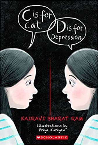
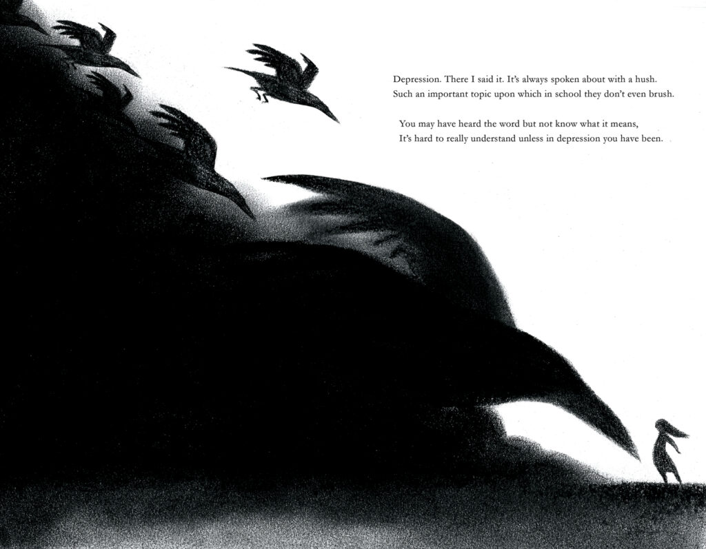
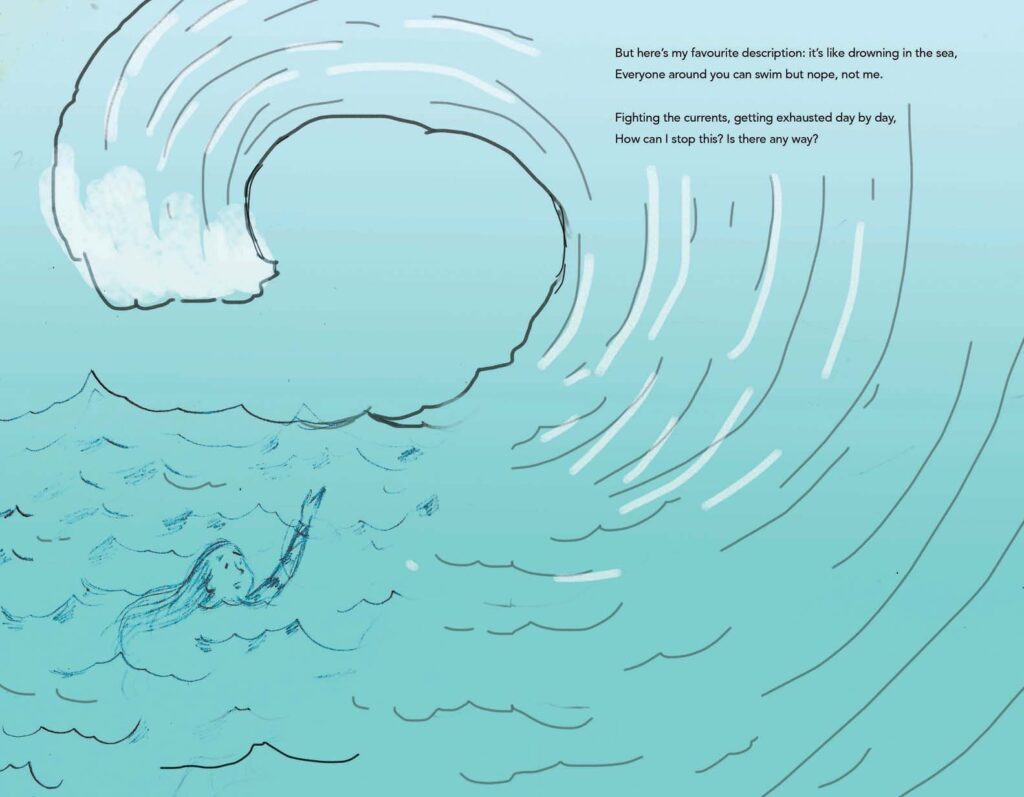
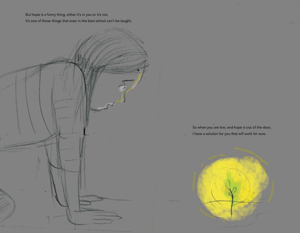
Mental health and related topics are at the best of times taboo subjects in India. To discuss openly about depression amongst teenagers/adolescents is unthinkable. In a country where being in therapy is still a hush-hush topic, to commission and publish a book on the topic is bold and that too in an experimental form — an illustrated memoir in rhyme. C is for Cat, D is for Depression( Scholastic India, 2020) is a much needed book for young adults in helping to break barriers about mental health and make it a socially acceptable topic to discuss openly and without any stigma.
Kairavi Bharat Ram is a young published author who is known for her previous books in rhyme — Ramayana and Krishna. Those were retellings of Hindu epics. But this is the first time she has told a story about her personal experience of battling depression as an adolescent. It is a powerful testimony to the challenges she faced. It is a vivid description of all that a patient afflicted by depression experiences and is unable to always share clearly. At the same time, it is a gentle request to caregivers of such individuals to be patient and offer a caring hand whenever required. She also equally gently plots out methods in which the person themselves or those around them can help an individual come to terms with depression and related mental health issues.
This is a precious book. A conversation starter and a handy tool for anyone interested in mental health. It should become an essential requirement in every classroom and school library.
Hopefully this will lay the foundation for a strong and well-defined yalit list on mental health in India/South Asia. Kudos to Scholastic India for publishing this book!
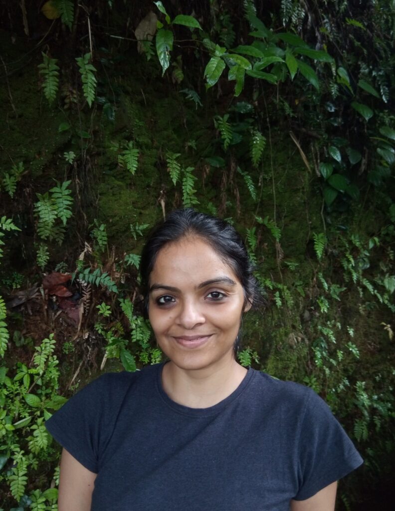
Priya Kuriyan’s illustrations for the text are out of this world. They complement the text well but also provide a narrative of their own to pull the reader in. While the drawings illustrate the text as beautifully and precisely as would be seen in a children’s picture book, the sophistication of the artwork is in keeping with some of the best international artists. Her eye for detail is astonishing. Her work as an illustrator begins from the cover, includes the endpapers and then the main text. To open the book and see the black endpaper that transforms brilliantly into a bright yellow at the end of the book is just one tiny detail that makes this book an extraordinary triumph. I had questions buzzing in my head for Priya while reading the book, so here is a lightly edited version of the interview conducted over email.
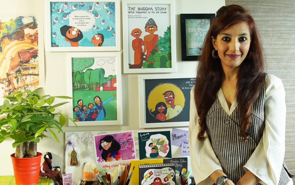
Priya Kuriyan is a children’s book writer-illustrator, comics maker and chronic doodler. She has directed educational films for the Sesame street show (India) and the Children’s Film Society of India (CFSI) and has illustrated numerous children’s books for various Indian publishers. She lives and works in the city of Bangalore and in her spare time makes funny caricatures of its residents.
How did you approach this project? What was your initial reaction upon reading the text?
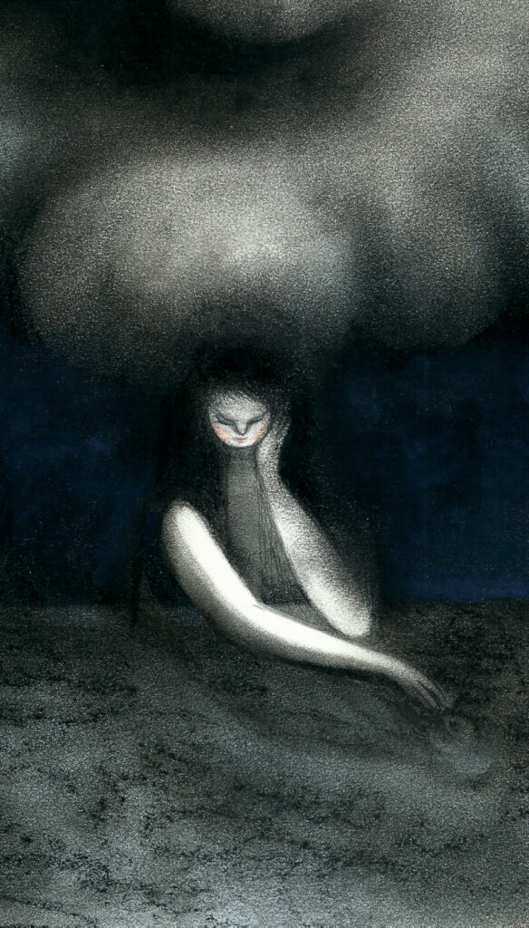
I first received the manuscript from the editor and went over it a couple of times trying to really get a sense of the genre. From the start, I was sure that though there are aspects of depression and mental health that are universal, (having had experiences with it myself and read up a fair bit) this was a very personal account of Kairavi’s experience with it. Therefore, I knew I would have to consult her at every stage of creating the book and that I wanted her voice to take centre stage. She had used metaphors in her poetry that I realised could translate very well into strong and evocative visuals that lead you into the mind of someone who is suffering so I knew that these strong full page illustration spreads would do justice to the text.
I had sent a few images from the early pages as samples to Kairavi and though she liked them a lot, she did rightfully ask me also to keep in mind that ultimately the book was also about hope.
2. How long did this project take to complete?
The manuscript was sent to me sometime in July last year and I had my first conversation with Kairavi in February this year over Skype. I worked on the project in bits and parts since then, but the serious work really started in April and was done by the end of June.
3. What was the initial concept note for the illustrations? Or did Kairavi and you have separate notes/ ideas that you then merged?
There was no initial concept note for the illustrations, but what I requested Kairavi after I had that first conversation with her was to pen down some words next to her lines as to what she saw when she wrote those words; not for every line, but at least for a few. Those did give me some cues that I could expand on. I would then send Kairavi rough drawings of my interpretations of those lines and she would then write back to tell me if it complemented the feelings that she intended to convey through her poetry
4. Your artwork is synonymous with light, freshness, primary colours etc. So how challenging was it to work with such dark colours, panel after panel?
Well, I think in my personal time where I don’t have to work on a client project, I do experiment with other kinds of media and genres. So, I didn’t really find the colour palette a challenge. I think most people have seen the work that I have done in the children’s book space (which I really enjoy being in), and then, one continues to get assigned work of the same kind based on what you’ve done before. I like and enjoy breaking away from my typical style from time to time.
5. Do you illustrate on the computer or do you use other mediums and then transfer the scans to the computer?
Most of the time I work analog first – scan my artworks, do some touch ups on an appropriate software and send digital files to the publisher. In this case I used dry pastels and charcoal for my original artworks.
6. If you had to write a note about creating the artwork for this story, what would you write?
That the illustrations should immerse you into a journey of a person trapped within their own mind, who is reintroduced to the idea of hope and ultimately releases himself/herself.
7. With this particular book, I feel that you have broken many of your creative boundaries and pushed yourself in a space that is new. I do not mean in that you are an over-reacher but as someone who has leapt into a new phase of creativity. Do you think this project changed you in any way? If so, what?
Hmm..It’s definitely a genre that I had not worked on before in the children’s book category. A lot of the work I do for adults (comics/ book covers etc) has tended to fall into a more serious (in the literal sense of the word) way. So, I’m not certain at the moment whether this has changed my work in a dramatic way. I think what I do with the next couple of projects that come my way will be what answers that question.
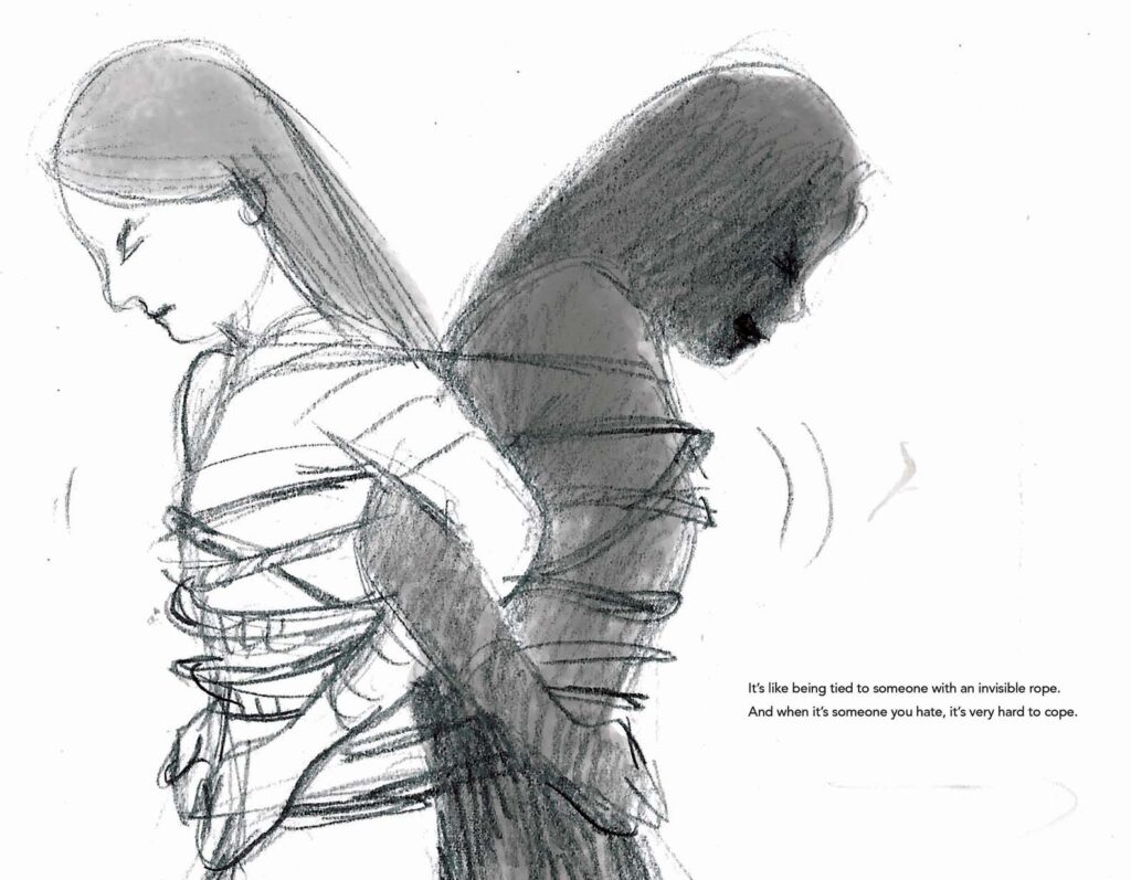
8. Which of these illustrations is your “favourite” of the book? Which of these illustrations has developed the furthest from the initial sketch? And why?
I think the one where the girl is tied to this black figure. I like the metaphor or the paradox of trying to release yourself from the person that you don’t know or recognise and yet knowing that person is you. I think that line really spoke to me. The illustrations that changed the most from the initial drawings were perhaps some of the earlier spreads. I think they were much darker and I later realised that the darkness must creep in gradually just as the light creeps in gradually into the latter part of the book.
9. What do you think is the relationship between illustrations and text? How does it vary depending upon the type of book it is — picture book, illustrated storybook, illustrations accompanying a story, chapter book, comics/graphic novels, novels etc.
The word and the text are entwined twins. I think in the case of picture books an illustrator anchors oneself on the text and is an equal partner when it comes to telling the story along with the writer. How long the rope needs to be, is the critical decision that the illustrator takes. It does vary vastly depending on each type of book. As far as possible, the illustrations that accompany any kind of format, should ideally not be a direct representation of what is in the text. It can bring further context to the story by adding more details that are not necessarily present in the text. In the case of comics, one has to also keep in mind that the page is being viewed panel by panel and also as a whole. So, text and image is intertwined differently out there.
10. What do you think are the fundamental guidelines an author should keep in mind while creating a concept note for an illustrator?
A clear idea of the context within which the book is set. Who the book is aimed at. Any image references that are essential to the research or details of the book. Having said that, it is always best if the author is generous enough or trusting enough to let the illustrator bring in his or her own voice to the book.
11. When did you discover your love for illustrations? What is your favourite medium for creating art? What is the medium you prefer to use while illustrating texts?
I love exploring different mediums and changing them depending on the book I’m working on. Needless to say stationary stores are the only stores I enjoy being in apart from bookstores.
I used to love drawing as a kid and also story books. I ultimately ended up studying animation in design school and as part of the course, we had illustration as a module. I really enjoyed it and perhaps that was when I considered that this could perhaps be something I could take up later. It was however a something I imagined I’d be doing on the side. I think I started taking children’s books seriously only after my 3rd or 4th book was published. There are no colleges that teach Illustration specifically in India and I think there’s a bit of a lacunae there since a lot of illustrators just by instinctively finding their way into a career in Illustration.
I don’t think I have a favourite medium as such. Though I work with watercolours quite a bit. I choose mediums depending on the nature/genre of the book. And I like exploring different techniques. At the moment, I’m inclined to say that graphite pencils are my favourite, but that might change in a few months from now.
12. Who are your favourite illustrators and who has influenced you the most
My favourite illustrators are Shaun Tan, David Weisner, Emily Gravett, Atanu Roy, Oliver Jeffers, Jon Klassen, Mickey Patel. All the illustrators of Target magazine that had a huge influence in my childhood namely Atanu Roy, Jayanto Banerji, Sudhaswatta Basu, and Ajit Ninan.
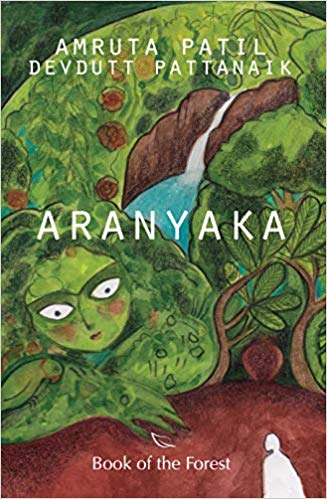
Aranyaka is the first collaboration between mythologist Devdutt Pattanaik and writer-painter Amruta Patil. Amruta is also India’s first female graphic novelist. “Aranyaka” is a modern retelling of the Vedic concepts that are not always easy to communicate. The best medium to do so seemed to be using text and imagery for which the graphic novel is the ideal art form. More importantly it is the creative energy between the authors that has been the prime force in narrating this parable, a love story, a creation myth, yet weaving in the essential elements of learning which the over 3000-year-old Vedas emphasise. The beauty of any scripture is its ability to be retold in any age and in any form without losing its core idea. With “Aranyaka”, the two authors seem to have achieved this magnificently. It is impossible to tell who contributed to which part of the storytelling apart from the obvious ones of Amrut Patil’s artwork and Devdutt Pattanaik’s corporate speak — at times the latter makes its presence felt in the dialogue. Nevertheless there is a seamless unified quality to the story which gets straight to the point — of immersing the reader immediately and effectively into the story about the forest. It is not imperative to have read the original Vedas in order to appreciate this modern version. It reads smoothly. Not once does the collaboration seem clunky! This magical jodi of Devdutt Pattanaik and Amruta Patil is perhaps the ideal desi version of Neil Gaiman and late Terry Pratchett who are equally phenomenal in retelling the scriptures.
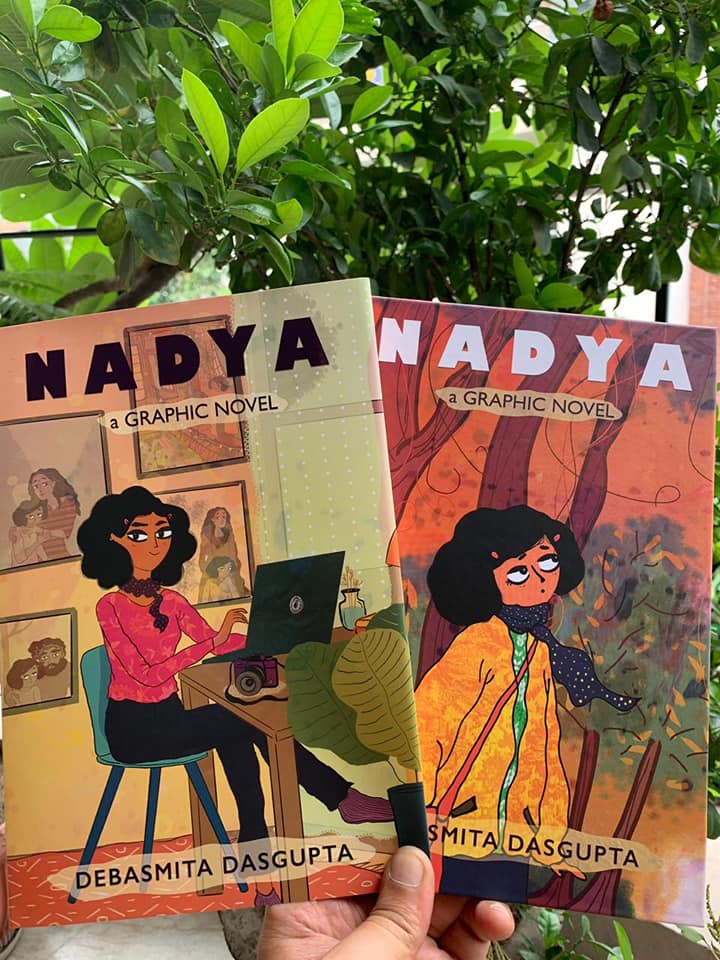
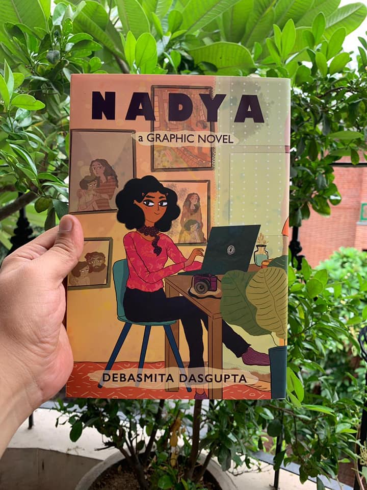
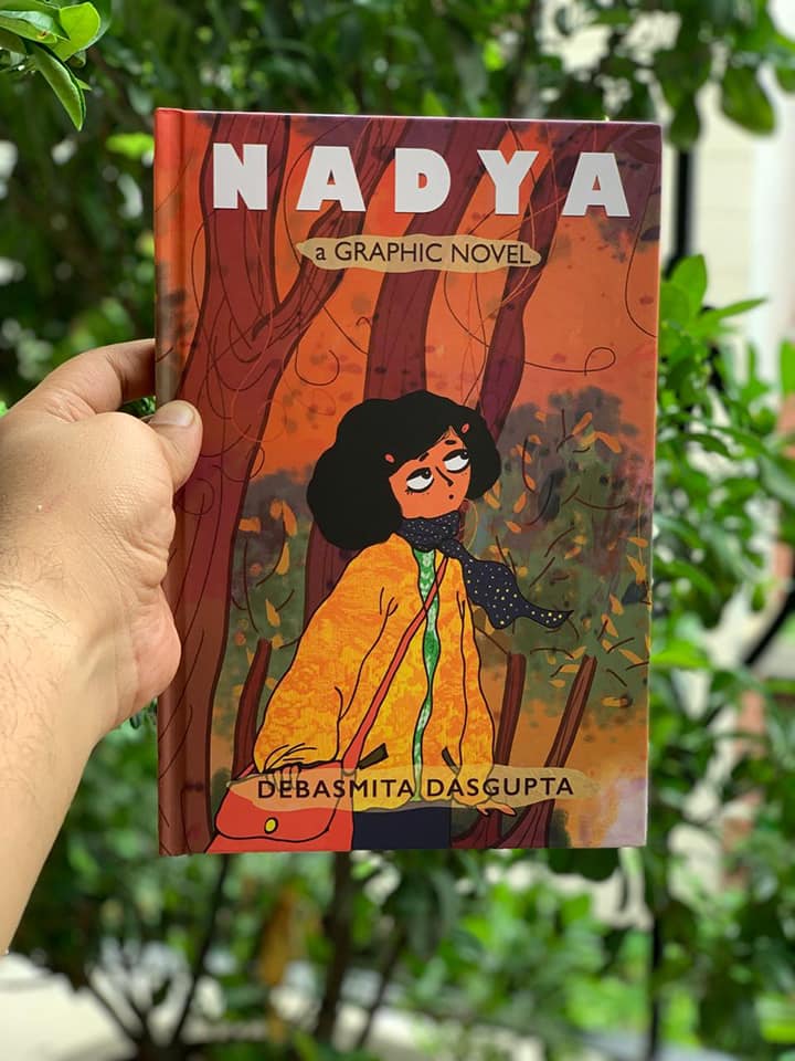
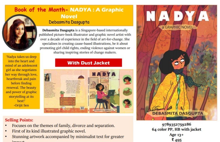
Nadya is a stunningly powerful graphic novel about thirteen-year-old Nadya who witnesses her parent’s marriage deteriorate. The story and the art work are devastating. The artist-cum-author Debasmita Dasgupta has created a very moving portrait of a family falling apart at the seams but also how the little girl, at the cusp of adulthood, is witness to a catastrophic set of circumstances. Her secure world crumbles and she feels helpless. Yet the staid portrait of the professional at her desk on the dust jacket belies the confused and anxious teenager portrayed on the hard cover — a fact that is revealed once the dust jacked is slipped off. It is an incredible play of images, a sleight of the hand creates a “flashback”, a movement, as well as a progress, that seemingly comes together in the calm and composed portrait of Nadya at her desk, tapping away at the computer, with her back to a wall on which are hung framed pictures. Many of these images are images of her past — pictures of her with her parents in happier times as well as when the family broke apart. A sobering reminder and yet a reason to move on as exemplified in the narrative itself too with the peace that Nadya discovers, a renewal, a faith within herself to soar. Scroll sums it up well “Teenagers may read this story of a nuclear family living in the hills for relatability, but for everyone there is the poetry of the form that this graphic novel poignantly evokes.” Nadya is an impressive debut by Debasmita Dasgupta as a graphic novelist. Nadya, is releasing on 30 September 2019 by Scholastic India.
Debasmita Dasgupta is a Singapore-based, internationally published Kirkus-Prize-nominated picture book illustrator and graphic novel artist. She enjoys drawing both fiction and non-fiction for children and young adults. Working closely with publishers across the world, she has illustrated over 10 picture books, comics and poems. Widely known as an art-for-change advocate, Debasmita tells stories of changemakers from around the world partnering with global non-profits. Her art is exhibited in Italy, Singapore, Thailand, Denmark and more than 40 international media outlets have featured it.
Here are excerpts of an interview conducted via email:
How did the story of Nadya and its publication come about? Was
it the story that came first or the illustrations? What is the backstory?
I am a visual
thinker. Words don’t come to me naturally. The story of Nadya was with me in
bits and pieces for a very long time. I needed some time and space to weave it
all together. It happened exactly a year ago when I went for an illustrators
residency near Burgos (in Spain). That’s when I completed the story and
illustrated a few key frames, which finally expanded to become this 64-page graphic
novel.
When I was in primary school, I had a very close friend (can’t disclose her name). I have faint memories of us spending time together and quite a vivid memory of her fading away from my life after her parents went through a divorce. I was too young to understand the significance of the word “divorce”. All I could understand, deeply, was that it changed the course of my friend’s life. She became more and more quiet and then one day never came back to school. There were rumours that perhaps she went to a different school or a different city. Years later, another very close friend of mine went through a divorce. She has a daughter and at that time she was eight. This time I realised the thing that bothered me the most in my childhood was that I couldn’t make an attempt to complement the loss in my friend’s life with my friendship. Simply because I didn’t know how to deal with it. Finally, I found an answer in my art and the story of Nadya began.
2. While the story is about Nadya witnessing her parents marriage fall apart, it is interesting how you also focus on the relationships of the individuals with each other. Is that intentional?
Absolutely! I don’t see Nadya as a story of separation. On the surface it is a story of a fractured family but underneath it is about our fractured emotions. In fact to me it is the story of finding your inner strength at the time of crisis. You just have to face your fear. Nothing and no one except you can do that for you.
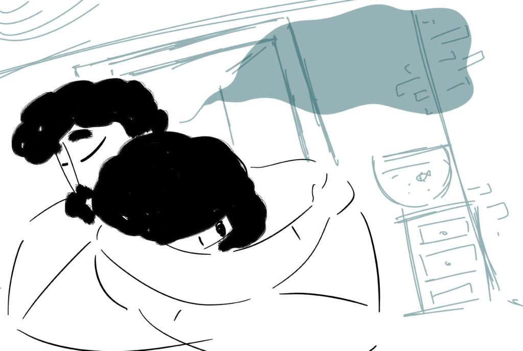
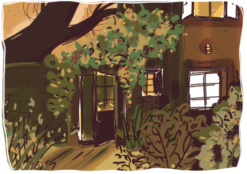
3. Nadya seems to collapse the boundaries between traditional artwork for comic frames and literary devices. For instance, while every picture frame is complete in itself as it should be in a comic book, there is also a reliance on imagery and metaphors such as Nadya being lost in the forest and finding the fawn at the bottom of a pit is akin to her being lost in reality too. Surprisingly these ellisions create a magical dimension to the story. Was the plot planned or did it happen spontaneously? [ There is just something else in this Debasmita that I find hard to believe is a pure methodical creation. It seems to well up from you from elsewhere.]
Thank you Jaya!
You are right that it is not a pure methodical creation. In fact, what fascinates me is that you could feel that the borders are blurred. When I was creating the story of Nadya, I felt that there were many crossovers between borders. Like emotional borders (grief and renewal) and timeline borders (past and present, with a hint of future). And I think these crossovers resulted in the form of an amalgamation of narrative forms, textures and colour palettes. In fact, that’s one of the reasons why I felt the story is set in the mountains where you cannot define the lines between two mountains or the distinctions between the trees in the forest when there is a mist. They all overlap each other like human emotions. It’s never all black and white.
4. How important do you think is the role of a father in a daughter’s life?
Let me tell you the story behind “My Father illustrations” – It was on a Sunday afternoon when the idea came to me after I heard a TED talk by Shabana Basij from Afghanistan. It was a moving experience. I felt something had permanently changed inside me. Over the next few days, I watched that talk over and over. Her honesty, her simplicity and power of narration moved me. Shabana grew up in Afghanistan during the Taliban regime. Despite all odds, her father never lost the courage to fight for her education. He used to say, “People can take away everything from you except your knowledge”. Shabana’s story gave me a strong impulse to do something but I didn’t know ‘what’ and ‘how’. That’s when my red sketchbook and pencil caught my eye. Before I’d even realized it, I had taken my first step. I illustrated Shabana’s story and posted it on Facebook. It was an impulsive reaction. I found Shabana’s contact and shared the illustration with her. Shabana was so touched that she forwarded it to her students, and then I started getting emails from a lot of other Afghan men! The emails were a note of thanks as they felt someone was trying to showcase Afghan men in a positive light. I realized that if there are so many positive father–daughter stories in Afghanistan, just imagine the positive stories across the world! My journey had started. I started looking for moving father-daughter stories from across the globe. Some I found, some found me. With every discovery, my desire to create art for people kept growing.
5. With Nadya you challenge many gender stereotypes such as the daughter’s relationship with her parents. It is not the standard portrayal seen in “traditional” literature. Here Nadya seems happier with her father rather than mother. The breaking down of Nadya’s relationship with her mother has been illustrated beautifully with the picture frames “echoing” Nadya’s loneliness and sadness. Even the colours used are mostly brown tints. This is an uneasy balance to achieve between text and illustration to create an evocative scene. How many iterations did it take before you hit a satisfactory note in your artwork? And were all these iterations in terms of art work or did it involve a lot of research to understand the nuances of a crumbling relationship?
I often say
“Preparation is Power”. And I have always learnt from great creators in the
world that there are no shortcuts to create any good art. However, the process
of preparation varies from artist to artist. To me, this is not a process, it’s
a journey. It starts with a seed of an idea and then it stays with me for a
long, long time before I could finally express it my way. There is a lot of
seeing, listening and spending time with my thoughts. Breaking of the
stereotypes, whether they are gender stereotypes or stereotypical formats, were
not intentional but I guess embedded in my thinking. It’s not that someone from
outside is telling me to break those norms but it’s a voice, deep inside,
constantly questioning. Not to find the right answers but to ask the right
questions.
There were many versions of character sketches and colour palettes before the finals were decided for Nadya. Even though the initial characters and colours were similar to the finals, the textures and tones are distinctively different. Since the story runs in different timelines with varied emotional arcs, I wanted to integrate separate tonalities in the frames. In the end, a graphic novel is not just about telling a story with words. If my images can’t speak, if their colours don’t evoke any emotion then my storytelling is incomplete.
6. Did you find it challenging to convey divorce, loneliness, relationships etc through a graphic novel? Why not create a heavily illustrated picture book, albeit for older readers?
I am a bit of an unconventional thinker in this regard. I can’t follow the rules of length and structure when it comes to visual storytelling. That’s why many of my illustrated books are crossovers between picture books and graphic novels. To me, when I know the story I want to tell, it finds its form, naturally.
7. As an established artist, what is your opinion of the popular phrase “art for art’s sake”?
I am an advocate of “art for change”, more precisely a positive change. I strongly believe (which is also the genesis of ArtsPositive) that art (of any form) has the ability to create a climate in which change is possible to happen. Maybe not today. Maybe not tomorrow. But eventually it will.
8. Graphic novels have become popular worldwide. Mostly the trend seems to be tell personal stories or memoirs or a lot of fantasy. To create a novel for social activism is still unusual though it is happening more and more. What do you hope to achieve with Nadya?
I admire those books (graphic novels) that I can read several times, because it’s not about the length of the book, instead it is the depth that intrigues me to re-visit it more and more. Books that help start a conversation. A conversation with yourself or with someone else. I want Nadya to be that conversation starter.
9. Although it is early days as yet, what has been the reception to Nadya, especially from adolescent readers?
The book is releasing in India on 30th September and I can’t wait to see what young adults have to say. Before that we had a soft launch in Singapore during the 10th Asian Festival of Children’s Content, where Nadya received a very warm welcome. All festival copies were sold out but my biggest reward was when I met this young artist from Indonesia, who told me that he could see himself in little Nadya. His parents separated when he was very young. I also met a teacher, who said that he is going through a divorce and would appreciate if I could speak to his children with this book. His eyes moistened when he was speaking to me.
10. Who are the artists and graphic novelists you admire?
That’s a long list! But surely the work of Marjane Satrapi, Paco Roca, Riad Sattouf, and Shaun Tan inspire me a lot. The way they present complex subjects with simplicity, is genius!
11. What motivated you to establish your NGO, ArtsPositive? What are the kind of projects you undertake and the impact you wish to make?
About a decade ago,
when I started my journey as an artist / art-for-change advocate, there was not
much awareness about this concept. It was a very lonely journey for me, helping
people understand what I do and what I aspire to do. So when I had the
opportunity to start an initiative, I decided to develop ArtsPositive to
contribute to the art-for-change ecosystem by supporting artists who create
art-for-change stories.
At ArtsPositive, we
create in-house art-for-change campaigns such as #MoreThanSkinDeep* (the most recent campaign). We have also launched a quarterly ArtsPositive
digital magazine to showcase art-for-change projects and enablers from around the
world, collaborate with artists, and share artistic opportunities.
* More Than Skin Deep is an illustrated poetry campaign by poet, Claire Rosslyn Wilson and
artist, Debasmita Dasgupta, through which we are amplifying the voice of
fifteen fearless acid attack survivors (from 13 countries), who are much more
than their scars.
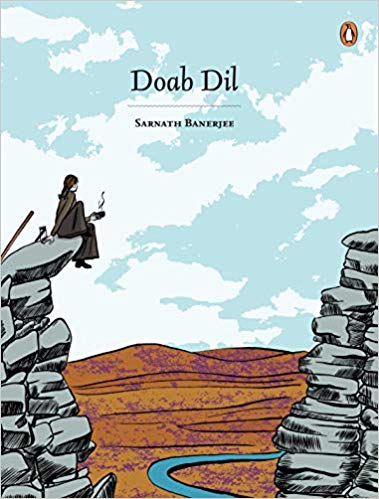
Graphic
novelist Sarnath Bannerjee’s Doab Dil is
an extraordinary piece of writing or “faction” as he would like to call it. It
is based on a few years of intense reading with a panel, sometimes a double
panel, dedicated to a writer – fiction, non-fiction, or even a lyricist. It is
an “extraordinary” book for every time you flip through it there is something
more to discover. The selection of the writers with the brown drawings is like
entering an accessible portal for a walk through a history of reading. A
reading that is a combination of the canonised writers along with the lesser
known. It is like browsing through the bookshelves at a library where the
familiar writers are placed with the lesser known names. Sarnath Bannerjee is
known for his graphic novels Corridor,
The Barn Owl’s Wondrous Capers, The
Harappa Files, and All Quiet in Vikaspuri.
Yet Doab
Dil is a pivotal piece of work as it marks a transition from his early
works to something new and exciting to come. It is to be found as he mentions,
in the “spaces between the text and images form the central backbone of the
book”.
Here is
an extract from Sarnath Bannerjee’s introduction to the book:
…I was commissioned ninety murals for the new Deutsche
Bank building at Canary Wharf, London. The curators, Alastair Hicks and Mary
Findley, gave me an open brief, which is always a scary thing. After struggling
through many meetings at Winchester House, we finally came up with the idea of
making the whole building read like a book. Two years of intense reading
suddenly came into sharp focus. This was my chance to archive my readings, to
put my thoughts into drawings and, in doing so, preserve the books in my mind.
Doab Dil
brings together drawings and text like two converging rivers. The fertile tract
of land lying between two confluent rivers is called a doab (Persian do ab, two rivers).
It is a rich, draught-free, populous tract where civilizations are born. These
spaces between the text and images form the central backbone of the book. I
have used bits of text that I have assimilated from my reading and mixed them
with my own writing and interpreted them through drawings.
It is not surprising that authors find it easier to talk about reading than writing. Doab Dil is written in that spirit – a book by one reader to another.
******
Here is a lightly edited interview with Sarnath Bannerjee via e-mail.
JBR: Why and how was Doab Dil conceptualised? How long did it take to be made?
SB: Doab Dil is a book about reading than writing. A kind of deep and slow reading that produces wayward thoughts. Often reading provides a springboard for ideas, places and characters. It opens up one’s imagination beyond the merely personal.
There are some themes that Doab Dil explores. Gardens as places of enquiry as well as places where class and taste are played out. Dark Arcadias. Utopia and Suburbia. Originally the book was called “Common Utopias”. Sections of the book also look at work, enlightenment, history and end with a few popular songs that echo the theme of the book.
It took a couple of years to write and draw and many
years of reading.
JBR: You refer to the Olympic Games project in the introduction but I am unable to see how the two are connected except for the book concept?
SB: The end product for both the projects have been large murals, they were drawn with expanse and detail in mind. The drawings themselves are self-contained and often tell parallel stories. This is the formal connection between the two works.
Some of the characters that appear in Doab Dil seem to be distant cousins of
the characters that appear in my Olympic project. In both these, I have tried
to practice the discipline of the unsaid. I have used minimal
text but tried to expand the scope of the theme. In successful cases, the
frugal text has brought out details and complexity of a larger tonal
universe.
JBR: What made you switch to non-fiction reading?
SB: It wasn’t a conscious choice and i haven’t switched to non-fiction. Every now and then I stumble upon a good non-fiction book, I start reading it reluctantly and slowly get drawn into it. It just is not my first preference. Information and facts don’t interest me so much. Neither does opinions. But i have a great appetite for imagination. Imagination is proper therapy to get through life. If i need to know about something, like a city or a political event, i look for fiction around the theme.
Ever since I started working on my History Biennale
project six years back. I have been reading a lot of books on rhetoric and
history. That’s how it started. Also, many of my academic friends are
converting their thesis into books, that gives me a steady stream of books to
read.
JBR: Which was the first nonfiction book you read that got you hooked and spurred on this reading spree?
SB: The Little History of the World by Ernst Gombrich, Cheese and Worms by Carlo Ginzburg, Mumbai Fables by Prof Gyan Prakash etc.
JBR: In Doab Dil what came first — the text or the illustrations?
SB: At first came reading, then pictures then the writing.
JBR: “Doab Dil” are two Hindustani words but the text is in English. Would you like to see this book translated into Urdu or Hindi?
SB: I would very much like to, I don’t like the fact that my books are only in English. I would most love to write in Bengali. I have a good sense of the language, but I am not yet confident about writing in Bengali although I believe an app exists that will help me in this task.
JBR: These read like meditative pieces on literature irrespective of form. You glean tit-bits from modern classics to contemporary pop across nations and cultures but they all work together beautifully. How did you make your selections?
SB: I think I have my mother’s instinct. Or so I think. I have work intuitively. I don’t think I am very clever about structure and nor do I have a head for analysis. I am mostly driven by a kind of reportage.
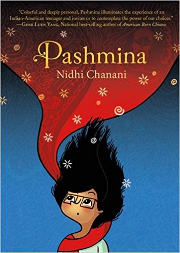
Pashmina by Nidhi Chanani is a graphic novel about a young Indian-American teenager Priyanka, growing up in America, where she lives alone with her mother. She has plenty of questions about India and her father. Her mother gives her information as and when she feels it necessary otherwise manages to evade them. One day at home she discovers a Pashmina shawl, beautifully embroidered. It falls out of the cupboard. Priyanka is enthralled by its beauty and wraps it around herself. When she does her world transforms and she is transported magically to a different world, represented colourfully in the plates which are otherwise black and white. These magical interludes in her life only strengthen Priyanka’s resolve to visit India and find out more about her roots. Despite her mother’s resistance she is able to book a flight to India by using the prize money she won at an art competition. While in India she discovers the truth about her identity, her mother’s decision to migrate and the history behind the shawl.
Pashmina is a beautiful coming-of-age story much like the desilit of nearly two decades that had suddenly become popular except in this case the format is graphic, a generally more acceptable form of storytelling nowadays. Having said that there is a statement on the glossary page saying “Traditionally, the term ‘pashmina’ is associated with shawls that are made from very fine Kashmiri wool. However, in this book, pashmina refers to the embroidered silk shawls that are woven in Nagpur, Maharashtra. ” Even though this clarification has been printed in the book it is misleading to have an entire story which is ostensibly set in America and western Indian state of Maharashtra to have the shawl and its title taken from the state of Kashmir, which is in the north. It may not be confusing for those unfamiliar with India, for whom the exoticism of this story will be appealing rather than the details but it is unfair to stretch the creative license of storytelling to transplant the handloom unique to a state to a different region. Handlooms and handicrafts are unique to every region and representative of the cultural identity of the state. It is also an identity that the artisans and others working in this sector for the preservation of handicrafts strive for — particularly in registering Geographical Indicators (GIs)under the TRIPS Act. So books like Pashmina while creating awareness indirectly about the beautiful shawls also cause damage by blurring regional identities in the minds of people who will ultimately be counted upon preserving handlooms. While writing for children and young adults, of impressionable minds, it is imperative that facts are checked, even if the story is purely fictional.
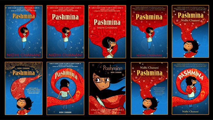
This book has been whispered about and discussed for a while now and its production quality has not disappointed one at all. In fact there is a lovely essay available online by the cover designer on the many avatars his designing underwent before the team selected the final layout.
Be that as it may despite the reservations about the mixed regional identity of the handloom, Pashmina is a lovely introduction to the community of Indian-Americans and the possible questions of identity that plague the younger generations. It is wonderfully represented in the storyline and the artwork. Well worth reading!
Nidhi Chanani Pashmina HarperCollins Children’s Books, an imprint of HarperCollins Publishers, Noida, 2018. Pb. pp. 170 Rs 399
5 May 2018
*Note: All images are off the Internet. If you own the copyright to them please let me know and I will acknowledge it.
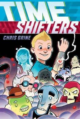
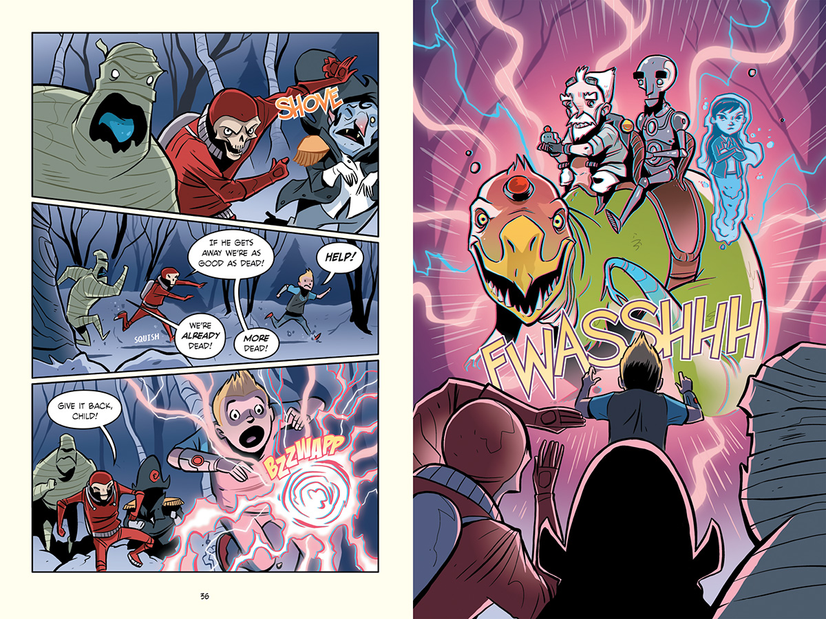
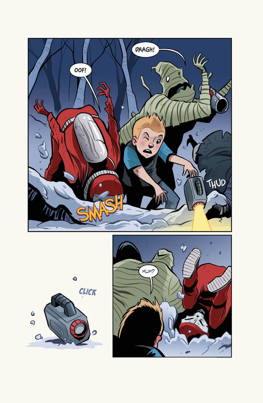
Time Shiftersby Chris Grine is about young Luke who is devastated after a day in the forest spent with his brother. Due to an unfortunate encounter with a bunch of bullies Luke’s beloved brother drowns. Luke is heartbroken just as is his mother. One day while sitting on the back porch he spots a blue light in the forest behind his home. He ventures closer to take a look and before he knows it he is pulled into an adventure that involves time travel, a bunch of strangers and a dinosaur. When in the forest strangest of devices gets clamped on to his forearm. Apparently it enables time travel through the multiverse. It had been accidentally dropped by an odd bunch consisting of a mummy, a skeleton in a spacesuit, and “vampire Napoleon”. Luke is given chase by this extraordinary team who want the device back otherwise they will incur the wrath of their evil master. Fortunately Luke is rescued by an equally odd team: a robot Abe Lincoln, an Asian-featured ghost named Artemis, a dinosaur named Zinc, and Doc—the white inventor who looks a lot like a caricature of Einstein and as it turns out had invented the device on Luke’s arm. To escape from the clutches of the evil creatures Luke and his new friends shift to an alternate Earth where spiders the size of humans inhabit what looks like the Old West. It is a very engrossing read even though the evil folks come across at times like pantomine characters. A spellbinding adventure that works well for young readers particularly for introducing the concept of time travel. The unexpectedly though-provoking conclusion imaginatively opens many conversation spaces with youngsters and old alike!
Highly recommended!
Chris Grine Time Shifters Graphix, an imprint of Scholastic Inc., 2017. Pb. pp. 270
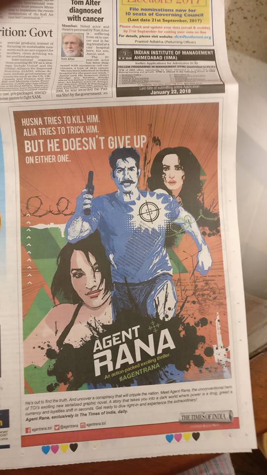
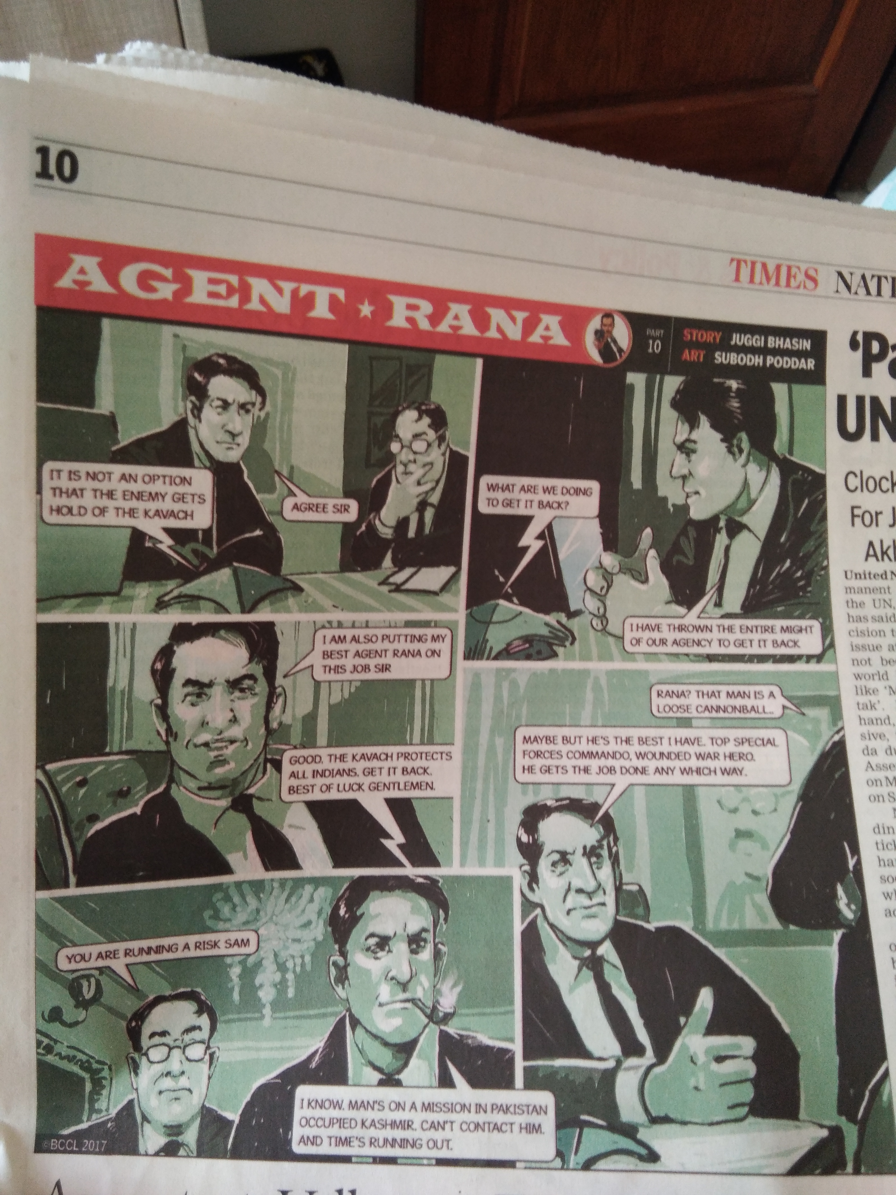
Juggi Bhasin is a successful writer who ” living out fulfilling a lifelong ambition: to become a writer”. Earlier this month he began serialising a graphic novel in the popular national daily, Times of India. Recognising this as a new and innovative experiement in creative storytelling I requested Juggi Bhasin to contribute a blog post on what it means to experiment in form, is there any difference to his storytelling etc. Here is his lovely note. Read on.
Late at night when I climb into bed, I set the alarm to wake me up, sharp at seven, next morning. It is that time of the day when I get up to sip some green tea, chew a couple of almonds and review in The Times of India, my graphic novel and daily feature, ‘Agent Rana’.
It’s a good time for me to review not just the novel but my entire journey through various art forms to reach that one common goal. And that goal is undoubtedly the production and dissemination of creative content that gives pleasure to my readers and me.
Every writer in a sense has had a long journey whether in years or in the mind. My journey began as a TV journalist and in my mind’s eye I can still see myself as the only Indian TV journalist that went to North Korea to meet old man Kim, the father of the present infamous dictator running that unfortunate country. Or that morning of Dec 6th, 1992, when I stood at the Babri Masjid with my TV crew and watched and recorded the structure being razed to the ground. I wanted to write a book about those earth shaking experiences but I did not have the words or the syntax or even the drive then to express my thoughts and emotions. The only weapon I had then at my command was what is popularly called in journalese —a ‘good copy’ ability. Many journalists write good copy but it does not make them into great writers. I had a good eye though, an active imagination and a great visual sense.
In the years after the events of Babri Masjid, I worked on stage, in serials and a couple of films and developed my visual imagination and sharpened my emotional outreach. The words to match my visuals also came to me and became a part of my development. By 2012, I felt I was ready to strike out as a writer. The passion in me to write something was overbearing and I felt I had developed a syntax which in a sense was a very different life form from ‘good copy.’
It resulted in my first book The Terrorist which was a national bestseller. The unusual element in The Terrorist was not only its theme but its usage of highly, evocative, visual imagery almost as if the reader was looking at breathtaking visuals from an Akira Kurosawa war film. The combination of intense passion and a visualised style of writing became the key notes of my writing. Many found it unusual, far removed from the traditional ‘bookish’ qualities, whatever they might be, that they felt a book should have. But it were my real life dramatic experiences of news reporting in Kashmir, insurgency hit areas and forbidden lands helped me to sculpt an intense, visually enriching writing style. My visualised writing style compels me to open a window in the reader’s mind. It is the gateway to explore the imagination; which is a desired goal for any author. My successive three novels after the The Terrorist incorporate this style which now has become an article of faith for me.
TOI, 18 Sept 2017
So when I was asked to write a graphic novel for the Times of India, a commission no one has ever done before in this country, it struck me that it would flow all so naturally for me. I had to produce text that was economic in its choice of words and length. It would have to write a text which supported powerful visuals but was also evocative and stirring. This is what Agent Rana accomplishes day after day in the Times of India.
This brings me to my thesis that all art forms are interconnected to create a single, living organism that pulsates with life and passion. The end goal is to explore the human condition. I, believe, that there is no such thing as a purist style of writing. All creative output is the result of myriad experiences, both stylistic and cerebral. In December, this year, my fifth book, Fear is the Key which has a female protagonist, will be released by Penguin Random House. It is perhaps my most challenging work to date. It is a psychological thriller and tells the story of a man conflicted in his mind.
So, that then is the challenge for me. How do you show the conflicts of the mind as evocative imagery? Writing for different genres is like a seven course meal; each course releasing different flavours at the tip of your tongue. But it all leads to that simple but profound thought at the end of it. ‘I really enjoyed myself. It was a great meal.’
Different roads, one destination. There is really no contradiction in that!
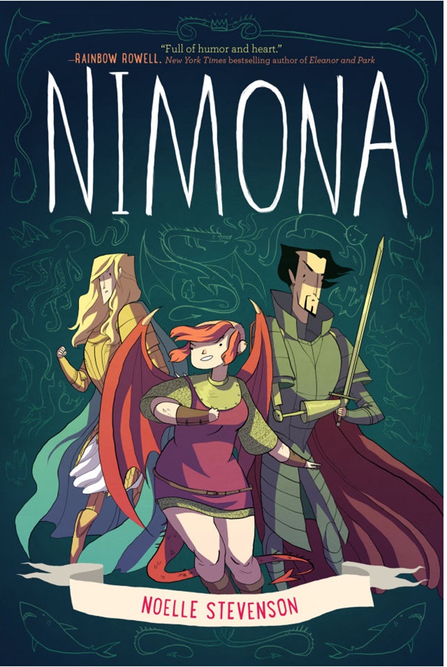
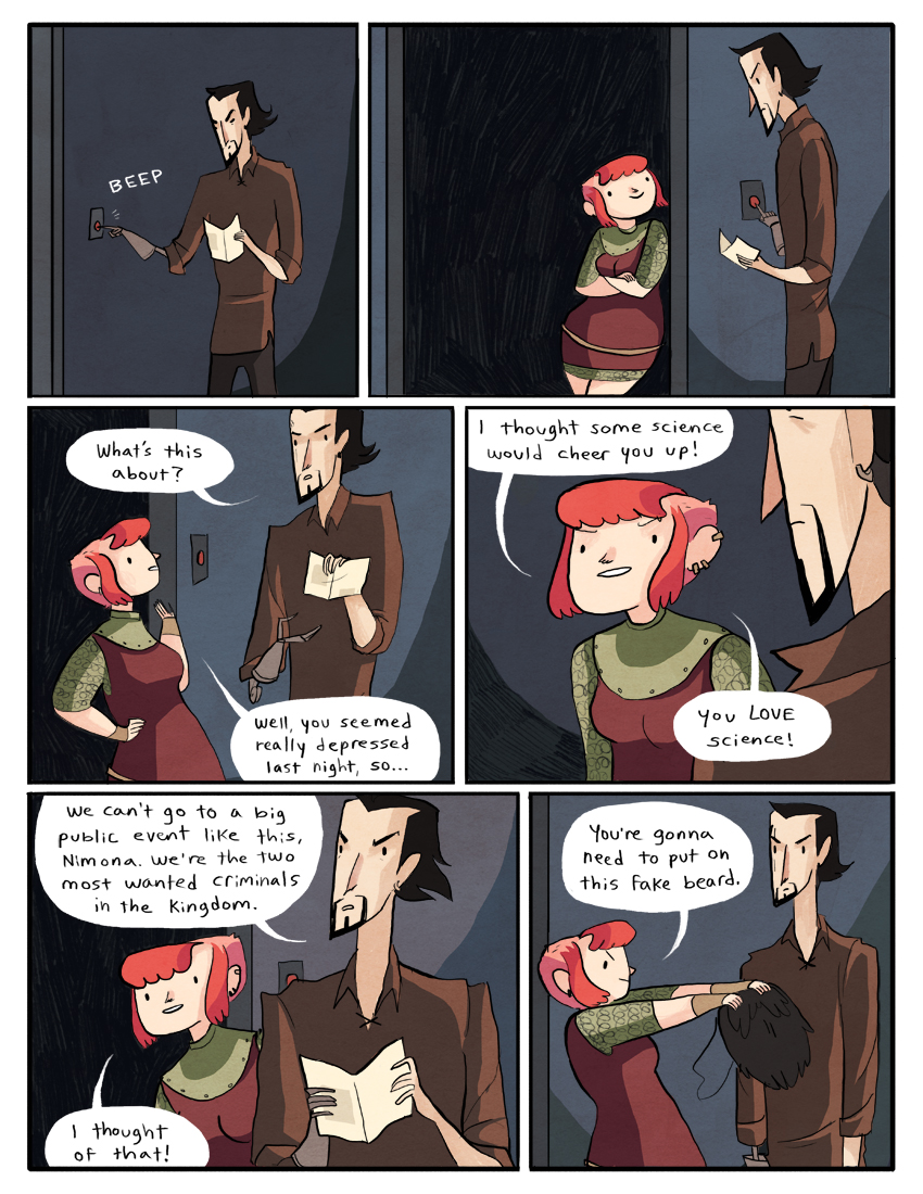
Noelle Stevenson’s debut graphic novel Nimona is about a young shape shifter who is a badass sidekick to super villain, Lord Blackheart. It is utterly delightful for its romp through the world of evil. Nimona for all her evilness comes across as a super-confident young girl who is not deterred by any challenge. Sometimes even Lord Blackheart is taken aback by her boldness.
According to Wikipedia, Nimona is a fantasy comic by the American comics writer and artist Noelle Stevenson. Stevenson started Nimona as a webcomic while a student at Maryland Institute College of Art. The comic was first published in June 2012 and doubled as Stevenson’s senior thesis. HarperCollins published the webcomic as a young adult graphic novel Noelle Stevenson in May 2015. In June 2015, 20th Century Fox Animation acquired the rights for an animated feature film adaptation. It has won a few awards and was shortlisted for the National Book Award 2015.
It is a book about a mighty girl. Meant to be owned. Savoured. Read over and over again.
Noelle Stevenson Nimona HarperTeen, an imprint of HarperCollinsPublishers, New York, 2015. Pb. pp. 270 $12.99