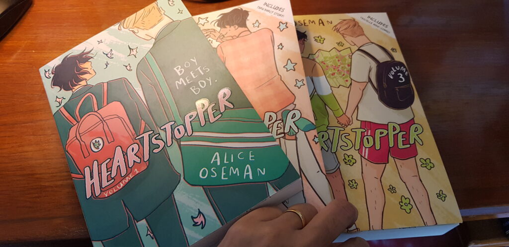
Writer, comic artist and illustrator Alice Oseman won her first publishing contract at the age of 17. Since then she has written three young adult novels and converted her popular web comic series, Heartstopper, into a four-book deal with Hachette Children’s Group. The first three volumes of the graphic novels have been published — Volume One, Volume Two, and Volume Three.
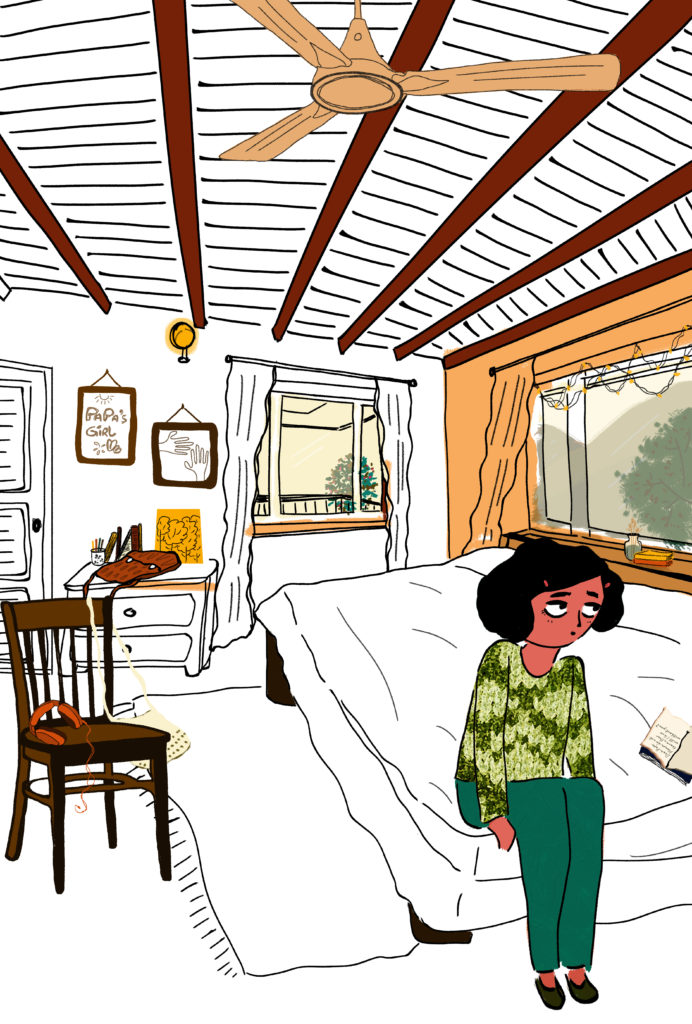
Heartstopper is a lovey-dovey story about two high school teenagers who discover that they are in love. Charlie and Nick are eighteen months apart in age. Charlie came out to his family and friends in Grade 9 and faced the horrific consequences of being bullied in school. Nick is the tough, popular, typical footballer-kind of schoolboy, who is in Grade 11. The three volumes are about Nick coming to terms with his love for Charlie. Nick is extremely hesitant and confused as he cannot undertand his attraction for the same sex particularly when he is also attracted to girls. Slowly Nick realises he is bisexual but his love for Charlie is for now firm.
The series move gently. At times it seems far too much time is spent in understanding and coming-to-terms with first love. But the awkwardness and anxiety riddled questions about whether the boys are making the right choices are very well presented. They are from a youngster’s perspective. It is difficult to describe but when adolescents are in love or think they are in love, it is a time-consuming preoccupation for them, usually at the cost of everything else — as Nick discovers when he fails to complete his maths homework,. His excuse? He had been up till late at night texting Charlie!
Heartstopper will fit very well in a YA LGBTQ+ list or section of a library except it is hard to imagine that many school librarians will permit these graphic novels to sit in the general section of their library. While YA LGBTQ+ lists are more and more well-defined with every passing year, their acceptance amongst the reading public will take time. The readers exist in the target audience of adolescents but the gatekeepers are still the adults. While novels of these lists are proliferating, particularly with Scholastic, graphic novels may be more challenging to accept for their explicit illustrations. Heartstopper is filled with innumerable scenes of kissing, hugging, cuddles and stolen moments between Nick and Charlie that may not go down too well with many adults who firmly believe that texts exploring sexuality are not necessarily to be introduced to imressionable minds. Having said that there are many, many reasons as to why these books must be shared, talked about and kept in classroom and institutional libraries. These are conversation starters. More importantly, while LGBTQ+ movements around the world continue gain in strength, younger generations continue to experience the confusion and anxiety that their sexual orientation may cause to them at first. It creates mental anguish that is not easy to share and discuss even with one’s closest family members as unfortunately acceptance of gay love continues to be taboo in many families. This is where books like Heartstopper prove to be useful. It is easy to read in solitude and come across questions that are constantly playing out in one’s mind. There are advantages of reading books as it helps in recognising and relating to scenarios outlines in the stories. LGBTQ+ activists may dismiss these books as being far too simplistic in their approach but the fact is that there are many youngsters who are worried and need to know. They may not be absolutely familiar with sophisticated arguments of the LGBTQ+ movement. It is important to start with the basics and slowly guide adolescents to a level of understanding and comfort that their anxiety about their sexual orientation is misplaced. As regards social acceptance, there are challenges but these too can be addressed slowly and steadily.
Heartstopper may not be to everyone’s liking but it is worth reading and discussing.
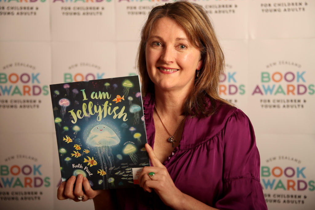
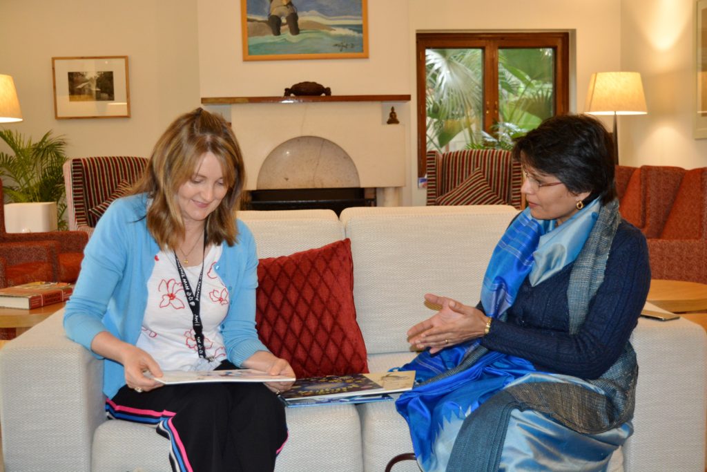
I met award-winning picture book author and illustrator Ruth Paul at the residence of the New Zealand High Commissioner on 4 Dec 2019 for a tête-à-tête. It was such a pleasure meeting Ruth Paul! I had read a clutch of her marvellous picture books, each with its own distinctive style. I had also heard about Ruth from the legendary children’s writer Gavin Bishop. Befittingly we met in the Sunshine Drawing Room as a distinctive characteristic of Ruth Paul’s picture books is her fondness for light and the manner in which she plays with it in her illustrations. It is fascinating to immerse oneself in the artwork.
Ruth Paul and Jaya Bhattacharji Rose in conversation. Picture taken by Arpita Basu.
Ruth Paul has written and illustrated over 20 picture book titles and is a recent recipient of a New Zealand Arts Foundation Laureate Award (August 2019).
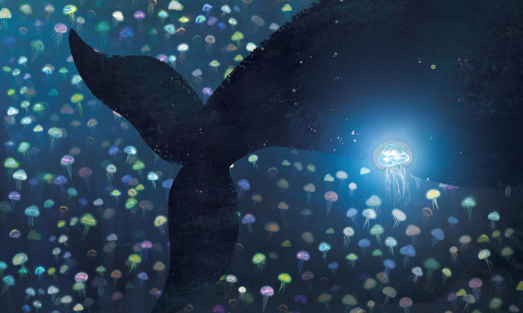
I Am Jellyfish recently won the 2018 award for Best
Picture Book at the New Zealand Book Awards for Children and Young Adults. Mini Whinny: Happy Birthday to Me! illustrated by Ruth and written by
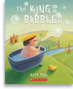
Stacy Gregg is shortlisted for the Best Picture Book Award, 2019. The King’s Bubbles won the Children’s
Choice picture book award in 2008, and five of her books have made the
Storylines Notable Book List over the years.
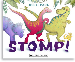
Stomp was a finalist in the NZ
Post Book Awards 2012, and Bad Dog Flash was
selected for the US Kid’s Indie Next List in 2014. Her books have sold in New
Zealand, Australia, USA, Canada, the UK, China and Korea, with translations in 5
languages. Cookie Boo! Is her first
book to be initially published in the USA, with a Harper Collins USA release in
summer 2020. Ruth’s poetry is included in
A Treasury of NZ Poems for Children, Penguin
Random House NZ 2014. Her original picture book illustrations have contributed
to touring exhibitions for Painted Stories (previously Te Tai Tamariki Trust)
and two are held in the Mazza Collection at the University of Findlay, Ohio.
Ruth lives in an off-grid,
straw-bale house on a farm just outside Wellington, New Zealand. As well as
writing and illustrating children’s picture books, Ruth has worked as a costume
illustrator for Peter Jackson movies. She has two teenaged sons and is actively
involved in her local community, having previously chaired her local Community
Board and School Board of Trustees. Over the years, Ruth achieved a Bachelor of
Arts majoring in English and History from Victoria University, a Diploma in
Visual Communication Design from Wellington Polytech (now Massey University),
and most of a law degree.
Ruth says every new book is a
challenge and presents the opportunity to get better at the craft she
wholeheartedly loves.
***
How do you prefer to introduce yourself
as — picture book author / author-illustrator / illustrator? Which came first
— illustrator or author? And if it is “illustrator” then when did
the transition to “author-illustrator” happen?
I call myself a picture book author and illustrator. A child once called me an “author and alligator”, but my teeth are not so big. I studied design and worked as a commercial illustrator first, illustrating books for a couple of other writers, then eventually wrote my own books. It is more common for author/illustrators to start as illustrators as this appears to be the more time-consuming craft to learn. Now that I do both, however, I’m not so sure.
2. When you envision a picture book — do you write first or do you create illustrations or do both the processes work in tandem?
It used to be that I started with words then added mages later, now it’s more a tandem process. Overall, I try to get a “concept” working first. I see (or wish for) a perfectly formed concept and story – both words and pictures – then I slowly destroy this perfect imagining as I put pen to paper and try to wrestle it into reality. The challenge is to preserve the magic of the story during this process.
3. What are the mediums you prefer to use for illustrations? Do you preserve your art work? Do you rely on digital tools to assist in your illustrations and text design?
I work and have worked in multiple mediums, traditional and digital. Having many techniques available is one of the advantages of previously attending art school. I change my style and technique depending on the needs of the book. Plus, illustrating a 32-page picture book is a big undertaking so I can get bored using the same technique twice in a row. Sometimes I use Photoshop and a Cintiq tablet to draw and I find that digital illustration almost replicates the real mediums and processes now so there’s less of a divide than people think. Whatever medium you use, you still have to be able to draw and compose, to have a sense of colour and communication. I try to change between computer and traditional forms just so I don’t get too reliant on one. I will say that generally publishers prefer me to supply my artwork digitally as opposed to hard-copy now, so that is a cost that needs to considered at the outset.
4. When you embark on a new book project, do you leave book production details to your editors or do you like to be involved in them as well?
I always plan images around words on the page, so I inevitably design the type layout as I go. However, as I use every last minute before book goes to production to work on the images, I leave the typography and final design to the publisher. I am usually always consulted on the final look of things, though often there is little you can change given time constraints. Publishers are very particular about the typefaces they use and you have to give their designers some room to work also.
5. Do your books get translated? If so what are the pros and cons of having picture books translated?
I love seeing my books in translation, but only having one language I usually have no idea what they read like! As some of my stories are in complex rhyme, I can’t imagine they work in any other language. My guess is that the substance not subtlety of the text is translated, for instance, in one of my books a sentence saying “Jump over the hump” in English, with a picture of dinosaurs jumping over tortoises, is (I am told) translated as “Jump over the turtles”. A little less fun, but it does the job.
6. How do you remain so enthusiastic and fresh about storytelling, appealing to a child’s imagination? Do you create picture books with your target audience in mind or is it yourself?
I am an adult writing for the child in myself. Fortunately, the audience for picture books this is both the adult-reader and the child so it shouldn’t be a problem. I myself am easily bored, so I guess that’s where I start when telling a story.
7. What are the essential elements of a picture book? Do you think children’s literature needs to be didactic? Is there a difference in creating picture books for the school market as opposed to those created for leisure reading?
Like most things, I can tell you
what a picture book shouldn’t be more easily that telling you what it should
be. A picture book shouldn’t be boring, ugly, preachy or mean. It should be
intriguing, satisfying and a joy to hold. Obviously books for the school market
have to be educationally correct, whereas a trade picture book need only appeal
to the buyer’s taste. And we all know it is easier to sell a child chips rather
than salad.
I don’t mind books with a message to convey as long as the message is held safely within the story and is not beating it to death with a club. I do like books that leave you with a good “feeling” of some kind, be it safety, quietness or a thought to chew over. I don’t like books that leave a child worried, fearful or over-stuffed.
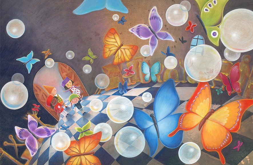
8. Your sense of perspective especially in the double page spread illustrations is incredible. These seem to have slowly transformed to become the centre point of your later picture books such as The King’s Bubble and I am a Jellyfish. Do you envision your picture books as one long spread or do you see them as a 32-page book at gestation itself?
I am a big fan of the double-page spread. It is a big painting or image with everything in it and I guess I like the logic of a single proposition that conveys all the necessary information. But sometimes vignettes are necessary to explain all the action of a story. The King’s Bubbles was my third book, I Am Jellyfish my sixteenth, but they share a personal sentiment and immersive style even though technically quite different. So I think your question relates to “flow”. I want the child to climb into the world of the book, and I work to make the flow of the page-turn seamless and logical so the spell of that world is not abruptly broken. So – a bit of both?
9. What are the kinds of questions children and adults ask of you? Have you had diverse reactions to the same story?
My favourite question ever was
asked at a school in Delhi just recently. It was “If you could live inside one
of your books, which one would it be?”. I had to really think about the answer
to that. I love that younger kids always want to tell me something about
themselves, rather than ask me questions. I will say “Do you have any questions
about writing a story or drawing pictures? A question is something where you
want to know something from me, and I answer”. Then all the hands will go up
and the first questions are inevitably “I know a story!” or “I’ve got a dog!”
etc. Cute.
Certain books are for certain audiences. I have picture books that are rollicking good yarns to recite or act out with kids, and some that are for one child only while cuddled up and quiet. There is a book for every situation so the trick is not doing a quiet introspective story with a group of 80 school kids, and vice versa.
10. How much research do your picture books require?
Enough to know you’re not wrong. Enough to know there’s a sound basis for your idea. Enough not to overthink and kill the idea. Enough to add flavour and nuance to the story. Reading everything and anything around your subject always helps to not inadvertently repeat what’s been done before and also to add seasoning.
11. What are the kinds of art forms that you appreciate? Which of these do you think work well in children’s literature or would that be immaterial as long as the illustrator is appealing to the reader’s aesthetic sensibility?
I like folk art because it is not elite, is often telling a story and frequently appeals to a child-like sensibility. I love everything in any art from that blows-my-mind – the extraordinary building, the tiny piece of lace, the kids talent show. I am omnivorous when it comes to art and craft and only know that the older I get the less frequently I am ‘moved’, but when I am, the most surprising things will reduce me to tears. I recently cried during a hip-hop performance, and also when looking at a young girls drawing of a monster. I am moved when I see the feeling – be it vulnerability, bravery, fear, love, joy or sorrow in art. Good art can do that.
12. Who are the artists, illustrators and writers that have influenced you?
Now there’s big question. The answer is in the multitudes and the top of the list rotates from year to year with my changing taste. To narrow it down to children’s authors and illustrators, from New Zealand I love the work of the pre-eminents Gavin Bishop and Lynley Dodd; from everywhere else there’s Emma Chichester Clarke, Roger Duvosin, the Provensons, Brian Wildsmith, Freya Blackwood, Etienne Delessert, Brendan Wenzel, Ayano Imai, Sophie Blackall … there is just so many! I can’t answer this properly!
13 December 2019
List of Ruth Paul’s books:
Trade Books:
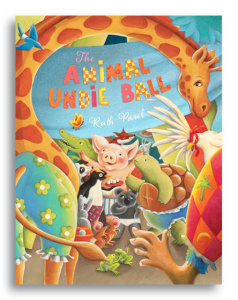
The Animal Undie Ball Scholastic 2004
The Little White Lie Scholastic 2005
The King’s Bubbles Scholastic 2007
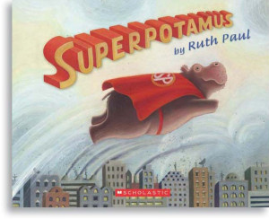
Superpotamus Scholastic 2008
Two Little Pirates Scholastic 2010
Stomp! Scholastic 2011
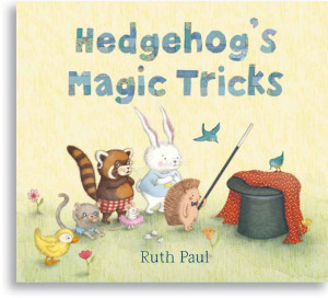
Hedgehog’s Magic Tricks Walker Books 2012
Red Panda’s Toffee
Apples
Walker Books 2013
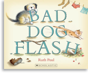
Bad Dog Flash Scholastic 2013
My Dinosaur Dad Scholastic 2014
Rabbit’s Hide and Seek Walker Books 2014
Go Home Flash Scholastic 2014
Bye-Bye Grumpy Fly Scholastic 2015
What’s the Time
Dinosaur?
Scholastic 2015
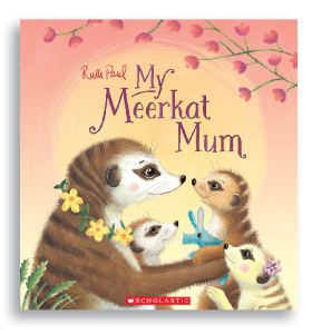
My Meerkat Mum Scholastic 2017
I Am Jellyfish Penguin Random House
2018
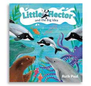
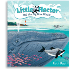
Little Hector and the
Big Blue Whale Penguin
Random House 2018
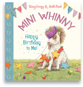
Mini Whinny, Happy
Birthday to Me!
by Stacy Gregg, illustrated by Ruth Paul, Scholastic NZ 2018
Upcoming Trade Books:
Little Hector and the
Big Idea Penguin
Random House 2019
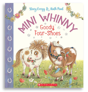
Mini Whinny: Goody Four
Shoes by
Stacy Gregg, ill. by Ruth Paul,Scholastic
2019
Cookie Boo! Harper Collins USA 2020
Little Hector Meets Maui Penguin Random House
2020.
Mini Whinny: Bad Day at the OK Corral by Stacy Gregg, ill. by Ruth Paul, Scholastic 2020.
Malamander by author and illustrator, Thomas Taylor is a fantastical book about two (approx.) 12yo — Violet Parma and Herbert Lemon. The unlikeliest team who set off to find the truth about the mysterious disappearance of Violet’s parents from the Grand Nautilus Hotel. An event that occurred 12 years ago when Violet was found abandoned in a cot in the hotel room. Herbert Lemon is the Lost-and-Founder at the hotel. He is in charge of collecting abandoned articles and returning them to their rightful owner except that at times decades, even a century, passes by and no one comes forth to claim the lost articles. Then Violet (literally) tumbles into Herbie’s life through an open window in his cramped space. She believes that Herbie is the only person in the world who can help her —- “Because I’m lost…And I’d like to be found.” Brilliant opening line for a fabulous plot for middle grade fiction. And off the two of them go on an adventure plotted marvelously well in Eerie on Sea that seems forever to be encased in thick sea mist or snowfall. It involves wheelchair bound owner of the hotel, Lady Kraken and her cameraluna which operates well on a full moon night to give her a bird’s-eye view of the town in 3D; the charmingly eccentric beachcomber Mrs Fossil, the local celebrity, an author, Sebastian Eels who freaks everyone with his creepy presence, a mysterious character who has a boat hook for a hand and a few more equally fascinating characters. Local life is enriched by local legends that some may believe and some may not. One particular story is about the mythical amphibious creature, Malamander, who lives in the sea but when it emerges on land can walk upright like man. It’s egg is known to possess magical powers of being able to grant any wish.
“Malamander” is the first of a trilogy by Thomas Taylor, who is perhaps better known for his book cover illustrations of the UK edition Harry Potter novels by a then relatively unknown author called J K Rowling. This particular novel of his has a wonderful book trailer and the good folks at Walker Books have been kind enough to create a standalone website recreating the map and landscape of Eerie on Sea . Unsurprisingly, the film rights to this book have already been sold to Sony whilst the author is still working on his second novel in the series.
I cannot praise this book enough for its crisp storytelling, wonderful use of visual imagery without it becoming too overpowering and the fabulous descriptions that are sufficiently sketched to tickle the imagination without being too stifling for the reader. It conjures up a magical space that is seemingly in present day but could for all practical purposes of storytelling be set in any time dimension. It is vague enough in its location details to be not too hyper-local.
Read Malamander and you shall not be disappointed. ( with @Walker Books)
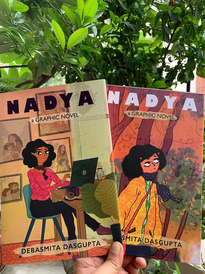
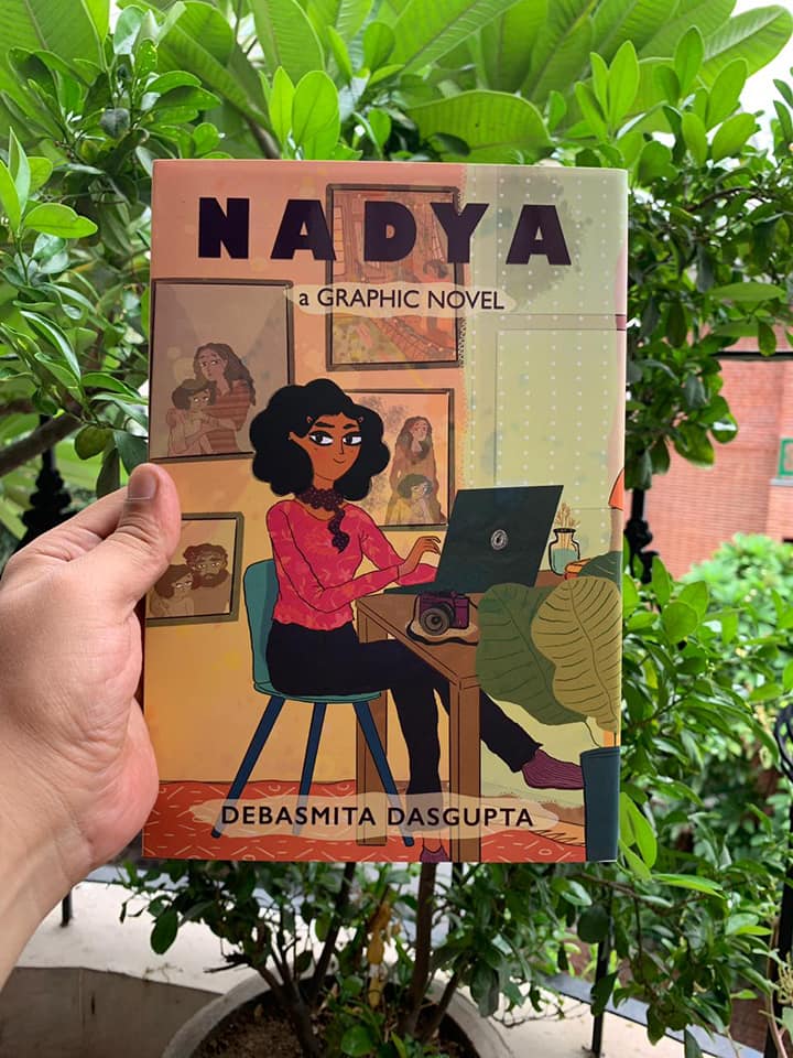
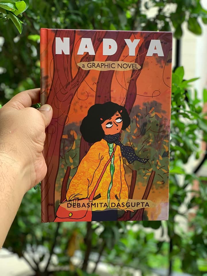
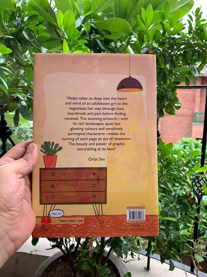
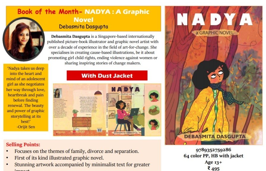
Nadya is a stunningly powerful graphic novel about thirteen-year-old Nadya who witnesses her parent’s marriage deteriorate. The story and the art work are devastating. The artist-cum-author Debasmita Dasgupta has created a very moving portrait of a family falling apart at the seams but also how the little girl, at the cusp of adulthood, is witness to a catastrophic set of circumstances. Her secure world crumbles and she feels helpless. Yet the staid portrait of the professional at her desk on the dust jacket belies the confused and anxious teenager portrayed on the hard cover — a fact that is revealed once the dust jacked is slipped off. It is an incredible play of images, a sleight of the hand creates a “flashback”, a movement, as well as a progress, that seemingly comes together in the calm and composed portrait of Nadya at her desk, tapping away at the computer, with her back to a wall on which are hung framed pictures. Many of these images are images of her past — pictures of her with her parents in happier times as well as when the family broke apart. A sobering reminder and yet a reason to move on as exemplified in the narrative itself too with the peace that Nadya discovers, a renewal, a faith within herself to soar. Scroll sums it up well “Teenagers may read this story of a nuclear family living in the hills for relatability, but for everyone there is the poetry of the form that this graphic novel poignantly evokes.” Nadya is an impressive debut by Debasmita Dasgupta as a graphic novelist. Nadya, is releasing on 30 September 2019 by Scholastic India.
Debasmita Dasgupta is a Singapore-based, internationally published Kirkus-Prize-nominated picture book illustrator and graphic novel artist. She enjoys drawing both fiction and non-fiction for children and young adults. Working closely with publishers across the world, she has illustrated over 10 picture books, comics and poems. Widely known as an art-for-change advocate, Debasmita tells stories of changemakers from around the world partnering with global non-profits. Her art is exhibited in Italy, Singapore, Thailand, Denmark and more than 40 international media outlets have featured it.
Here are excerpts of an interview conducted via email:
How did the story of Nadya and its publication come about? Was
it the story that came first or the illustrations? What is the backstory?
I am a visual
thinker. Words don’t come to me naturally. The story of Nadya was with me in
bits and pieces for a very long time. I needed some time and space to weave it
all together. It happened exactly a year ago when I went for an illustrators
residency near Burgos (in Spain). That’s when I completed the story and
illustrated a few key frames, which finally expanded to become this 64-page graphic
novel.
When I was in primary school, I had a very close friend (can’t disclose her name). I have faint memories of us spending time together and quite a vivid memory of her fading away from my life after her parents went through a divorce. I was too young to understand the significance of the word “divorce”. All I could understand, deeply, was that it changed the course of my friend’s life. She became more and more quiet and then one day never came back to school. There were rumours that perhaps she went to a different school or a different city. Years later, another very close friend of mine went through a divorce. She has a daughter and at that time she was eight. This time I realised the thing that bothered me the most in my childhood was that I couldn’t make an attempt to complement the loss in my friend’s life with my friendship. Simply because I didn’t know how to deal with it. Finally, I found an answer in my art and the story of Nadya began.
2. While the story is about Nadya witnessing her parents marriage fall apart, it is interesting how you also focus on the relationships of the individuals with each other. Is that intentional?
Absolutely! I don’t see Nadya as a story of separation. On the surface it is a story of a fractured family but underneath it is about our fractured emotions. In fact to me it is the story of finding your inner strength at the time of crisis. You just have to face your fear. Nothing and no one except you can do that for you.
3. Nadya seems to collapse the boundaries between traditional artwork for comic frames and literary devices. For instance, while every picture frame is complete in itself as it should be in a comic book, there is also a reliance on imagery and metaphors such as Nadya being lost in the forest and finding the fawn at the bottom of a pit is akin to her being lost in reality too. Surprisingly these ellisions create a magical dimension to the story. Was the plot planned or did it happen spontaneously? [ There is just something else in this Debasmita that I find hard to believe is a pure methodical creation. It seems to well up from you from elsewhere.]
Thank you Jaya!
You are right that it is not a pure methodical creation. In fact, what fascinates me is that you could feel that the borders are blurred. When I was creating the story of Nadya, I felt that there were many crossovers between borders. Like emotional borders (grief and renewal) and timeline borders (past and present, with a hint of future). And I think these crossovers resulted in the form of an amalgamation of narrative forms, textures and colour palettes. In fact, that’s one of the reasons why I felt the story is set in the mountains where you cannot define the lines between two mountains or the distinctions between the trees in the forest when there is a mist. They all overlap each other like human emotions. It’s never all black and white.
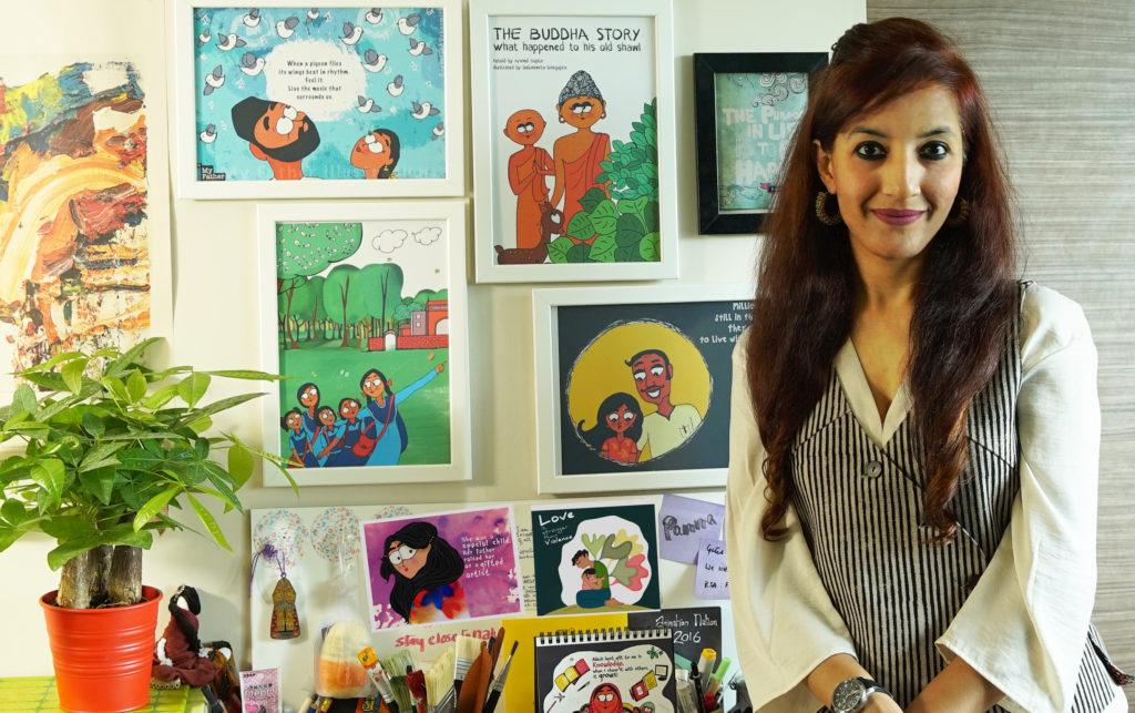
4. How important do you think is the role of a father in a daughter’s life?
Let me tell you the story behind “My Father illustrations” – It was on a Sunday afternoon when the idea came to me after I heard a TED talk by Shabana Basij from Afghanistan. It was a moving experience. I felt something had permanently changed inside me. Over the next few days, I watched that talk over and over. Her honesty, her simplicity and power of narration moved me. Shabana grew up in Afghanistan during the Taliban regime. Despite all odds, her father never lost the courage to fight for her education. He used to say, “People can take away everything from you except your knowledge”. Shabana’s story gave me a strong impulse to do something but I didn’t know ‘what’ and ‘how’. That’s when my red sketchbook and pencil caught my eye. Before I’d even realized it, I had taken my first step. I illustrated Shabana’s story and posted it on Facebook. It was an impulsive reaction. I found Shabana’s contact and shared the illustration with her. Shabana was so touched that she forwarded it to her students, and then I started getting emails from a lot of other Afghan men! The emails were a note of thanks as they felt someone was trying to showcase Afghan men in a positive light. I realized that if there are so many positive father–daughter stories in Afghanistan, just imagine the positive stories across the world! My journey had started. I started looking for moving father-daughter stories from across the globe. Some I found, some found me. With every discovery, my desire to create art for people kept growing.
5. With Nadya you challenge many gender stereotypes such as the daughter’s relationship with her parents. It is not the standard portrayal seen in “traditional” literature. Here Nadya seems happier with her father rather than mother. The breaking down of Nadya’s relationship with her mother has been illustrated beautifully with the picture frames “echoing” Nadya’s loneliness and sadness. Even the colours used are mostly brown tints. This is an uneasy balance to achieve between text and illustration to create an evocative scene. How many iterations did it take before you hit a satisfactory note in your artwork? And were all these iterations in terms of art work or did it involve a lot of research to understand the nuances of a crumbling relationship?
I often say
“Preparation is Power”. And I have always learnt from great creators in the
world that there are no shortcuts to create any good art. However, the process
of preparation varies from artist to artist. To me, this is not a process, it’s
a journey. It starts with a seed of an idea and then it stays with me for a
long, long time before I could finally express it my way. There is a lot of
seeing, listening and spending time with my thoughts. Breaking of the
stereotypes, whether they are gender stereotypes or stereotypical formats, were
not intentional but I guess embedded in my thinking. It’s not that someone from
outside is telling me to break those norms but it’s a voice, deep inside,
constantly questioning. Not to find the right answers but to ask the right
questions.
There were many versions of character sketches and colour palettes before the finals were decided for Nadya. Even though the initial characters and colours were similar to the finals, the textures and tones are distinctively different. Since the story runs in different timelines with varied emotional arcs, I wanted to integrate separate tonalities in the frames. In the end, a graphic novel is not just about telling a story with words. If my images can’t speak, if their colours don’t evoke any emotion then my storytelling is incomplete.
6. Did you find it challenging to convey divorce, loneliness, relationships etc through a graphic novel? Why not create a heavily illustrated picture book, albeit for older readers?
I am a bit of an unconventional thinker in this regard. I can’t follow the rules of length and structure when it comes to visual storytelling. That’s why many of my illustrated books are crossovers between picture books and graphic novels. To me, when I know the story I want to tell, it finds its form, naturally.
7. As an established artist, what is your opinion of the popular phrase “art for art’s sake”?
I am an advocate of “art for change”, more precisely a positive change. I strongly believe (which is also the genesis of ArtsPositive) that art (of any form) has the ability to create a climate in which change is possible to happen. Maybe not today. Maybe not tomorrow. But eventually it will.
8. Graphic novels have become popular worldwide. Mostly the trend seems to be tell personal stories or memoirs or a lot of fantasy. To create a novel for social activism is still unusual though it is happening more and more. What do you hope to achieve with Nadya?
I admire those books (graphic novels) that I can read several times, because it’s not about the length of the book, instead it is the depth that intrigues me to re-visit it more and more. Books that help start a conversation. A conversation with yourself or with someone else. I want Nadya to be that conversation starter.
9. Although it is early days as yet, what has been the reception to Nadya, especially from adolescent readers?
The book is releasing in India on 30th September and I can’t wait to see what young adults have to say. Before that we had a soft launch in Singapore during the 10th Asian Festival of Children’s Content, where Nadya received a very warm welcome. All festival copies were sold out but my biggest reward was when I met this young artist from Indonesia, who told me that he could see himself in little Nadya. His parents separated when he was very young. I also met a teacher, who said that he is going through a divorce and would appreciate if I could speak to his children with this book. His eyes moistened when he was speaking to me.
10. Who are the artists and graphic novelists you admire?
That’s a long list! But surely the work of Marjane Satrapi, Paco Roca, Riad Sattouf, and Shaun Tan inspire me a lot. The way they present complex subjects with simplicity, is genius!
11. What motivated you to establish your NGO, ArtsPositive? What are the kind of projects you undertake and the impact you wish to make?
About a decade ago,
when I started my journey as an artist / art-for-change advocate, there was not
much awareness about this concept. It was a very lonely journey for me, helping
people understand what I do and what I aspire to do. So when I had the
opportunity to start an initiative, I decided to develop ArtsPositive to
contribute to the art-for-change ecosystem by supporting artists who create
art-for-change stories.
At ArtsPositive, we
create in-house art-for-change campaigns such as #MoreThanSkinDeep* (the most recent campaign). We have also launched a quarterly ArtsPositive
digital magazine to showcase art-for-change projects and enablers from around the
world, collaborate with artists, and share artistic opportunities.
* More Than Skin Deep is an illustrated poetry campaign by poet, Claire Rosslyn Wilson and
artist, Debasmita Dasgupta, through which we are amplifying the voice of
fifteen fearless acid attack survivors (from 13 countries), who are much more
than their scars.
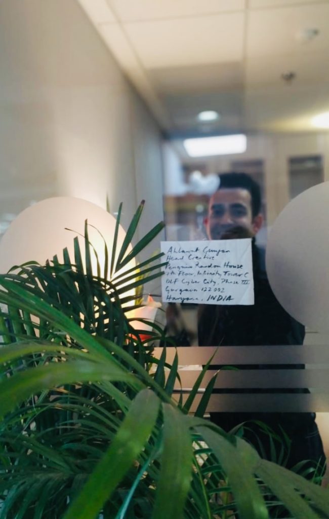
Ahlawat Gunjan has a Master’s Degree in Graphic Design from The Glasgow School of Art, UK. Previous to that he also spent a semester at Indiana-Purdue University, USA focusing on design thinking and leadership. He is a graduate of the National Institute of Design, Ahmedabad.
Trained at Lars Mullers Switzerland and Faber & Faber, UK, Ahlawat has a varied and interesting work experience. His overlapping interests in art and literature not only made him pursue a career in publishing but also informs his keen interest in visual authorial interventions and curatorship. This allowed Gunjan to shape the visual personality of the book at every step of its creation. Ahlawat also enjoys the many ways and levels at which a designer can take narrative construction forward through type and image.
He heads Design Department at Penguin Random House, India during the day and spends time painting in the evenings and over the weekends.
Following are edited excerpts of an interview conducted via email:
1.How did you get into the world of publishing?
It was a beautiful accident. My first job was with Hidesign in Pondicherry and I wanted to move closer to home. So, I was looking for opportunities in Delhi and DK happened. I was really enjoying the process of book making, image editing, and managing large book design projects. And I’m rarely satisfied. So, I wanted to try out my hands on a few book covers for Penguin (which used to be next door really in Panchsheel). I still remember being nervous asking my then manager and now Managing Director, DK India, Aparna Sharma, and she was absolutely open to the idea and very encouraging. I did one cover and it went off very well and this was the start of a new journey. I went on to do four more covers and discovered a sort of hidden joy in myself. I realized I really wanted to do this for living now. With huge support from DK and Penguin, the switch happened and I made Penguin my home thereafter. My masters at The Glasgow School of Arts was focused on publishing and as a part of it, I was extremely lucky to intern at Lars Mullers in Switzerland and later at Faber and Faber. This is how publishing happened to me and today, honestly I can’t imagine myself in any other domain of Graphic design.
2. What in your opinion are the basic elements of designing a book cover?
Since seeing comes before words, I would say strength and clarity are foremost and non-negotiable. By strength, I mean the ability of the cover to draw your attention towards it and clarity is the ability (through image and typography) to communicate the message clearly and effectively. The rest happens between these two.
3. Are there a set of basic ground rules that a book designer should be aware of before delving into a new project?
Be courageous and have
conviction.
Design and not decorate.
Allow things to evolve.
4. Do you think the basic principles of book designing have undergone a massive transformation since the medieval ages or is it that the modes of production have transformed the process?
Since medieval ages, absolutely. That time we used
to have decorative leather bound books with very less variations in terms of
size and colour palette. Margins and page settings were dictated how monks
would hand write the contents.
With Guttenburg’s invention, the game changed
entirely. With printing press, movable type blocks were introduced for mass
production. One can see a lot of illustrated elements like decorative
capital letters, but what was missing was para spacing, line spacing, leading
and all forced justified text which made the whole page pretty hard to read. It
was the time when publishers were the printers and often wanted to show their
abilities that were boring, hard to read and based on little showing off.
Designs that wouldn’t enhance the text. By 1700s, printing became somewhat
common to the masses.
By 1800s, there were authors and fine artists who
were involved and commissioned to design and set the books. They introduced the
notion of foot notes, side bars and paste numbers. This was the time when the
economics of making a book took some precedence, which until now was secondary.
1900s saw several design schools mushrooming all over Europe and USA, with
their respective design philosophies (It is very evident even today. For
instance, the way Swiss or Dutch people approach design and produce their books,
with very strong and distinct typography, imaging and very high production
quality).
So, on the whole with turn off every century, book designing saw their own changes.
5. How important is it to know typography as well as different art forms to design a book cover/ book? If yes, what are the fonts for which you have a soft corner?
Author assigns certain voice to their characters and as a book designer we have to assign visual voices to those characters. So, you can understand what a narrative can do without a voice or having a wrong voice. I believe the relationship between the cover design and the text is very special. This is because a font, colour or layout is not chosen solely in function of its legibility but principally for its associative capacity. The classic problem of semiotic theory is that a single image expresses more than a thousand words, and a single word conveys more than a thousand images. (p. 116 Devleminck, Steven, Gobert, Inge, Looveren Johan Van. The Balancing Act of Design )
It’s the backbone of a good cover and I strongly
believe in it. Infact, I went to do a summer intensive typography course at the
Royal College of Arts, London fairly recently.
I do have some favourites fonts, but I’m trying to work with as few as four/six.
6. Has digital technology made a qualitative difference to book covers?
Yes, your work can reach an unimaginable amounts of readers (say FB, Instagram and other social medias, people tagging etc.), which wasn’t the case 10 years back really. Additionally, unknown readers reach out to you on Facebook, Instagram, Amazon review with their compliments, which is very satisfying and encouraging.
7. What is it that you seek in a book cover design?
A space to negotiate, collaborate, and construct
ideas/thoughts and above all space to create! I try to be in author’s
shoes to see and feel the writings, to basically try to get the pulse of every
possible detail and to assure them that we are equally excited about your work
and at the end, making them hand over the controls to you. These are far more
fundamental than deciding which fonts to use, what leading is better for a book
cover, and so on and so forth.
A designer has a certain accountability and his/ her actions have enormous impact on millions of readers. Without knowing, they become a part of the design and literary history. Along with all the fun you may have, it’s also a huge responsibility on your shoulders, because you are going to give a visual personality to someone’s years of work. Additionally, this will go to print and will be out there for years to come (unlike the digital format, where you can change details quickly). A book cover designer needs to understand that the author’s work is linear but the images on the cover are associative. The challenge is to add layers through visual intervention with type and image. That means, apart from giving a structure, designer can control the reader to read the content in certain way. In other words, the designer holds a remote control to direct the reader a certain way.
8. What is your ideal brief for a book cover design? What are the elements it must absolutely contain and what are the elements that would be bonus if included but are not that necessary?
We have a standard cover brief format at Penguin
and we get written cover briefs from our editors. But, I always believe in
having a detailed chat with the editor, sometimes with the author and the sales
team also, before I start thinking and researching for the cover. I feel, this
way I get the best results!
It’s helpful to have all the elements pertaining to
the cover:
Format (HB or PB), size, spine width, budget, extracts to read along with visual suggestions and any additional inputs from the author and Sales.
9. What are the cost considerations of creating a book cover design?
We do work with certain budget per cover and depending upon the design ideas, we sometimes push and pull. For instance, if a designer got a cover design that is dependent on post-press effects (embossing, die-cuts, debossing, Pantone colours) or wants to use unusual stock or slightly extensive printing technique, then we do push the cost boundaries to make it happen. I think it’s about how much we collectively believe in that book and it’s linked to the way we are positioning that particular book.
10. How do you manage to maintain a freshness of style especially with the play of light in most of your compositions? What are the mediums you are partial to — watercolours, acrylic, ink etc.?
My mentor Lars Müller says, “We are authors
while designing. Design is our language. And I must reflect my beliefs”. I
start each book cover design project from scratch, from reading the manuscript
to researching about visuals, fonts I will be using or drawing, discussing the
ideas with editors and authors. My way is slow, simple and uncluttered, as
already there is enough visual pollution both in typography and imaging. Both
of these are art and science and one should strive for simplicity.
No, I’m not partial to any medium when it comes to designing a cover. It has to be absolutely objective and true to the contents inside.
11. What would you claim to be your signature style in creating an art work, may it be canvas or a book cover? For Turner it was the playing of paper and colours. What is yours?
I like making my own imagery for the covers. Originality is one feature that plays an enormous role in my designs. In this age and date where everything is a click away, one seems to think that they have browsed through similar visuals. To arrive at something that is startlingly unconventional and refreshing, the process of thinking needs to be unconventional too. Therefore, one must embrace ambiguity and not kill any idea that one has. I always say it is better to produce an ugly cover but it should be an original. “I prefer ugly covers to clone covers. At least ugly covers demand a certain amount of attention. And will continue to be ugly. In other words, today’s ugly is tomorrow’s beautiful,” says Peter Mendelsund and I can’t agree more to this.
12. Who are the artists and book designers who have influenced you?
My absolute favourites are Irma Boom, Adrian Shaugnehhesy (just spent a
week with him in London) and Peter Mendelsund (my ex-colleague from Knopf,
USA).
Artists: David Hockney, Ivon Hitchens and Amrita Sher Gil. I can’t do without them!!
13. Can you share examples of book covers that you consider iconic?
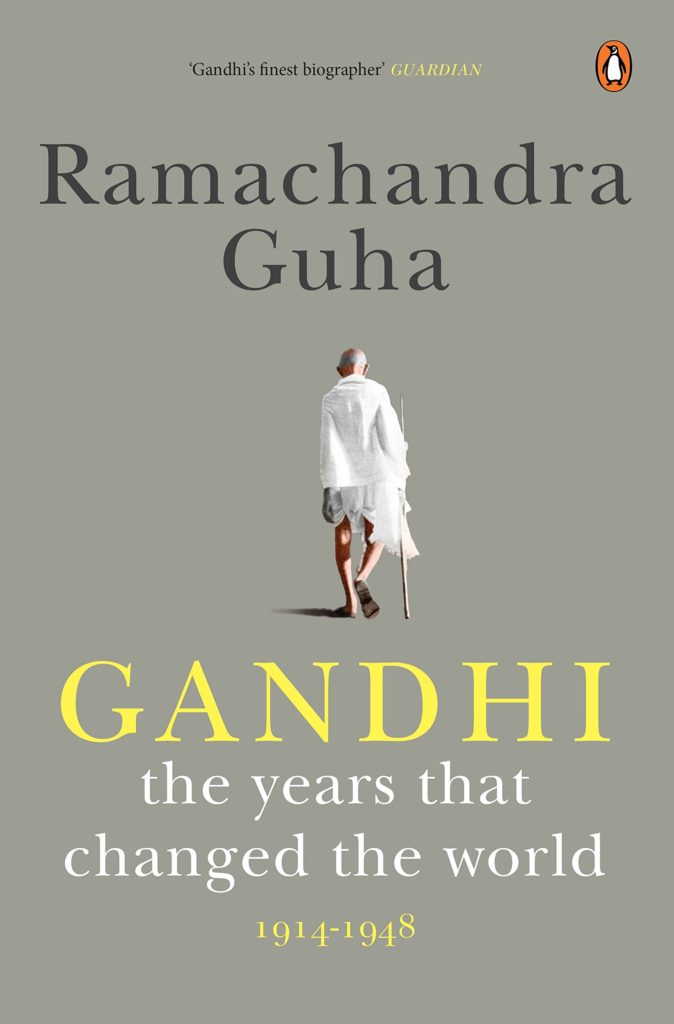
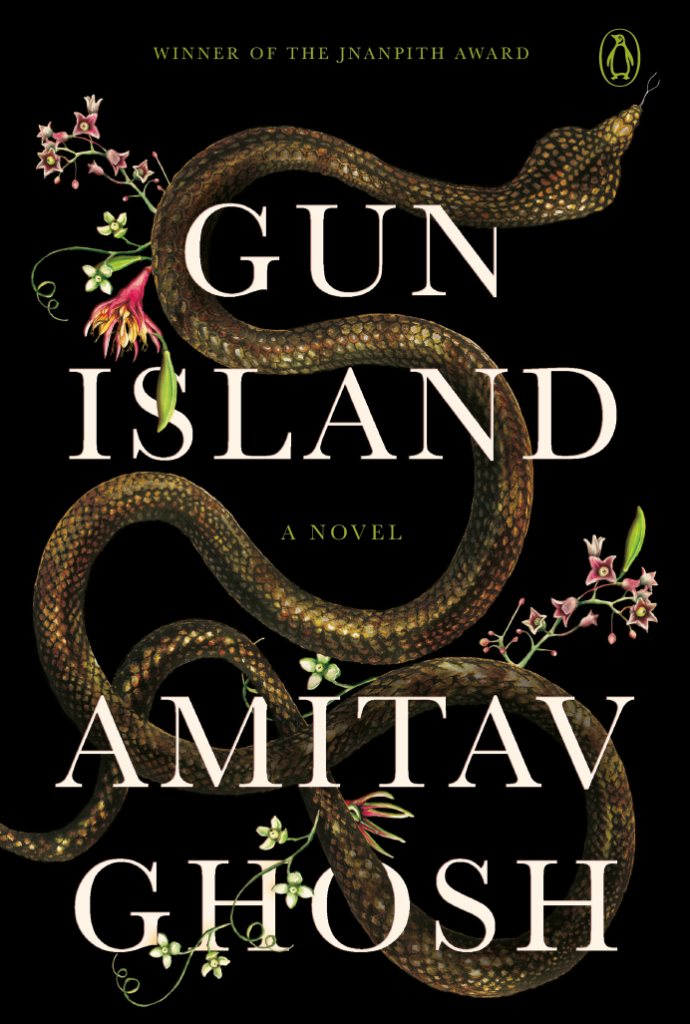
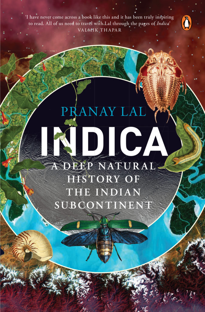
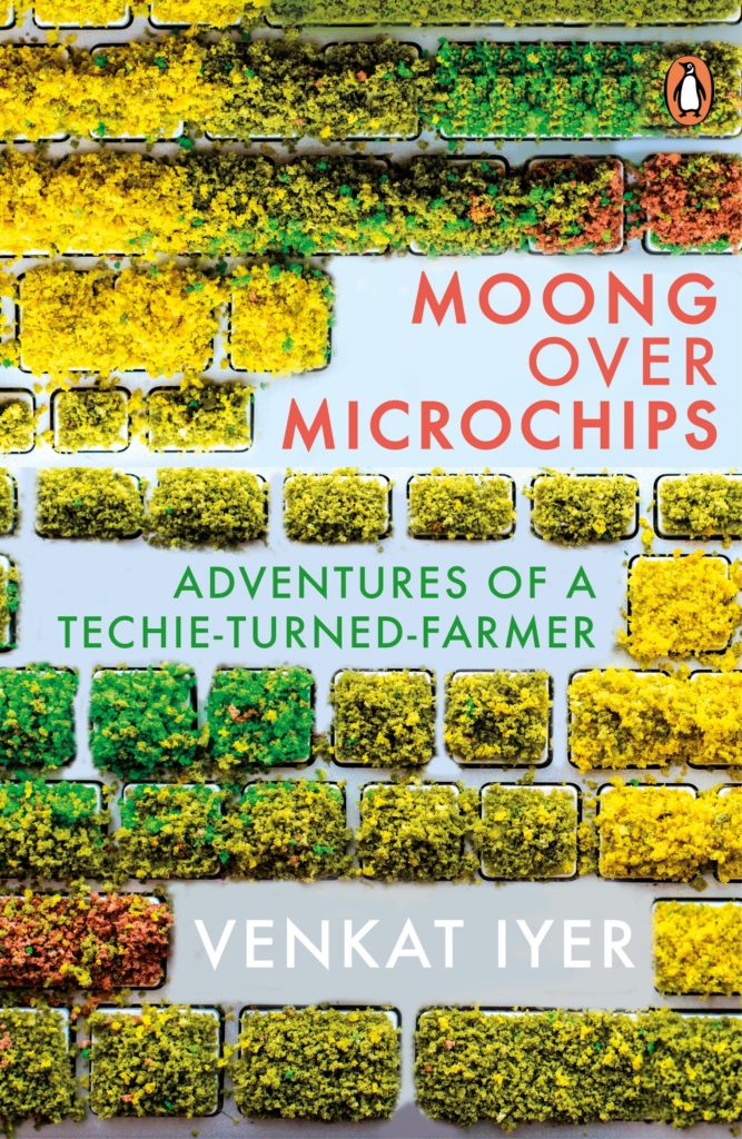
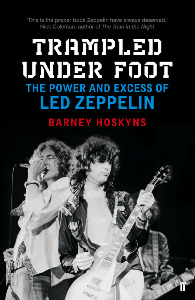
Gun Island by Amitav Ghosh, Gandhi by Ramchandra Guha, Premchand series, Indica by Pranay Lal, Moong Over Microchip by Venkat Iyer, God in the Quran by Jack Miles (Knopf US), Trampled Under Foot by Barney Hoskins (Faber and Faber) and The Room on the Roof by Ruskin Bond (anniversary edition).
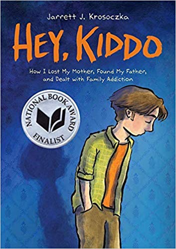
Writer and illustrator of children’s books Jarrett J. Krosoczka‘s graphic memoir Hey, Kiddois as the sub-title describes “How I lost my mother, found my father, and dealt with family addiction” . As he said in a TED Talk recorded in Oct 2012 that he uses his “imagination for his day time job”. He tells stories with words and pictures. Sometimes he lets the words tell the story and sometimes he lets the illustrations to do the work. He has always loved to draw. His mother was a talented artist too. Unfortunately he did not know her very well as she was a heroin addict and lived most of her life either in jail or in care. His father was faceless and unknown to him till they met when Jarrett was 17 and discovered he had half-siblings. Jarrett K. Krosoczka was formally adopted by his maternal grandparents when he was three years old.
Check out this animated preview that @Scholastic made for HEY, KIDDO. I am so psyched that this graphic memoir of mine is out in the world. I really hope that this book can help young people move passed their current realities. pic.twitter.com/wyo9lRT48b
When he was in the third grade, a real author came to the school for an interaction during the school assembly. It was Jack Gantos of the Rotten Ralph series. Jarrett was over the moon with joy. Then the artist came to the classroom and walked around to see what the students were drawing. Looking over young Jarrett’s shoulder, Jack Gantos said “Nice cat”. It was a significant moment for the child as an established author appreciated his art work.
Hey, Kiddo is a mix of traditional graphic storyboards along with paste-ups of Jarrett’s memorabilia. It is painted mostly in tones of grey and orangeish-red with little else colour. The only splash of brightness is in the green and yellow checked shirt of the boy on the cover. This little detail stands out for the glossy finish to the character. Otherwise the book has fragments of the loving letters his mother wrote her son from prison and were preserved by Jarrett’s grandparents. There are pictures of Jarrett with his mother holding her newborn son. There are clippings of his grandparent’s notes to him. There are snippets of the first book he ever wrote for children while in third grade called The Own Who Thought He Was The Best Flyer.
This graphic memoir explores a space of writing for young adults that is tricky as it shares family secrets like a mother who is a drug addict and an absentee father. It is about a family that would probably be termed as “dysfunctional” for not conforming to the socially acceptable norms of a “normal family”. As Jarrett admits in the book he had two incredible parents except that they were one generation removed. On the one hand the author is sharing very personal moments in his upbringing and on the other he has to ensure through his art that the takeaway young readers get from Hey, Kiddo is that they are not alone if they belong to dysfunctional families. Also it is hopefully empowering such readers that it is important to find a way to live, perhaps find a hobby, a passion that you love and stick to it determinedly. In Jarrett’s case it was his love for drawing. This is a confidence building measure that is equally important as holding up a mirror to one’s own experiences as it helps the reader feel he/she is fully in charge of at least one aspect of their life. Truth is always stranger than fiction.
Hey, Kiddo is a graphic memoir that has understandably been shortlisted for many awards and has been a part of innumerable “Best of 2018 Reads” lists for while it focusses on a child/adult who is flawed, it only makes him human — someone the readers can relate to. The book presents the tough childhood Jarrett had or even the difficulties his grandparents had and yet in their eighties they bravely took on a little boy to care for, although they had already brought up five of their own. Yet what shines through Hey, Kiddo is that despite the straitened circumstances, Jarrett was showered with love. He was not necessarily in want. His grandparents recognising his love for art were as heartbroken as their grandson when the public funding for the art classes dried up. So they put their pennies together, a tough decision for self-made man like his grandfather, and enrolled Jarrett into art classes at Worcester Art Museum— and Jarrett blossomed. For his fourteenth birthday they bought him a drafting board. That night Jarrett had a Chinese dinner with his grandparents. On the top hand right corner of the drafting board is pasted the message he received in the fortune cookie that he ate that night — “You will be successful in your work”. Decades later Jarrett continues to use the same drafting board!
Hey, Kiddo is an extraordinary memoir meant for readers of all ages. It is a bittersweet reading experience with a happy ending — full of hope and joy!
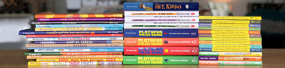
From Jarrett J.Krosoczka’s website header. The pile of books he has published.
Every Monday I post some of the books I have received in the previous week. Embedded in the book covers and post will also be links to buy the books on Amazon India. This post will be in addition to my regular blog posts and newsletter.
In today’s Book Post 11 I have included some titles that I received in the past few weeks and are worth mentioning and not necessarily confined to parcels received last week.
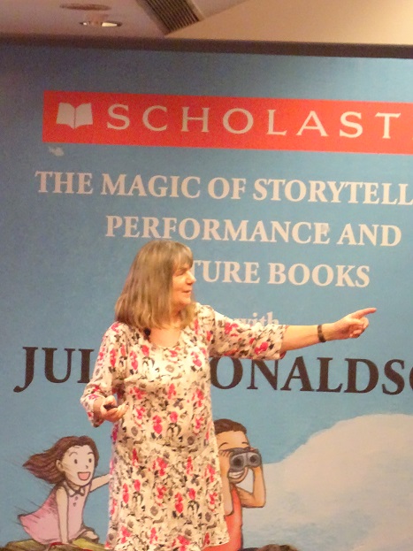
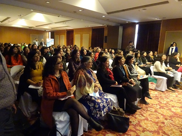
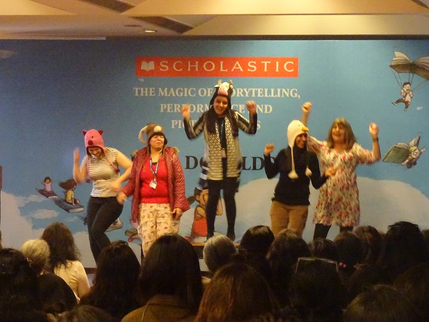
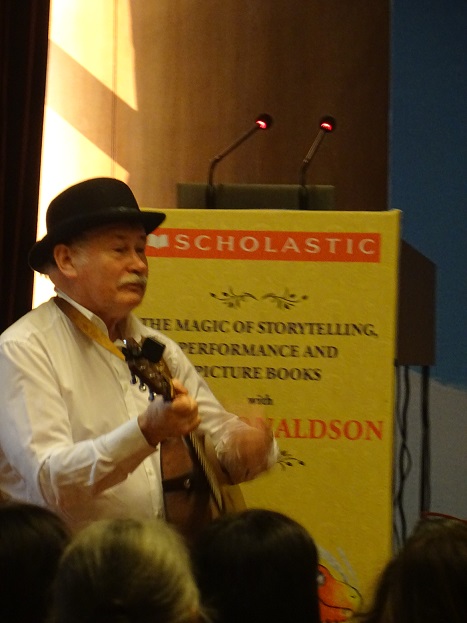
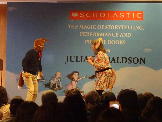
Scholastic India organised a FABULOUS interaction led by Julia Donaldson’s with educators, teachers and librarians at the India Habitat Centre, New Delhi. It was a technically perfect masterclass on how storytelling and picturebooks can be employed imaginatively in classrooms, with minimal or NO props, involving all the children, with a little bit of rhythm, song and dance, opening a world of possibilities!
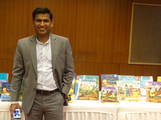
Neeraj Jain, MD, Scholastic India standing in front of a display of Julia Donaldson’s books
Julia Donaldson spoke of her journey from a musician/songwriter making an unexpected foracy in to the world of books and how very fortuitous it turned out. She spoke of her collaboration with Axel Scheffler and other illustrators. She performed some of her better known stories such as Gruffalo transforming the room of schoolteachers into little children as they sang along with her! She was accompanied on the guitar by her husband Malcolm and a supporting cast that included her publishers from UK and India.
( My interview with Shandana Minhas was published on the literary website, Bookwitty. )
Award-winning writer Shandana Minhas and her husband, journalist and playwright Imran Yusuf recently founded Mongrel Books, a small press based in Karachi. Their first title, The Mongrel Book of Voices, Volume 1, Breakups was published in January 2017. It consists of different forms around the theme of breakups, very broadly interpreted, with work by 21 writers from 9 countries. It’s available in bookstores across Pakistan, and there is a Kindle edition too. Three more titles are to be published later this year.
Shandana Minhas’s first novel, Tunnel Vision, was nominated for the Commonwealth Writers’ Prize and the second, Survival Tips for Lunatics, won the Karachi Literature Festival Fiction Prize. Daddy’s Boy is her third novel. She has also written for stage, screen, Op-Ed pages, and is an honorary fellow of the International Writing Program at the University of Iowa. Her short fiction has appeared in The Indian Quarterly and Griffith Review. Imran Yusuf’s play Stumped won the first NAPA playwriting award in Pakistan and was staged in Delhi and Kolkata as well. He has also had readings in theatres in London.
Following is an interview with Shandana Minhas:
Why did you decide to found Mongrel Books? How did you choose the name?
We thought shelves in Pakistan had room for, and need of, books that might not otherwise make it to the market. And books that are affordable too. For instance, I am currently reading Michel Houellebecq’s novel Submission, which Imran bought from the local chain bookstore for Rs 2095. Which means that was the only book we could buy that month. Even second hand books in ‘old book stores’ now cost between 250-650 rupees. That’s the price range we would like to stay within.
I have always called myself a mongrel, in terms of being a little bit of this and a little bit of that. My father is Muslim, my mother is Christian and I’m not even going to start on the ethnic mix. We also had a lot of mongrels around the house when we were growing up, in Karachi, we’d spend all day on the streets and bring them home with us. When we were deciding on a name it was the first choice for us. There were others though. What made up my mind to stick with Mongrel was somebody I was brainstorming with telling me I shouldn’t call it Mongrel because a lot of Pakistanis didn’t like dogs and I would alienate potential customers. I heard a lot of that when I was a kid too, of course, when there were so many dogs around. ‘The angels won’t come to your house’ or ‘You can’t pray with them around’. I still say ‘Excellent!’ Seriously, the term reminds us of a kinder time, of a less homogenous or monolithic culture.
What is its focus? What are your first books about?
Mongrel Books’ focus in fiction is good story telling, and in non-fiction work that challenges or enriches contemporary ways of looking and seeing.
Will you be publishing only in English? Or in translation as well?
We will publish original work in English as well as translations into English. Pakistan itself has a vast reservoir of stories in Sindhi, Punjabi, Hindko, Seraiki and other languages, and we hope to build relationships with translators to bring some of those to people who might not otherwise know them.
What are the new projects you are working on?
We are set to publish a comedy of errors set in space, a first novel from talented Pakistani sci-fi writer Sidra F. Sheikh. And a non-fiction title from journalist Kamal Siddiqi, The Other Pakistanis, which bears anecdotal witness to the lives of non-Muslims here. Then there is another first novel about corporate life in Karachi from a highly original, unsettling writer who prefers to remain mysterious till the pages – and the bodies –cool. For next year, I’m collaborating with gifted illustrator Aziza Ahmad on a collection of graphic short stories, In Laws from Space and other tales of Domestic Woe, there is a novel and a short story collection from the reading pile I’ve got my beady eyes on, and fiction that children here can actually relate to as well. And of course we plan to do the second volume of The Mongrel Book of Voices.
Does your having previously published fiction in India have anything to do with launching a publishing house in Pakistan?
Peripherally, yes. Indian publishing is excellent; skilled, curious, open and vast. That vastness…there is a fine line between being embraced and being swallowed. Apart from a respite from the strangeness of being intellectually intimate with somebody you will never meet – your editor, your publisher, your agent, there is a practicality to local publishing for local writers as well. Distance, visa regimes, arbitration options and banking laws are not friends to Pakistani writers being published across the border. Even something as simple as receiving your royalties can become a Kafkaesque nightmare. For example, I still haven’t received a payment I was due in 2014.
What is the Pakistani readership like? Is there sufficient book hunger for local books in English?
All I can offer you is what has been offered to me, in spoken words. There is no centralized data collection. The circulation of Urdu digests featuring a steady diet of misogynistic moralizing to upwardly mobile women is in the hundreds of thousands. The number of people who go to the Karachi International Book fair – where sales actually happen – has climbed every year and might now be half a million, and though a lot of stalls there sell what might politely be dubbed literature of a religious persuasion, children’s books do well too, as do cookbooks – ring binding and all – and cheap editions of novels considered to be classics. Cookbooks, pulp piety, platonic romances, children’s books, nostalgia…it seems, then, that Pakistanis are hungry readers but they just might not have the most balanced diet.
…it seems, then, that Pakistanis are hungry readers but they just might not have the most balanced diet.
But figures are much lower for English titles. In chain bookstores, state-of-the-nation non-fiction sells the most. One bookseller tells me English language fiction only has to sell five hundred copies to be considered a bestseller. An internationally visible title from conglomerate publishing will have no trouble getting pre-orders. Other figures I have been given for what constitutes a bestseller in the English language in Pakistan are eight hundred and fifty and three thousand. Pricing does little to diminish the perception that English is just the language for the narcissistic preoccupations of a parasitic elite rather than, say, the language of a minority whose holy book might be the King James Bible. The more upmarket demographic happily invests thousands in the latest coffee table exceptionalism – Our ruins! Our textiles! Our jewellery! Our truck art! Our haemorrhoids!
So far, most books were routed through India but will having a local publishing program make a difference to the price points?
Absolutely. And that might have all kinds of interesting knock on effects. Like most other places in the world, here too there is an increasing gap between the haves and the have nots. If we persist in the perpetuation of a world where our children can’t eat, wear or drive the same things, or go to the same schools, maybe they can at least read the same books?
If we persist in the perpetuation of a world where our children can’t eat, wear or drive the same things, or go to the same schools, maybe they can at least read the same books?
What are your plans for the future?
The plan for the immediate future is financial survival, the acquisition of knowledge about the nuts and bolts of publishing, and Jedi level time management. It would be premature for us to project further than that.
Today in global publishing there is stress on ensuring free speech and it is not muzzled in any way. What are the pros and cons of publishing in Pakistan?
I note with sadness that the second question would not be prefaced by the first if Mongrel Books was, say, an Estonian press. But there are real dangers, and there is real loss. This makes the need for stories greater. Human beings, as far better writers than me have noted recently, think in stories, learn how to live and how to love from stories, which is why the control of storytelling seems to be a matter of such concern to fundamentalists. So it is a bittersweet truth that, as a pro, we know that what we do here matters.
The cons of publishing in Pakistan are the cons of running a small business in any developing economy. Our most pressing concerns are childcare for the working mother, sourcing quality paper, shoddy printing jobs, the ethics of unregulated labor practices in the binding industry, or that big academic publishers snap up and hoard what paper does come in its warehouses, uninterrupted electricity supply, and the bank manager having no internet access when we need to make international payments. So to temper any impulse to simply label us as yet another example of ‘defying the Taliban’ – something we see being used to market everything from T-shirts to bad filmmaking – please note that the only thing we are currently defying is common sense.
Will you be publishing in traditional print format or embracing ebooks and digital features such as audio, augmented reality etc.?
We will be publishing in traditional print format as well as e-books. As for augmenting reality, I will simply say that I still do not own or know how to use a smartphone. (But my partner does.)
Pakistani authors writing in English are very prominent internationally. Why do you think no other publishing house apart from OUP [Oxford University Press] has set roots locally to encourage literary talent?
OUP in Pakistan is primarily an academic publisher looking to engineer its own access to the cash cow of state curriculums, so its risk aversion makes business sense. The only reason we are actually even mentioning it in a conversation about literary talent is because in recent years it has muddied the waters by pitching its self-marketing fairs in Karachi and Islamabad as ‘literature festivals’, effectively capitalizing on lucrative sponsorship from imperialist powers struggling to maintain influence amongst suddenly speaking subalterns. Other older publishers seem comfortable with the grooves they are in, textbooks and backlists. And there are issues like piracy, lack of transparency in accounting and royalties keeping writers away too. An increasing amount are choosing to self-publish.
What is the history of independent publishing in Pakistan? Is there space for it now?
I can’t answer that. I don’t think anyone can! There is no way to tell what is going on or what has been going on in terms of publishing, beyond the surface of it, because as I mentioned earlier there has been no centralized data collection. And booksellers here still play things very close to the chest.
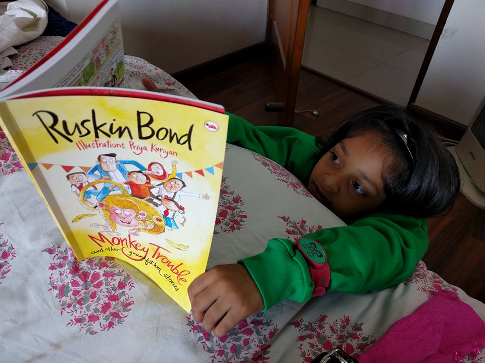
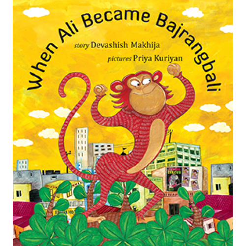
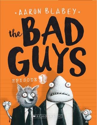
Every night Sarah and I have a bedtime ritual. She picks out a book and we read it together. Some of the titles we read these past few days are Ruskin Bond’s Monkey Trouble and Other Grandfather Stories, Aaron Blabey’s The Bad Guys and Devashish Makhija’s When Ali Became Bajrangbali.
Ruskin Bond’s new offering — Monkey Trouble and Other Grandfather Stories is a delightful comic-like chapter book consisting of three tales wonderfully illustrated by Priya Kuriyan. The speech bubbles make it easy for a new reader. Well laid out text and pictures. Clean. Not fussy. Speech bubbles consist of simple sentences. The printing is neat too. One of the pitfalls of these complicated books is the mismatch in colours or text not sitting well within the prescribed boundaries. Every story panel is neatly placed. Each page is filled with light…the water colours are not dreary to engage with. All these factors make it a pleasure to read.
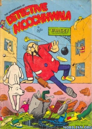
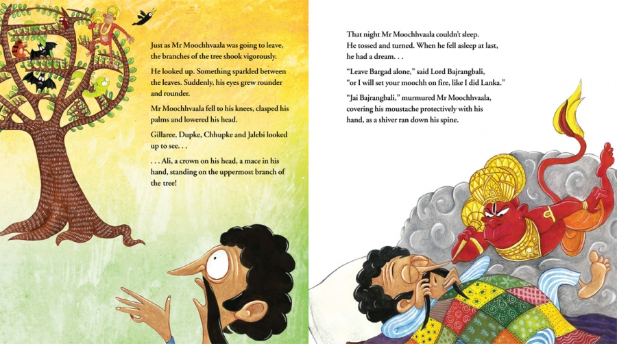
Another one illustrated by Priya Kuriyan is Devashish Makhija’s absolutely stupendous When Ali Became Bajrangbali. The story line is delightfully simple and straightforward but deceptively so. There are layers and layers to it. The child enjoys it for the story, rhythm and the roller coaster of emotions it causes. The illustrations incorporating a montage of advertisements and street art give it a richness too. For the adult, from the tongue-in-cheek title onwards it is fun, fun, fun to read while building upon memories too. I love particularly the literary reincarnation of Mr Moochhvaala. He first appeared as “Detective Moochwala” in his own comic strip created by Ajit Ninan in the now-defunct children’s magazine Target. And here is a lovely YouTube link to Devashish Makhija reading the story out at Bookaroo Literature Festival, Pune: https://www.youtube.com/watch?v=pthzhJxBSiA&ab_channel=TulikaBooks
The last one is laugh aloud rib tickling The Bad Guys by Aaron Blabey. It is a chapter book that has the Bad Wolf of countless fairy tales and folklore as the main character. He is trying to turn over a good leaf and become acceptable. He puts together a motley crew of cronies in the Good Guys Club consisting of Mr Shark, Mr Piranha and Mr Snake. They go on quests such as rescuing a stranded cat in a tree —who is petrified when he notices his wouldbe rescuers. The Good Guys Club members hope that such quests will improve their “tarnished” image as vicious and untrustworthy creatures. A very tough call when they look more like the mafia! Here is the book trailer: https://www.youtube.com/watch?v=uqbUANlqXXE
Buy these books and make the children happy! Absolutely delightful!
In India these books are available by the following publishers:
Ruskin Bond’s Monkey Trouble and Other Grandfather Stories by Red Turtle, Rupa Publishers
Devashish Makhija’s When Ali Became Bajrangbali by Tulika Books