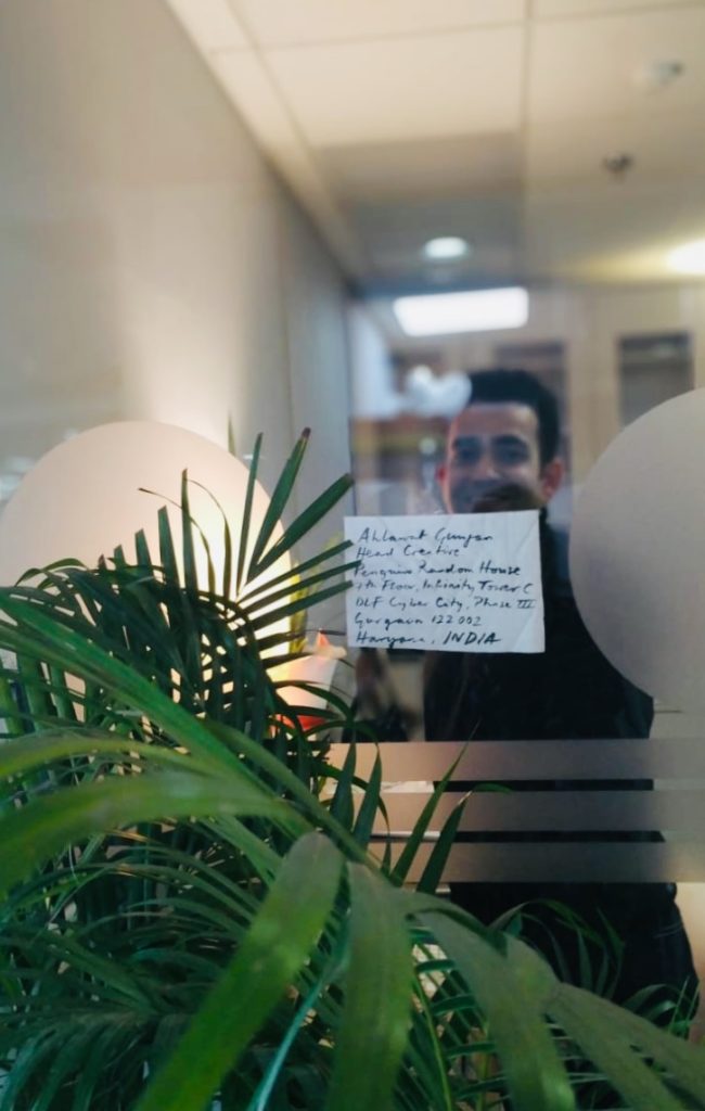
Interview with Ahlawat Gunjan
Ahlawat Gunjan has a Master’s Degree in Graphic Design from The Glasgow School of Art, UK. Previous to that he also spent a semester at Indiana-Purdue University, USA focusing on design thinking and leadership. He is a graduate of the National Institute of Design, Ahmedabad.
Trained at Lars Mullers Switzerland and Faber & Faber, UK, Ahlawat has a varied and interesting work experience. His overlapping interests in art and literature not only made him pursue a career in publishing but also informs his keen interest in visual authorial interventions and curatorship. This allowed Gunjan to shape the visual personality of the book at every step of its creation. Ahlawat also enjoys the many ways and levels at which a designer can take narrative construction forward through type and image.
He heads Design Department at Penguin Random House, India during the day and spends time painting in the evenings and over the weekends.
Following are edited excerpts of an interview conducted via email:
1.How did you get into the world of publishing?
It was a beautiful accident. My first job was with Hidesign in Pondicherry and I wanted to move closer to home. So, I was looking for opportunities in Delhi and DK happened. I was really enjoying the process of book making, image editing, and managing large book design projects. And I’m rarely satisfied. So, I wanted to try out my hands on a few book covers for Penguin (which used to be next door really in Panchsheel). I still remember being nervous asking my then manager and now Managing Director, DK India, Aparna Sharma, and she was absolutely open to the idea and very encouraging. I did one cover and it went off very well and this was the start of a new journey. I went on to do four more covers and discovered a sort of hidden joy in myself. I realized I really wanted to do this for living now. With huge support from DK and Penguin, the switch happened and I made Penguin my home thereafter. My masters at The Glasgow School of Arts was focused on publishing and as a part of it, I was extremely lucky to intern at Lars Mullers in Switzerland and later at Faber and Faber. This is how publishing happened to me and today, honestly I can’t imagine myself in any other domain of Graphic design.
2. What in your opinion are the basic elements of designing a book cover?
Since seeing comes before words, I would say strength and clarity are foremost and non-negotiable. By strength, I mean the ability of the cover to draw your attention towards it and clarity is the ability (through image and typography) to communicate the message clearly and effectively. The rest happens between these two.
3. Are there a set of basic ground rules that a book designer should be aware of before delving into a new project?
Be courageous and have conviction.
Design and not decorate.
Allow things to evolve.
4. Do you think the basic principles of book designing have undergone a massive transformation since the medieval ages or is it that the modes of production have transformed the process?
Since medieval ages, absolutely. That time we used to have decorative leather bound books with very less variations in terms of size and colour palette. Margins and page settings were dictated how monks would hand write the contents.
With Guttenburg’s invention, the game changed entirely. With printing press, movable type blocks were introduced for mass production. One can see a lot of illustrated elements like decorative capital letters, but what was missing was para spacing, line spacing, leading and all forced justified text which made the whole page pretty hard to read. It was the time when publishers were the printers and often wanted to show their abilities that were boring, hard to read and based on little showing off. Designs that wouldn’t enhance the text. By 1700s, printing became somewhat common to the masses.
By 1800s, there were authors and fine artists who were involved and commissioned to design and set the books. They introduced the notion of foot notes, side bars and paste numbers. This was the time when the economics of making a book took some precedence, which until now was secondary. 1900s saw several design schools mushrooming all over Europe and USA, with their respective design philosophies (It is very evident even today. For instance, the way Swiss or Dutch people approach design and produce their books, with very strong and distinct typography, imaging and very high production quality).
So, on the whole with turn off every century, book designing saw their own changes.
5. How important is it to know typography as well as different art forms to design a book cover/ book? If yes, what are the fonts for which you have a soft corner?
Author assigns certain voice to their characters and as a book designer we have to assign visual voices to those characters. So, you can understand what a narrative can do without a voice or having a wrong voice. I believe the relationship between the cover design and the text is very special. This is because a font, colour or layout is not chosen solely in function of its legibility but principally for its associative capacity. The classic problem of semiotic theory is that a single image expresses more than a thousand words, and a single word conveys more than a thousand images. (p. 116 Devleminck, Steven, Gobert, Inge, Looveren Johan Van. The Balancing Act of Design )
It’s the backbone of a good cover and I strongly believe in it. Infact, I went to do a summer intensive typography course at the Royal College of Arts, London fairly recently.
I do have some favourites fonts, but I’m trying to work with as few as four/six.
6. Has digital technology made a qualitative difference to book covers?
Yes, your work can reach an unimaginable amounts of readers (say FB, Instagram and other social medias, people tagging etc.), which wasn’t the case 10 years back really. Additionally, unknown readers reach out to you on Facebook, Instagram, Amazon review with their compliments, which is very satisfying and encouraging.
7. What is it that you seek in a book cover design?
A space to negotiate, collaborate, and construct ideas/thoughts and above all space to create! I try to be in author’s shoes to see and feel the writings, to basically try to get the pulse of every possible detail and to assure them that we are equally excited about your work and at the end, making them hand over the controls to you. These are far more fundamental than deciding which fonts to use, what leading is better for a book cover, and so on and so forth.
A designer has a certain accountability and his/ her actions have enormous impact on millions of readers. Without knowing, they become a part of the design and literary history. Along with all the fun you may have, it’s also a huge responsibility on your shoulders, because you are going to give a visual personality to someone’s years of work. Additionally, this will go to print and will be out there for years to come (unlike the digital format, where you can change details quickly). A book cover designer needs to understand that the author’s work is linear but the images on the cover are associative. The challenge is to add layers through visual intervention with type and image. That means, apart from giving a structure, designer can control the reader to read the content in certain way. In other words, the designer holds a remote control to direct the reader a certain way.
8. What is your ideal brief for a book cover design? What are the elements it must absolutely contain and what are the elements that would be bonus if included but are not that necessary?
We have a standard cover brief format at Penguin and we get written cover briefs from our editors. But, I always believe in having a detailed chat with the editor, sometimes with the author and the sales team also, before I start thinking and researching for the cover. I feel, this way I get the best results!
It’s helpful to have all the elements pertaining to the cover:
Format (HB or PB), size, spine width, budget, extracts to read along with visual suggestions and any additional inputs from the author and Sales.
9. What are the cost considerations of creating a book cover design?
We do work with certain budget per cover and depending upon the design ideas, we sometimes push and pull. For instance, if a designer got a cover design that is dependent on post-press effects (embossing, die-cuts, debossing, Pantone colours) or wants to use unusual stock or slightly extensive printing technique, then we do push the cost boundaries to make it happen. I think it’s about how much we collectively believe in that book and it’s linked to the way we are positioning that particular book.
10. How do you manage to maintain a freshness of style especially with the play of light in most of your compositions? What are the mediums you are partial to — watercolours, acrylic, ink etc.?
My mentor Lars Müller says, “We are authors while designing. Design is our language. And I must reflect my beliefs”. I start each book cover design project from scratch, from reading the manuscript to researching about visuals, fonts I will be using or drawing, discussing the ideas with editors and authors. My way is slow, simple and uncluttered, as already there is enough visual pollution both in typography and imaging. Both of these are art and science and one should strive for simplicity.
No, I’m not partial to any medium when it comes to designing a cover. It has to be absolutely objective and true to the contents inside.
11. What would you claim to be your signature style in creating an art work, may it be canvas or a book cover? For Turner it was the playing of paper and colours. What is yours?
I like making my own imagery for the covers. Originality is one feature that plays an enormous role in my designs. In this age and date where everything is a click away, one seems to think that they have browsed through similar visuals. To arrive at something that is startlingly unconventional and refreshing, the process of thinking needs to be unconventional too. Therefore, one must embrace ambiguity and not kill any idea that one has. I always say it is better to produce an ugly cover but it should be an original. “I prefer ugly covers to clone covers. At least ugly covers demand a certain amount of attention. And will continue to be ugly. In other words, today’s ugly is tomorrow’s beautiful,” says Peter Mendelsund and I can’t agree more to this.
12. Who are the artists and book designers who have influenced you?
My absolute favourites are Irma Boom, Adrian Shaugnehhesy (just spent a week with him in London) and Peter Mendelsund (my ex-colleague from Knopf, USA).
Artists: David Hockney, Ivon Hitchens and Amrita Sher Gil. I can’t do without them!!
13. Can you share examples of book covers that you consider iconic?
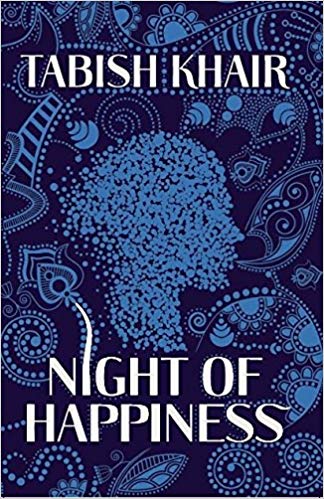
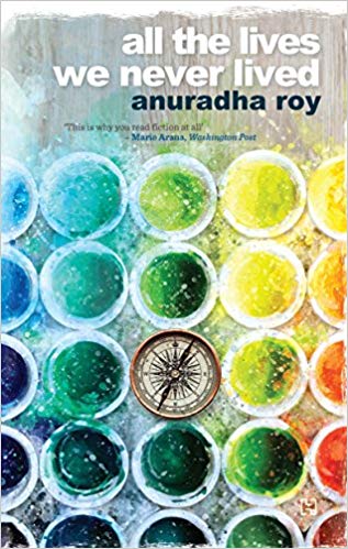
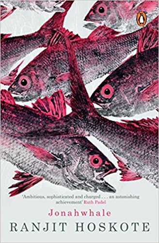
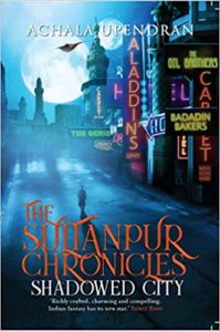
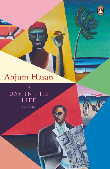
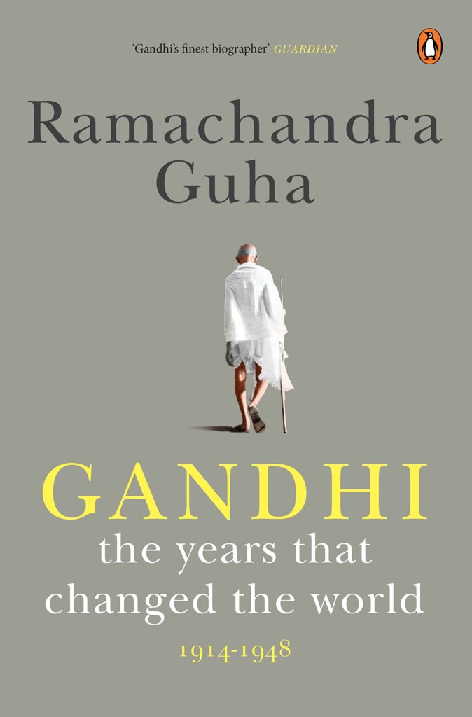
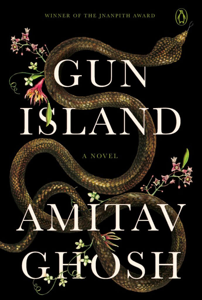
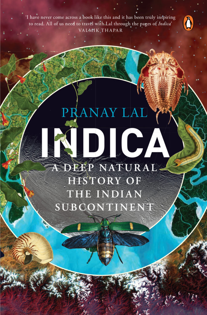
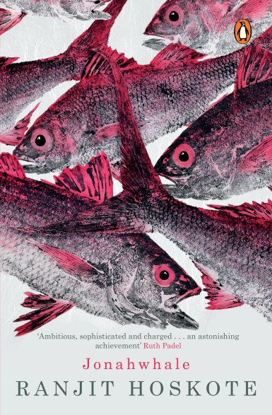
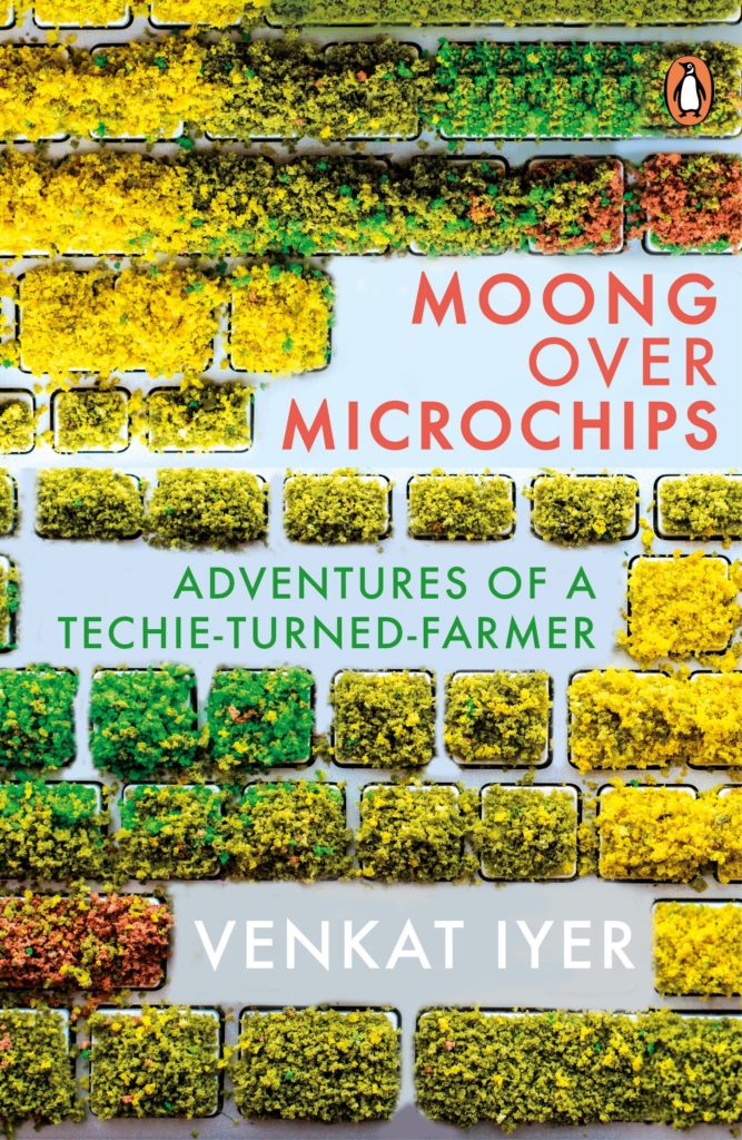
Gun Island by Amitav Ghosh, Gandhi by Ramchandra Guha, Premchand series, Indica by Pranay Lal, Moong Over Microchip by Venkat Iyer, God in the Quran by Jack Miles (Knopf US), Trampled Under Foot by Barney Hoskins (Faber and Faber) and The Room on the Roof by Ruskin Bond (anniversary edition).


5 September 2019