Shaun Tan Posts

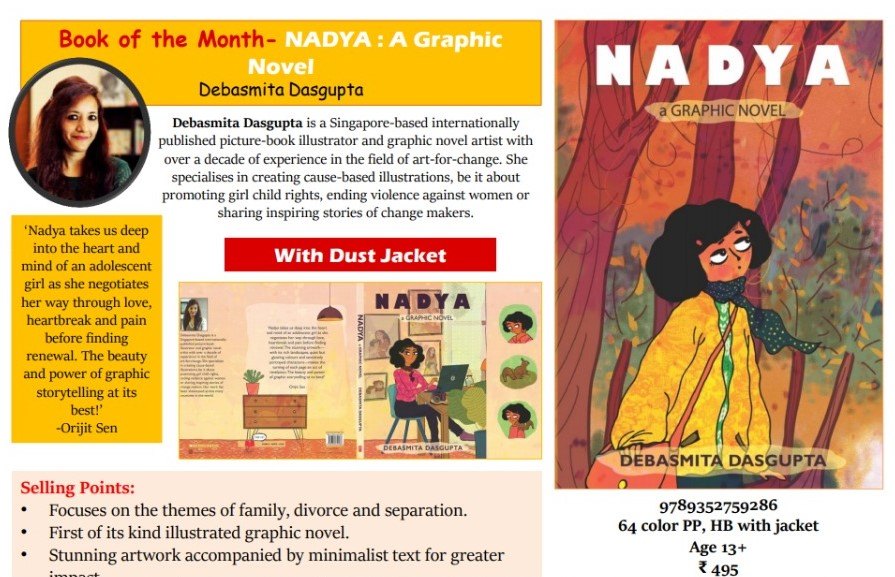
Interview with Priya Kuriyan

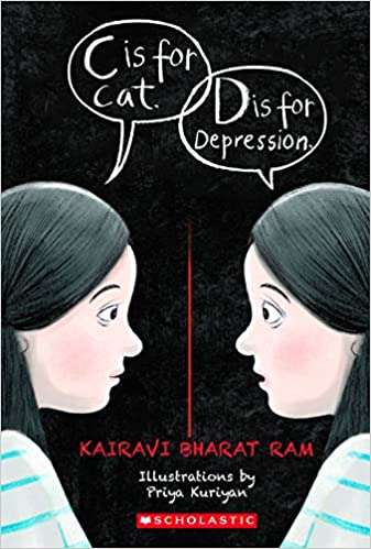
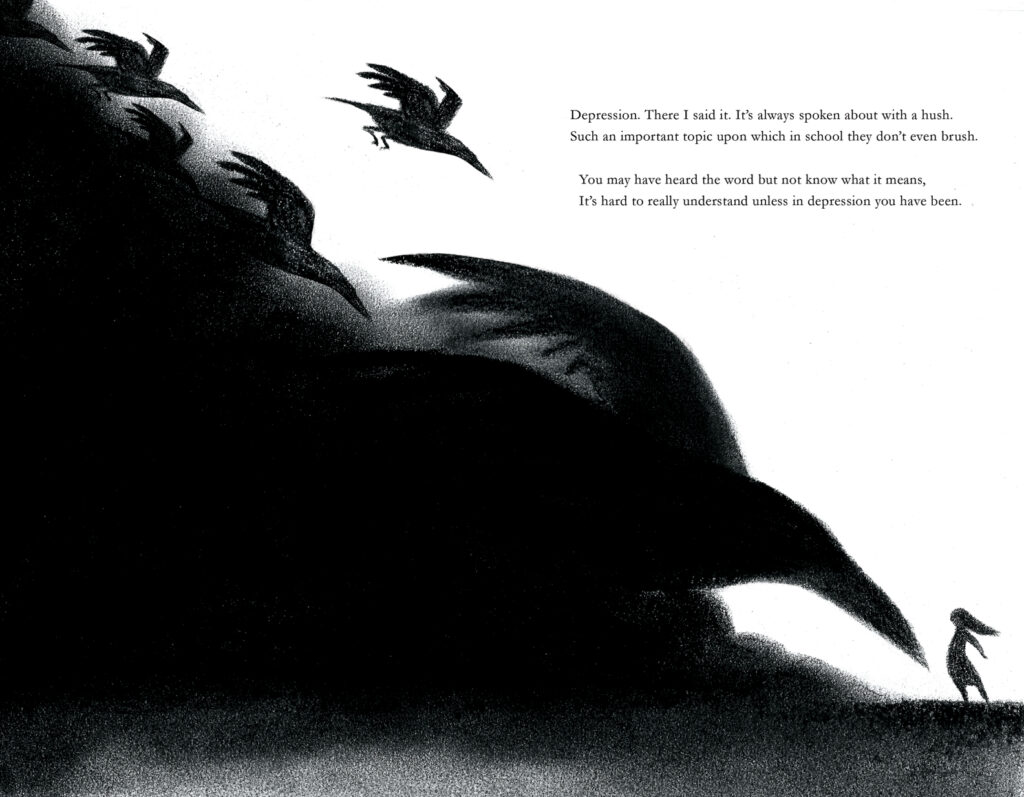
Mental health and related topics are at the best of times taboo subjects in India. To discuss openly about depression amongst teenagers/adolescents is unthinkable. In a country where being in therapy is still a hush-hush topic, to commission and publish a book on the topic is bold and that too in an experimental form — an illustrated memoir in rhyme. C is for Cat, D is for Depression ( Scholastic India, 2020) is a much needed book for young adults in helping to break barriers about mental health and make it a socially acceptable topic to discuss openly and without any stigma.

Kairavi Bharat Ram is a young published author who is known for her previous books in rhyme — Ramayana and Krishna. Those were retellings of Hindu epics. But this is the first time she has told a story about her personal experience of battling depression as an adolescent. It is a powerful testimony to the challenges she faced. It is a vivid description of all that a patient afflicted by depression experiences and is unable to always share clearly. At the same time, it is a gentle request to caregivers of such individuals to be patient and offer a caring hand whenever required. She also equally gently plots out methods in which the person themselves or those around them can help an individual come to terms with depression and related mental health issues.

This is a precious book. A conversation starter and a handy tool for anyone interested in mental health. It should become an essential requirement in every classroom and school library.

Hopefully this will lay the foundation for a strong and well-defined yalit list on mental health in India/South Asia. Kudos to Scholastic India for publishing this book!

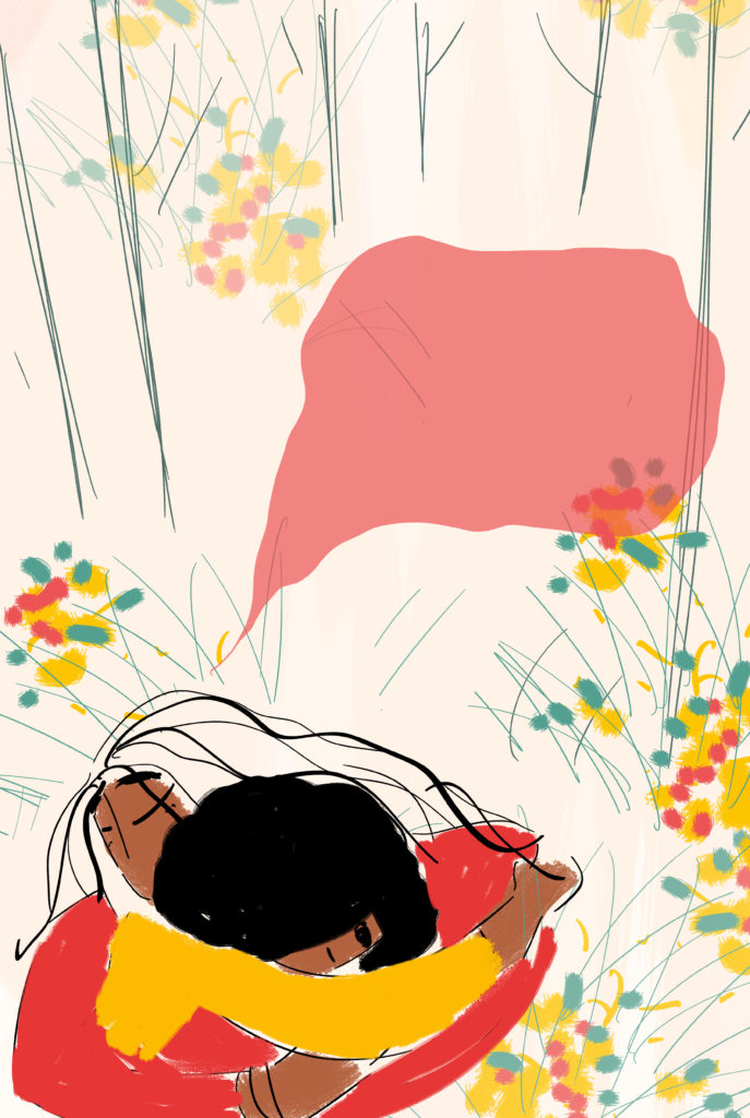
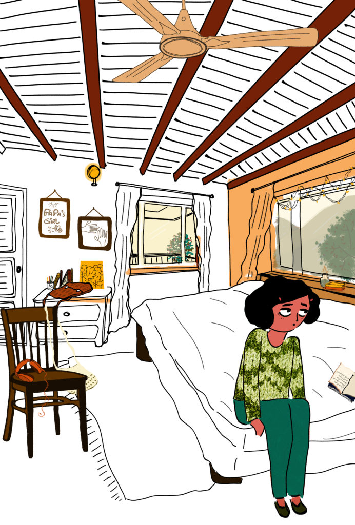
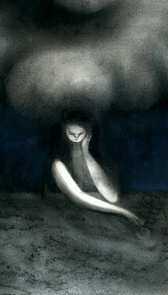
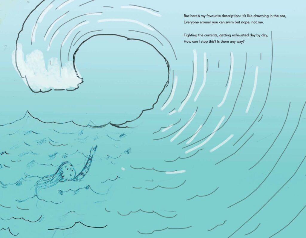
Priya Kuriyan’s illustrations for the text are out of this world. They complement the text well but also provide a narrative of their own to pull the reader in. While the drawings illustrate the text as beautifully and precisely as would be seen in a children’s picture book, the sophistication of the artwork is in keeping with some of the best international artists. Her eye for detail is astonishing. Her work as an illustrator begins from the cover, includes the endpapers and then the main text. To open the book and see the black endpaper that transforms brilliantly into a bright yellow at the end of the book is just one tiny detail that makes this book an extraordinary triumph. I had questions buzzing in my head for Priya while reading the book, so here is a lightly edited version of the interview conducted over email.

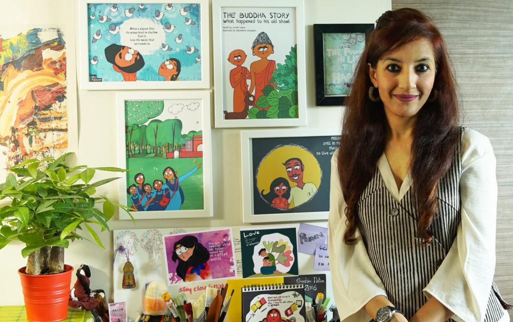
Priya Kuriyan is a children’s book writer-illustrator, comics maker and chronic doodler. She has directed educational films for the Sesame street show (India) and the Children’s Film Society of India (CFSI) and has illustrated numerous children’s books for various Indian publishers. She lives and works in the city of Bangalore and in her spare time makes funny caricatures of its residents.

  1. How did you approach this project? What was your initial reaction upon reading the text? 

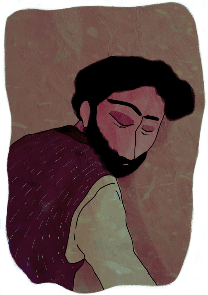
I first received the manuscript from the editor and went over it a couple of times trying to really get a sense of the genre. From the start, I was sure that though there are aspects of depression and mental health that are universal, (having had experiences with it myself and read up a fair bit) this was a very personal account of Kairavi’s experience with it. Therefore, I knew I would have to consult her at every stage of creating the book and that I wanted her voice to take centre stage. She had used metaphors in her poetry that I realised could translate very well into strong and evocative visuals that lead you into the mind of someone who is suffering so I knew that these strong full page illustration spreads would do justice to the text.

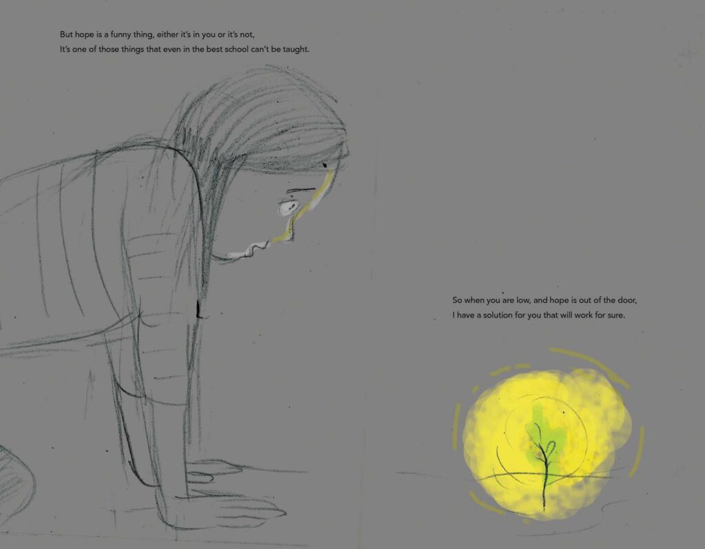
I had sent a few images from the early pages as samples to Kairavi and though she liked them a lot, she did rightfully ask me also to keep in mind that ultimately the book was also about hope. 

2. How long did this project take to complete? 

The manuscript was sent to me sometime in July last year and I had my first conversation with Kairavi in February this year over Skype. I worked on the project in bits and parts since then, but the serious work really started in April and was done by the end of June. 

3. What was the initial concept note for the illustrations? Or did Kairavi and you have separate notes/ ideas that you then merged? 

There was no initial concept note for the illustrations, but what I requested Kairavi after I had that first conversation with her was to pen down some words next to her lines as to what she saw when she wrote those words; not for every line, but at least for a few. Those did give me some cues that I could expand on. I would then send Kairavi rough drawings of my interpretations of those lines and she would then write back to tell me if it complemented the feelings that she intended to convey through her poetry

4. Your artwork is synonymous with light, freshness, primary colours etc. So how challenging was it to work with such dark colours, panel after panel? 

Well, I think in my personal time where I don’t have to work on a client project, I do experiment with other kinds of media and genres. So, I didn’t really find the colour palette a challenge. I think most people have seen the work that I have done in the children’s book space (which I really enjoy being in), and then, one continues to get assigned work of the same kind based on what you’ve done before. I like and enjoy breaking away from my typical style from time to time.

5. Do you illustrate on the computer or do you use other mediums and then transfer the scans to the computer? 

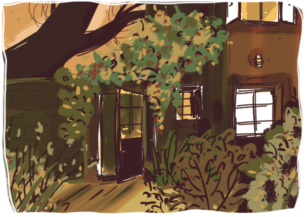
Most of the time I work analog first – scan my artworks, do some touch ups on an appropriate software and send digital files to the publisher. In this case I used dry pastels and charcoal for my original artworks.

6. If you had to write a note about creating the artwork for this story, what would you write? 

That the illustrations should immerse you into a journey of a person trapped within their own mind, who is reintroduced to the idea of hope and ultimately releases himself/herself.

7. With this particular book, I feel that you have broken many of your creative boundaries and pushed yourself in a space that is new. I do not mean in that you are an over-reacher but as someone who has leapt into a new phase of creativity. Do you think this project changed you in any way? If so, what? 

Hmm..It’s definitely a genre that I had not worked on before in the children’s book category. A lot of the work I do for adults (comics/ book covers etc) has tended to fall into a more serious (in the literal sense of the word) way. So, I’m not certain at the moment whether this has changed my work in a dramatic way. I think what I do with the next couple of projects that come my way will be what answers that question.

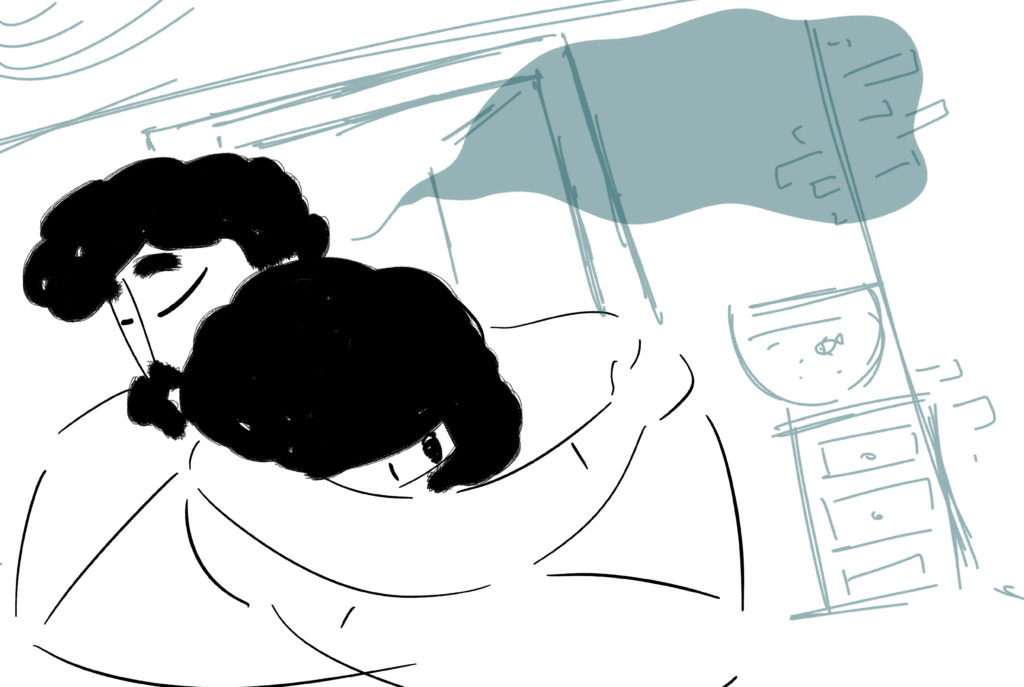
8. Which of these illustrations is your “favourite” of the book? Which of these illustrations has developed the furthest from the initial sketch? And why? 

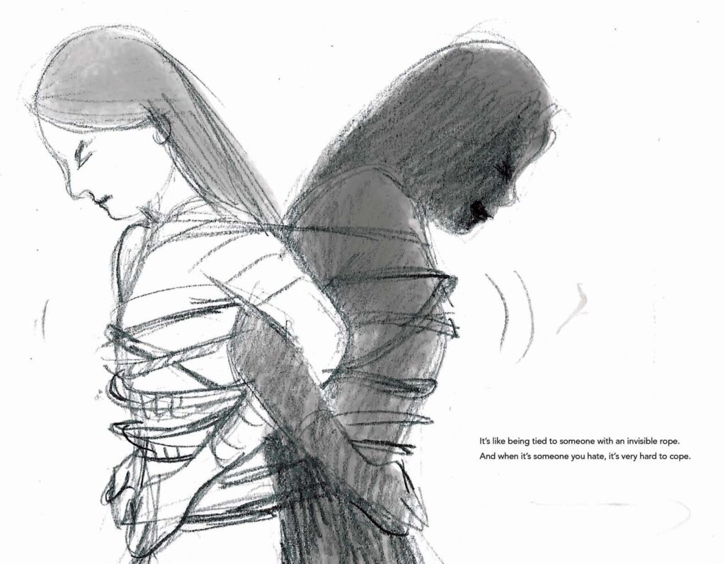
I think the one where the girl is tied to this black figure. I like the metaphor or the paradox of trying to release yourself from the person that you don’t know or recognise and yet knowing that person is you. I think that line really spoke to me. The illustrations that changed the most from the initial drawings were perhaps some of the earlier spreads. I think they were much darker and I later realised that the darkness must creep in gradually just as the light creeps in gradually into the latter part of the book.

9. What do you think is the relationship between illustrations and text? How does it vary depending upon the type of book it is — picture book, illustrated storybook, illustrations accompanying a story, chapter book, comics/graphic novels, novels etc. 

The word and the text are entwined twins. I think in the case of picture books an illustrator anchors oneself on the text and is an equal partner when it comes to telling the story along with the writer. How long the rope needs to be, is the critical decision that the illustrator takes. It does vary vastly depending on each type of book. As far as possible, the illustrations that accompany any kind of format, should ideally not be a direct representation of what is in the text. It can bring further context to the story by adding more details that are not necessarily present in the text. In the case of comics, one has to also keep in mind that the page is being viewed panel by panel and also as a whole. So, text and image is intertwined differently out there.

10. What do you think are the fundamental guidelines an author should keep in mind while creating a concept note for an illustrator? 

A clear idea of the context within which the book is set. Who the book is aimed at. Any image references that are essential to the research or details of the book. Having said that, it is always best if the author is generous enough or trusting enough to let the illustrator bring in his or her own voice to the book.

11. When did you discover your love for illustrations? What is your favourite medium for creating art? What is the medium you prefer to use while illustrating texts? 

I love exploring different mediums and changing them depending on the book I’m working on. Needless to say stationary stores are the only stores I enjoy being in apart from bookstores.

I used to love drawing as a kid and also story books. I ultimately ended up studying animation in design school and as part of the course, we had illustration as a module. I really enjoyed it and perhaps that was when I considered that this could perhaps be something I could take up later. It was however a something I imagined I’d be doing on the side. I think I started taking children’s books seriously only after my 3rd or 4th book was published. There are no colleges that teach Illustration specifically in India and I think there’s a bit of a lacunae there since a lot of illustrators just by instinctively finding their way into a career in Illustration.

I don’t think I have a favourite medium as such. Though I work with watercolours quite a bit. I choose mediums depending on the nature/genre of the book. And I like exploring different techniques. At the moment, I’m inclined to say that graphite pencils are my favourite, but that might change in a few months from now.

12. Who are your favourite illustrators and who has influenced you the most

My favourite illustrators are Shaun Tan, David Weisner, Emily Gravett, Atanu Roy, Oliver Jeffers, Jon Klassen, Mickey Patel. All the illustrators of Target magazine that had a huge influence in my childhood namely Atanu Roy, Jayanto Banerji, Sudhaswatta Basu, and Ajit Ninan.

7 Oct 2020

Interview with Debasmita Dasgupta on her debut graphic novel, “Nadya”

Nadya is a stunningly powerful graphic novel about thirteen-year-old Nadya who witnesses her parent’s marriage deteriorate. The story and the art work are devastating. The artist-cum-author Debasmita Dasgupta has created a very moving portrait of a family falling apart at the seams but also how the little girl, at the cusp of adulthood, is witness to a catastrophic set of circumstances. Her secure world crumbles and she feels helpless. Yet the staid portrait of the professional at her desk on the dust jacket belies the confused and anxious teenager portrayed on the hard cover — a fact that is revealed once the dust jacked is slipped off. It is an incredible play of images, a sleight of the hand creates a “flashback”, a movement, as well as a progress, that seemingly comes together in the calm and composed portrait of Nadya at her desk, tapping away at the computer, with her back to a wall on which are hung framed pictures. Many of these images are images of her past — pictures of her with her parents in happier times as well as when the family broke apart. A sobering reminder and yet a reason to move on as exemplified in the narrative itself too with the peace that Nadya discovers, a renewal, a faith within herself to soar. Scroll sums it up well “Teenagers may read this story of a nuclear family living in the hills for relatability, but for everyone there is the poetry of the form that this graphic novel poignantly evokes.” Nadya is an impressive debut by Debasmita Dasgupta as a graphic novelist. Nadya, is releasing on 30 September 2019 by Scholastic India. 

Debasmita Dasgupta is a Singapore-based, internationally published Kirkus-Prize-nominated picture book illustrator and graphic novel artist. She enjoys drawing both fiction and non-fiction for children and young adults. Working closely with publishers across the world, she has illustrated over 10 picture books, comics and poems. Widely known as an art-for-change advocate, Debasmita tells stories of changemakers from around the world partnering with global non-profits. Her art is exhibited in Italy, Singapore, Thailand, Denmark and more than 40 international media outlets have featured it.

Here are excerpts of an interview conducted via email:

  1. How did the story of Nadya and its publication come about? Was it the story that came first or the illustrations? What is the backstory?

I am a visual thinker. Words don’t come to me naturally. The story of Nadya was with me in bits and pieces for a very long time. I needed some time and space to weave it all together. It happened exactly a year ago when I went for an illustrators residency near Burgos (in Spain). That’s when I completed the story and illustrated a few key frames, which finally expanded to become this 64-page graphic novel.

When I was in primary school, I had a very close friend (can’t disclose her name). I have faint memories of us spending time together and quite a vivid memory of her fading away from my life after her parents went through a divorce. I was too young to understand the significance of the word “divorce”. All I could understand, deeply, was that it changed the course of my friend’s life. She became more and more quiet and then one day never came back to school. There were rumours that perhaps she went to a different school or a different city. Years later, another very close friend of mine went through a divorce. She has a daughter and at that time she was eight. This time I realised the thing that bothered me the most in my childhood was that I couldn’t make an attempt to complement the loss in my friend’s life with my friendship. Simply because I didn’t know how to deal with it. Finally, I found an answer in my art and the story of Nadya began. 

2. While the story is about Nadya witnessing her parents marriage fall apart, it is interesting how you also focus on the relationships of the individuals with each other. Is that intentional? 

Absolutely! I don’t see Nadya as a story of separation. On the surface it is a story of a fractured family but underneath it is about our fractured emotions. In fact to me it is the story of finding your inner strength at the time of crisis. You just have to face your fear. Nothing and no one except you can do that for you. 

3. Nadya seems to collapse the boundaries between traditional artwork for comic frames and literary devices. For instance, while every picture frame is complete in itself as it should be in a comic book, there is also a reliance on imagery and metaphors such as Nadya being lost in the forest and finding the fawn at the bottom of a pit is akin to her being lost in reality too. Surprisingly these ellisions create a magical dimension to the story. Was the plot planned or did it happen spontaneously? [ There is just something else in this Debasmita that I find hard to believe is a pure methodical creation. It seems to well up from you from elsewhere.] 

Thank you Jaya!

You are right that it is not a pure methodical creation. In fact, what fascinates me is that you could feel that the borders are blurred. When I was creating the story of Nadya, I felt that there were many crossovers between borders. Like emotional borders (grief and renewal) and timeline borders (past and present, with a hint of future). And I think these crossovers resulted in the form of an amalgamation of narrative forms, textures and colour palettes. In fact, that’s one of the reasons why I felt the story is set in the mountains where you cannot define the lines between two mountains or the distinctions between the trees in the forest when there is a mist. They all overlap each other like human emotions. It’s never all black and white. 

4. How important do you think is the role of a father in a daughter’s life?

Let me tell you the story behind “My Father illustrations” – It was on a Sunday afternoon when the idea came to me after I heard a TED talk by Shabana Basij from Afghanistan. It was a moving experience. I felt something had permanently changed inside me. Over the next few days, I watched that talk over and over. Her honesty, her simplicity and power of narration moved me. Shabana grew up in Afghanistan during the Taliban regime. Despite all odds, her father never lost the courage to fight for her education. He used to say, “People can take away everything from you except your knowledge”. Shabana’s story gave me a strong impulse to do something but I didn’t know ‘what’ and ‘how’. That’s when my red sketchbook and pencil caught my eye. Before I’d even realized it, I had taken my first step. I illustrated Shabana’s story and posted it on Facebook. It was an impulsive reaction. I found Shabana’s contact and shared the illustration with her. Shabana was so touched that she forwarded it to her students, and then I started getting emails from a lot of other Afghan men! The emails were a note of thanks as they felt someone was trying to showcase Afghan men in a positive light. I realized that if there are so many positive father–daughter stories in Afghanistan, just imagine the positive stories across the world! My journey had started. I started looking for moving father-daughter stories from across the globe. Some I found, some found me. With every discovery, my desire to create art for people kept growing.

5. With Nadya you challenge many gender stereotypes such as the daughter’s relationship with her parents. It is not the standard portrayal seen in “traditional” literature. Here Nadya seems happier with her father rather than mother. The breaking down of Nadya’s relationship with her mother has been illustrated beautifully with the picture frames “echoing” Nadya’s loneliness and sadness. Even the colours used are mostly brown tints. This is an uneasy balance to achieve between text and illustration to create an evocative scene. How many iterations did it take before you hit a satisfactory note in your artwork? And were all these iterations in terms of art work or did it involve a lot of research to understand the nuances of a crumbling relationship?

I often say “Preparation is Power”. And I have always learnt from great creators in the world that there are no shortcuts to create any good art. However, the process of preparation varies from artist to artist. To me, this is not a process, it’s a journey. It starts with a seed of an idea and then it stays with me for a long, long time before I could finally express it my way. There is a lot of seeing, listening and spending time with my thoughts. Breaking of the stereotypes, whether they are gender stereotypes or stereotypical formats, were not intentional but I guess embedded in my thinking. It’s not that someone from outside is telling me to break those norms but it’s a voice, deep inside, constantly questioning. Not to find the right answers but to ask the right questions.

There were many versions of character sketches and colour palettes before the finals were decided for Nadya. Even though the initial characters and colours were similar to the finals, the textures and tones are distinctively different. Since the story runs in different timelines with varied emotional arcs, I wanted to integrate separate tonalities in the frames. In the end, a graphic novel is not just about telling a story with words. If my images can’t speak, if their colours don’t evoke any emotion then my storytelling is incomplete. 

6. Did you find it challenging to convey divorce, loneliness, relationships etc through a graphic novel? Why not create a heavily illustrated picture book, albeit for older readers?   

I am a bit of an unconventional thinker in this regard. I can’t follow the rules of length and structure when it comes to visual storytelling. That’s why many of my illustrated books are crossovers between picture books and graphic novels. To me, when I know the story I want to tell, it finds its form, naturally. 

7. As an established artist, what is your opinion of the popular phrase “art for art’s sake”? 

I am an advocate of “art for change”, more precisely a positive change. I strongly believe (which is also the genesis of ArtsPositive) that art (of any form) has the ability to create a climate in which change is possible to happen. Maybe not today. Maybe not tomorrow. But eventually it will.

8. Graphic novels have become popular worldwide. Mostly the trend seems to be tell personal stories or memoirs or a lot of fantasy. To create a novel for social activism is still unusual though it is happening more and more. What do you hope to achieve with Nadya

I admire those books (graphic novels) that I can read several times, because it’s not about the length of the book, instead it is the depth that intrigues me to re-visit it more and more. Books that help start a conversation. A conversation with yourself or with someone else. I want Nadya to be that conversation starter.

9. Although it is early days as yet, what has been the reception to Nadya, especially from adolescent readers?  

The book is releasing in India on 30th September and I can’t wait to see what young adults have to say. Before that we had a soft launch in Singapore during the 10th Asian Festival of Children’s Content, where Nadya received a very warm welcome. All festival copies were sold out but my biggest reward was when I met this young artist from Indonesia, who told me that he could see himself in little Nadya. His parents separated when he was very young. I also met a teacher, who said that he is going through a divorce and would appreciate if I could speak to his children with this book. His eyes moistened when he was speaking to me.

10. Who are the artists and graphic novelists you admire? 

That’s a long list! But surely the work of Marjane Satrapi, Paco Roca, Riad Sattouf, and Shaun Tan inspire me a lot. The way they present complex subjects with simplicity, is genius!

11. What motivated you to establish your NGO, ArtsPositive? What are the kind of projects you undertake and the impact you wish to make?

About a decade ago, when I started my journey as an artist / art-for-change advocate, there was not much awareness about this concept. It was a very lonely journey for me, helping people understand what I do and what I aspire to do. So when I had the opportunity to start an initiative, I decided to develop ArtsPositive to contribute to the art-for-change ecosystem by supporting artists who create art-for-change stories. 

At ArtsPositive, we create in-house art-for-change campaigns such as #MoreThanSkinDeep* (the most recent campaign). We have also launched a quarterly ArtsPositive digital magazine to showcase art-for-change projects and enablers from around the world, collaborate with artists, and share artistic opportunities.

* More Than Skin Deep is an illustrated poetry campaign by poet, Claire Rosslyn Wilson and artist, Debasmita Dasgupta, through which we are amplifying the voice of fifteen fearless acid attack survivors (from 13 countries), who are much more than their scars.

Web Analytics Made Easy -
StatCounter