Illustrations Posts

Book Post 43: 7 – 24 Aug 2019

Book Post 43 includes some of the titles received in the past few weeks. Wherever available Amazon’s Kindle widget has been embedded in the blog post. It will allow you to browse through the book before you decide to buy it.

26 Aug 2019

Interview with Ahlawat Gunjan

Ahlawat Gunjan has a Master’s Degree in Graphic Design from The Glasgow School of Art, UK. Previous to that he also spent a semester at Indiana-Purdue University, USA focusing on design thinking and leadership. He is a graduate of the National Institute of Design, Ahmedabad.

Trained at Lars Mullers Switzerland and Faber & Faber, UK, Ahlawat has a varied and interesting work experience. His overlapping interests in art and literature not only made him pursue a career in publishing but also informs his keen interest in visual authorial interventions and curatorship. This allowed Gunjan to shape the visual personality of the book at every step of its creation. Ahlawat also enjoys the many ways and levels at which a designer can take narrative construction forward through type and image.

He heads Design Department at Penguin Random House, India during the day and spends time painting in the evenings and over the weekends.

Following are edited excerpts of an interview conducted via email:

1.How did you get into the world of publishing?

It was a beautiful accident. My first job was with Hidesign in Pondicherry and I wanted to move closer to home. So, I was looking for opportunities in Delhi and DK happened. I was really enjoying the process of book making, image editing, and managing large book design projects. And I’m rarely satisfied. So, I wanted to try out my hands on a few book covers for Penguin (which used to be next door really in Panchsheel). I still remember being nervous asking my then manager and now Managing Director, DK India, Aparna Sharma, and she was absolutely open to the idea and very encouraging. I did one cover and it went off very well and this was the start of a new journey. I went on to do four more covers and discovered a sort of hidden joy in myself. I realized I really wanted to do this for living now. With huge support from DK and Penguin, the switch happened and I made Penguin my home thereafter. My masters at The Glasgow School of Arts was focused on publishing and as a part of it, I was extremely lucky to intern at Lars Mullers in Switzerland and later at Faber and Faber. This is how publishing happened to me and today, honestly I can’t imagine myself in any other domain of Graphic design.

2. What in your opinion are the basic elements of designing a book cover?

Since seeing comes before words, I would say strength and clarity are foremost and non-negotiable. By strength, I mean the ability of the cover to draw your attention towards it and clarity is the ability (through image and typography) to communicate the message clearly and effectively. The rest happens between these two.

3. Are there a set of basic ground rules that a book designer should be aware of before delving into a new project?

Be courageous and have conviction.

Design and not decorate.

Allow things to evolve.

4. Do you think the basic principles of book designing have undergone a massive transformation since the medieval ages or is it that the modes of production have transformed the process?

Since medieval ages, absolutely. That time we used to have decorative leather bound books with very less variations in terms of size and colour palette. Margins and page settings were dictated how monks would hand write the contents.

With Guttenburg’s invention, the game changed entirely. With printing press, movable type blocks were introduced for mass production.  One can see a lot of illustrated elements like decorative capital letters, but what was missing was para spacing, line spacing, leading and all forced justified text which made the whole page pretty hard to read. It was the time when publishers were the printers and often wanted to show their abilities that were boring, hard to read and based on little showing off. Designs that wouldn’t enhance the text. By 1700s, printing became somewhat common to the masses.

By 1800s, there were authors and fine artists who were involved and commissioned to design and set the books. They introduced the notion of foot notes, side bars and paste numbers. This was the time when the economics of making a book took some precedence, which until now was secondary. 1900s saw several design schools mushrooming all over Europe and USA, with their respective design philosophies (It is very evident even today. For instance, the way Swiss or Dutch people approach design and produce their books, with very strong and distinct typography, imaging and very high production quality).

So, on the whole with turn off every century, book designing saw their own changes.

5. How important is it to know typography as well as different art forms to design a book cover/ book? If yes, what are the fonts for which you have a soft corner?

Author assigns certain voice to their characters and as a book designer we have to assign visual voices to those characters. So, you can understand what a narrative can do without a voice or having a wrong voice. I believe the relationship between the cover design and the text is very special. This is because a font, colour or layout is not chosen solely in function of its legibility but principally for its associative capacity. The classic problem of semiotic theory is that a single image expresses more than a thousand words, and a single word conveys more than a thousand images. (p. 116 Devleminck, Steven, Gobert, Inge, Looveren Johan Van. The Balancing Act of Design )

It’s the backbone of a good cover and I strongly believe in it. Infact, I went to do a summer intensive typography course at the Royal College of Arts, London fairly recently.

I do have some favourites fonts, but I’m trying to work with as few as four/six.

6. Has digital technology made a qualitative difference to book covers?

Yes, your work can reach an unimaginable amounts of readers (say FB, Instagram and other social medias, people tagging etc.), which wasn’t the case 10 years back really. Additionally, unknown readers reach out to you on Facebook, Instagram, Amazon review with their compliments, which is very satisfying and encouraging.

7. What is it that you seek in a book cover design?

A space to negotiate, collaborate, and construct ideas/thoughts and above all space to create! I try to be in author’s shoes to see and feel the writings, to basically try to get the pulse of every possible detail and to assure them that we are equally excited about your work and at the end, making them hand over the controls to you. These are far more fundamental than deciding which fonts to use, what leading is better for a book cover, and so on and so forth.

A designer has a certain accountability and his/ her actions have enormous impact on millions of readers. Without knowing, they become a part of the design and literary history. Along with all the fun you may have, it’s also a huge responsibility on your shoulders, because you are going to give a visual personality to someone’s years of work. Additionally, this will go to print and will be out there for years to come (unlike the digital format, where you can change details quickly). A book cover designer needs to understand that the author’s work is linear but the images on the cover are associative. The challenge is to add layers through visual intervention with type and image. That means, apart from giving a structure, designer can control the reader to read the content in certain way. In other words, the designer holds a remote control to direct the reader a certain way.

8. What is your ideal brief for a book cover design? What are the elements it must absolutely contain and what are the elements that would be bonus if included but are not that necessary?  

We have a standard cover brief format at Penguin and we get written cover briefs from our editors. But, I always believe in having a detailed chat with the editor, sometimes with the author and the sales team also, before I start thinking and researching for the cover. I feel, this way I get the best results!

It’s helpful to have all the elements pertaining to the cover:

Format (HB or PB), size, spine width, budget, extracts to read along with visual suggestions and any additional inputs from the author and Sales.

9. What are the cost considerations of creating a book cover design?

We do work with certain budget per cover and depending upon the design ideas, we sometimes push and pull. For instance, if a designer got a cover design that is dependent on post-press effects (embossing, die-cuts, debossing, Pantone colours) or wants to use unusual stock or slightly extensive printing technique, then we do push the cost boundaries to make it happen. I think it’s about how much we collectively believe in that book and it’s linked to the way we are positioning that particular book.

10. How do you manage to maintain a freshness of style especially with the play of light in most of your compositions? What are the mediums you are partial to — watercolours, acrylic, ink etc.?

My mentor Lars Müller says, “We are authors while designing. Design is our language. And I must reflect my beliefs”. I start each book cover design project from scratch, from reading the manuscript to researching about visuals, fonts I will be using or drawing, discussing the ideas with editors and authors. My way is slow, simple and uncluttered, as already there is enough visual pollution both in typography and imaging. Both of these are art and science and one should strive for simplicity.

No, I’m not partial to any medium when it comes to designing a cover. It has to be absolutely objective and true to the contents inside.

11. What would you claim to be your signature style in creating an art work, may it be canvas or a book cover? For Turner it was the playing of paper and colours. What is yours?

I like making my own imagery for the covers. Originality is one feature that plays an enormous role in my designs. In this age and date where everything is a click away, one seems to think that they have browsed through similar visuals. To arrive at something that is startlingly unconventional and refreshing, the process of thinking needs to be unconventional too. Therefore, one must embrace ambiguity and not kill any idea that one has. I always say it is better to produce an ugly cover but it should be an original. “I prefer ugly covers to clone covers. At least ugly covers demand a certain amount of attention. And will continue to be ugly. In other words, today’s ugly is tomorrow’s beautiful,” says Peter Mendelsund and I can’t agree more to this.

12. Who are the artists and book designers who have influenced you?

My absolute favourites are Irma Boom, Adrian Shaugnehhesy (just spent a week with him in London) and Peter Mendelsund (my ex-colleague from Knopf, USA).

Artists: David Hockney, Ivon Hitchens and Amrita Sher Gil. I can’t do without them!!

13. Can you share examples of book covers that you consider iconic?

Gun Island by Amitav Ghosh, Gandhi by Ramchandra Guha, Premchand series, Indica by Pranay Lal, Moong Over Microchip by Venkat Iyer, God in the Quran by Jack Miles (Knopf US), Trampled Under Foot by Barney Hoskins (Faber and Faber) and The Room on the Roof by Ruskin Bond (anniversary edition). 

5 September 2019

“Nadya” by Debasmita Dasgupta

http://bit.ly/30ijzI1 Scholastic India’s forthcoming release in September 2019 includes Nadya by Debasmita Dasgupta. It is an absolute must read. It is stupendously breathtaking.

As Orijit Sen affirms ‘Nadya takes us deep into the heart and mind of an adolescent girl as she negotiates her way through love, heartbreak and pain before finding renewal. The stunning artwork—with its rich landscapes, quiet but glowing colours and sensitively portrayed characters—makes the turning of each page an act of revelation. The beauty and power of graphic storytelling at its best!’

26 August 2019

Book Post 42: 21 July – 6 Aug 2019

Book Post 42 includes some of the titles received in the past few weeks. Wherever available Amazon’s Kindle widget has been embedded in the blog post. It will allow you to browse through the book before you decide to buy it.

8 Aug 2019

Mira Jacob’s “Good Talk”

Award-winning author Mira Jacob‘s Good Talk is a graphic memoir. It was written after the extraordinary success of her 37 Difficult Questions From My Mixed-Race Son: “Are white people afraid of brown people?” published on BuzzFeed ( 8 June 2015). Though seemingly inspired by the questions her son posed to her incessantly about Michael Jackson, music and race but the Good Talk is also much more. It is much more than the conversations every sane and rational parent has with their children, let alone those of mixed parentage. It is all about the difficult conversations that are most often ignored even by adults. These are mostly revolving around race in America.

Mira Jacob’s Syrian Christian parents immigrated to America in 1968. So Mira and her brother were born and brought up in America and are Americans. Yet because of their brown skin colour the Jacob children have experienced racism at all levels whether as microaggression or explicity racist comments/attacks as the horrific one described in Good Talk of Mira Jacob being physically assaulted in public. This is quite unlike the America Mira Jacob’s Jewish husband, Jed Rothstein, has ever had to face as he is white.

To unpack all that exists in this exquisite graphic memoir will take an essay longer than the book itself! There is much to read, analyse, mull over and share. Many, many readers will have the same reaction that they did to Mira Jacob’s first book The Sleepwalker’s Guide to Dancing — “This is a story about us and our family.” It is immaterial that Good Talk has been written by an American of East Indian / South Asian origin. This is a book that will resonate with readers of different nationalities. A fact Mira Jacob records in “I Gave A Speech About Race To The Publishing Industry And No One Heard Me” about the reaction of readers to her first novel.

…really, it happened a lot. It happened with people of all ages, races, and genders. It happened at readings and it happened in emails and a lot of times it was just a thank you for writing this book — but just as often, it was someone commenting on the family dynamics. “I know you are Indian,” they would say, “but really, this is about my family, the Italians. My family, the Jews. My family, the Greeks. The Dominicans. The Koreans. The Irish.”

In a fabulous interview on Longreads, Mira Jacob speaks of the title, particularly within the context of parenting in this new world. ( “Imagine Us, Because We’re Here: An interview with Mira Jacob, March 2019)

The title is really tongue in cheek because so many of the talks in here are not anything you would ever call a good talk. For me, it’s almost like when you step away from a conversation that you know has gone bafflingly off-the-rails and you’re like, ‘good talk, good talk’ you know? You just say it to yourself in this way that’s like, ‘that was a disaster, I don’t know how anyone is going to recover from that one!’ Mostly I would leave conversations with him and I would be like, ‘that’s another five years of therapy right there.’

This is the really frustrating thing about being a parent especially in this moment, but I imagine all parents in every moment feel this — that despite all your carefully laid ideas about how you’re going to grow a small human into a big one, it’s just a disaster. It’s a shitshow left and right. You’re doing your very very best and it is so not even close to enough.

Good Talk must be read by everyone. This is not a memoir meant only for adults. Share it widely.

10 June 2019

Interview with Sarnath Bannerjee on “Doab Dil”

Graphic novelist Sarnath Bannerjee’s Doab Dil is an extraordinary piece of writing or “faction” as he would like to call it. It is based on a few years of intense reading with a panel, sometimes a double panel, dedicated to a writer – fiction, non-fiction, or even a lyricist. It is an “extraordinary” book for every time you flip through it there is something more to discover. The selection of the writers with the brown drawings is like entering an accessible portal for a walk through a history of reading. A reading that is a combination of the canonised writers along with the lesser known. It is like browsing through the bookshelves at a library where the familiar writers are placed with the lesser known names. Sarnath Bannerjee is known for his graphic novels Corridor, The Barn Owl’s Wondrous Capers, The Harappa Files, and All Quiet in Vikaspuri.  Yet Doab Dil is a pivotal piece of work as it marks a transition from his early works to something new and exciting to come. It is to be found as he mentions, in the “spaces between the text and images form the central backbone of the book”.

Here is an extract from Sarnath Bannerjee’s introduction to the book:

…I was commissioned ninety murals for the new Deutsche Bank building at Canary Wharf, London. The curators, Alastair Hicks and Mary Findley, gave me an open brief, which is always a scary thing. After struggling through many meetings at Winchester House, we finally came up with the idea of making the whole building read like a book. Two years of intense reading suddenly came into sharp focus. This was my chance to archive my readings, to put my thoughts into drawings and, in doing so, preserve the books in my mind.

Doab Dil brings together drawings and text like two converging rivers. The fertile tract of land lying between two confluent rivers is called a doab (Persian do ab, two rivers). It is a rich, draught-free, populous tract where civilizations are born. These spaces between the text and images form the central backbone of the book. I have used bits of text that I have assimilated from my reading and mixed them with my own writing and interpreted them through drawings.

It is not surprising that authors find it easier to talk about reading than writing. Doab Dil is written in that spirit – a book by one reader to another.

******

Here is a lightly edited interview with Sarnath Bannerjee via e-mail.

JBR: Why and how was Doab Dil conceptualised? How long did it take to be made? 

SB: Doab Dil is a book about reading than writing. A kind of deep and slow reading that produces wayward thoughts. Often reading provides a springboard for ideas, places and characters. It opens up one’s imagination beyond the merely personal. 

There are some themes that Doab Dil explores. Gardens as places of enquiry as well as places where class and taste are played out. Dark Arcadias. Utopia and Suburbia. Originally the book was called “Common Utopias”. Sections of the book also look at work, enlightenment, history and end with a few popular songs that echo the theme of the book.

It took a couple of years to write and draw and many years of reading. 

JBR: You refer to the Olympic Games project in the introduction but I am unable to see how the two are connected except for the book concept?

SB: The end product for both the projects have been large murals, they were drawn with expanse and detail in mind. The drawings themselves are self-contained and often tell parallel stories. This is the formal connection between the two works. 

Some of the characters that appear in Doab Dil seem to be distant cousins of the characters that appear in my Olympic project. In both these, I have tried to practice the discipline of the unsaid. I have used minimal text but tried to expand the scope of the theme. In successful cases, the frugal text has brought out details and complexity of a larger tonal universe.  

JBR: What made you switch to non-fiction reading? 

SB: It wasn’t a conscious choice and i haven’t switched to non-fiction. Every now and then I stumble upon a good non-fiction book, I start reading it reluctantly and slowly get drawn into it. It just is not my first preference. Information and facts don’t interest me so much. Neither does opinions. But i have a great appetite for imagination. Imagination is proper therapy to get through life.  If i need to know about something, like a city or a political event, i look for fiction around the theme.

Ever since I started working on my History Biennale project six years back. I have been reading a lot of books on rhetoric and history. That’s how it started. Also, many of my academic friends are converting their thesis into books, that gives me a steady stream of books to read. 

JBR: Which was the first nonfiction book you read that got you hooked and spurred on this reading spree? 

SB: The Little History of the World by Ernst Gombrich, Cheese and Worms by Carlo Ginzburg, Mumbai Fables by Prof Gyan Prakash etc. 

JBR: In Doab Dil what came first — the text or the illustrations? 

SB: At first came reading, then pictures then the writing. 

JBR: “Doab Dil” are two Hindustani words but the text is in English. Would you like to see this book translated into Urdu or Hindi? 

SB: I would very much like to, I don’t like the fact that my books are only in English. I would most love to write in Bengali. I have a good sense of the language, but I am not yet confident about writing in Bengali although I believe an app exists that will help me in this task. 

JBR: These read like meditative pieces on literature irrespective of form. You glean tit-bits from modern classics to contemporary pop across nations and cultures but they all work together beautifully. How did you make your selections? 

SB: I think I have my mother’s instinct. Or so I think. I have work intuitively. I don’t think I am very clever about structure and nor do I have a head for analysis. I am mostly driven by a kind of reportage. 

JBR: What has been the reception to this book?   

SB: Honestly, I have no idea.

30 May 2019

“First To The Top: Sir Edmund Hillary’s Amazing Everest Adventure”

First To The Top is a picture book by David Hill and illustrated by Phoebe Morris about the first successful ascent of Mt. Everest by Sir Edmund Hillary and Tenzing Norgay. It is a simply told tale of an extraordinary achievement by a New Zealander mountaineer and a Nepali sherpa. The 1953 British Mount Everest expedition was the ninth mountaineering expedition to attempt the first ascent of Mount Everest, and the first confirmed to have succeeded when Edmund Hillary and Tenzing Norgay reached the summit on Friday, 29 May 1953. Led by Colonel John Hunt, it was organised and financed by the Joint Himalayan Committee. News of the expedition’s success reached London in time to be released on the morning of Queen Elizabeth II’s coronation, 2 June.

While it is a legendary story for it was the first time humans had scaled the highest mountain peak on earth at 8,848 m (29,029 ft), it is also a tale that is inspirational and highlights the grit and determination of Edmund Hillary. He was accompanied in his ascent by his sherpa, Tenzing Norgay. Later the two of them became firm friends too. Despite what the book title highlights, the picture book does not stop the story with the successful attempt. Instead David Hill shares the extraordinary work Edmund Hillary did in Nepal by establishing schools and helping the locals in many other ways. Later Edmund Hillary was appointed the New Zealand High Commissioner to India too.

By Jamling Tenzing Norgay – http://www.tenzing-norgay-trekking.de, CC BY-SA 3.0, https://commons.wikimedia.org/w/index.php?curid=11252058

Today, 29 May, is the 66th anniversary of the ascent of Mt. Everest. 20 July 2019 will also be the birth centenary of Sir Edmund Hillary. Sadly it is also the week when world media is agog with stories of overcrowding at the summit of Everest. There have been many unnecessary deaths too. A trek that should normally take only a few hours is now taking twice as long due to the excessive number of people wanting to climb the mountain.

Nevertheless the story of the first ascent of Everest will continue to be legendary for it is the first time that man overcame all odds to climb a formidable peak such as Mt. Everest. It was at a time when mountaineering equipment by today’s standards would be considered rudimentary. It was not necessarily wind and water proof light clothing. The rucksacks the mountaineers carried would have been heavy and coupled with low oxygen supplies at such a height, the climb would have been dangerously challenging.

First To The Top is an inspirational tale that little children may as well hear. It has been told well by David Hill. The illustrations by Phoebe Morris are bright and colourful. The double-page spreads with the text in varying fonts laid out across the pages allows for an interactive experiences while introducing tiddlers to letters and word formations. No wonder it won a clutch of awards: Winner of the 2016 Non-fiction HELL Children’s Choice Awards, 2016 Story lines Notable Picture Book Awards and 2015 New Zealand Listener Top 50 Children’s Book Awards.

First To The Top is a good addition to a personal or a school library. Get it.

29 May 2019

Book Post 36: 21 April – 19 May 2019 / Childlit and Yalit list

Book Post 36 focuses on childlit and yalit.

20 May 2019

Asterix Speaks Hindi Now!

Guest post by Dipa Chaudhuri & Puneet Gupta, Co-translators of the Adventures of Asterix in Hindi

Astérix albums have been published in 111 languages and dialects, making it the best-selling comic book series worldwide, with 375 million copies sold to date. The series, popularly known as The Adventures of Asterix, was written by René Goscinny and illustrated by Albert Uderzo and first appeared in the Franco-Belgian comics magazine Pilote, on 29 October 1959.

These satirical comics focus on the adventures of the protagonists Asterix and Obelix, and their village of Gauls, fending off Roman offensives in 50 BC, with the help of a magic potion brewed by the venerable village druid, that temporarily imparts the Gauls superhuman strength. Today, these adventures have been adapted to animated and live action films, video games, theme parks, 
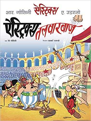
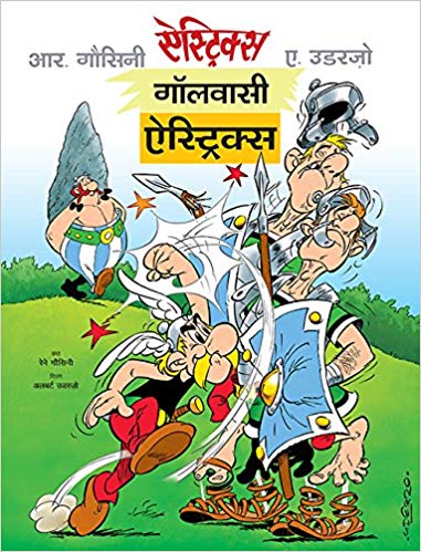
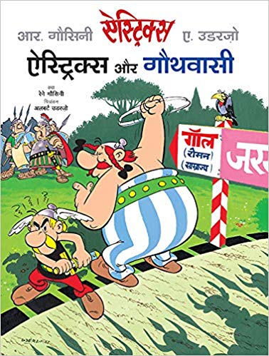
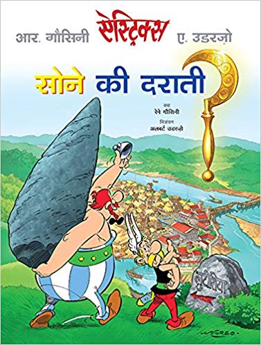
and more. The first four albums—Gaulwasi Astérix (Asterix the Gaul); Sone ki Darati (Asterix and the Golden Sickle); Astérix aur Gawthwasi (Asterix and the Goths); Astérix Talwarbaz (Asterix the Gladiator)—are now available in Hindi.

Ajay Mago, Publisher, Om Books International, acquired the Hindi translation rights of The Adventures of Asterix from Hachette Livres, France, after nearly 5 years of negotiations that started in 2009 with a blind call at the Frankfurt Book Fair. He just walked into the Hachette Livres stand, hoping to just walk out with the Hindi rights for Asterix, a logical step after having recently acquired the Hindi translation rights for The Adventures of Tintin from Editions Casterman.

Hachette Livres wanted to see a detailed marketing plan for the books in Hindi. They also insisted that the translation be carried out in Hindi from the original comics in French and not from English. Given that I speak French (I have an M.Phil. in French Literature from Université Paris Diderot-Paris 7) and have been Chief Editor, Om Books International, since 2010, Ajay suggested, I come on board. Thereafter, we got on board Puneet Gupta, an advertising professional and a producer of audio visuals, who writes science fiction novels, short stories and humorous poetry in Hindi. A die-hard comics enthusiast since childhood, he has translated the comic series, Tintin, in Hindi, also published by Om Books International. We then had to send Hachette Livres a sample 10-page translation of Album 1 to prove our credentials. After about a month, we received the stamp of approval—the translation was much appreciated with a few changes here and there. Clearly, we were dealing with publishers who needed to be convinced that they were interacting with a team of professionals in India who would do right by the bestselling comic series in the world. The rights were finally granted in 2014.

Given the number of comics in the Asterix ‘canon’, and in the entire series, it was clear that Ajay, Puneet and I were in it for the long haul. To begin with, Puneet and I read up the entire series a few times to get the drift of the constants and the variables. (At the moment, the first four albums are out.  Completing the series would take, at the very least, another couple of years.)

It was obvious that we were not dealing with a straightforward narrative and Puneet does not speak French. So I would share with him the multiple meanings of each dialogue/ frame, the wordplays and the etymology as also the distortions in the French originals. I would do that primarily in Hindi with the truly odd recourse to English. (it was a conscious decision taken by both of us to leave English out of the process). Thereafter, both of us would come up with multiple parallel possibilities in Hindi, till we got the context and register right each time. This is amply clear from the revisions on each draft (see scanned examples of handwritten revisions for Gaulwasi Asterix).

At the very outset, we realised translating comics have practical constraints. The first and immediate constraint is fitting the Hindi translation into each speech bubble, despite Hindi being syntactically longer than French also because of the maatras on the top, bottom and the side (in French, the accents are only on the top and bottom).

While the French comics are hand-written, we had to look for a similar font in Hindi that could be typed out on the keyboard. At times, we needed to choose different fonts that would establish the distinct accent with which a Goth would speak for instance (in the English translation, the Gothic font was used for the Goths). The font of the main copy was Kruti Dev 010. Kruti Dev 240 was used for Goths in Asterix Aur Gauthwasi.

Besides the fonts, we had to ensure that each linguistic community spoke with the accents phonetically associated with it. So, the Goths took on harsh and guttural sounds in Hindi. The accent was also a challenge when we were translating the speech of a drunken sod. Besides slurred speech, words altered forms constantly through a series of dialogue to indicate a constantly altered perception of reality as is wont to happen when one is sloshed.

Apart from Asterix and Obelix, the various gods and goddesses, and historical figure like Julius Caesar, Vercingetorix, Cleopatra, whose names remain unchanged, renaming the characters, designations, geographical coordinates was a challenging exercise as each name in French and in Hindi has multiple meanings.

Each language has a set of distinct sounds or onomatopoeia. We had to work our way through the sounds from French to Hindi too, and already have a directory of over 150 onomatopoeia.

For pure visual effect, more so after a vigorous exchange of fisticuffs, sounds in Hindi had to be drawn and manually fitted into many frames without speech bubbles.

As we went along, it became clear that we were translating not only from French to Hindi, but depending on the provenance of the protagonist, we were translating from Latin, and on occasion, German too. This shall only get more complicated as Asterix and Obelix travel out to Britain, Egypt, Corsica, Spain, India, amongst other places, for the distorted nuances in French are likely to be borrowed heavily from the languages spoken in these places. So before translating the nuances into Hindi, we shall have to go into the etymology of the words, the idioms, the phraseology of the region in which the Asterix and Obelix find themselves. Negotiating between different registers of each language to establish the social hierarchy that binds the characters, was part of the task at hand.

The series is replete with French songs, nursery rhymes, ditties, military marches etc. that have often been distorted in the French version itself. That posed the twin challenge of first decoding the original versions and then translating these into Hindi with as many implicit and explicit layers of meanings carried forward.

The comics are also replete with intricate word play, sometimes running through a series of dialogue, and on occasion, through several pages. As the word plays became more complex, finding suitable translations became more challenging; we worked through various options till we stumbled upon that epiphany, that elusive translation which worked well.

Puneet Gupta says “We had to decide on a few guidelines that would be followed in the course of translating the entire series. These included the set of names of the central characters, the Roman garrisons surrounding the village of the Gauls, the various ethnic groups—the Romans, the Germans, the British or the Egyptians, to name a few, all identified with a unique suffix as given to them in the original text. Apart from historical figures such as Vercingetorix, Julius Caesar, Brutus, Cleopatra, etc., all the other character names are puns and mini jokes in themselves. In Sone ki Darati, there is a shifty dealer Lentix, who we translated as Dal-me-kalix.

Barbaric Germans tribes have funny sounding names, ending with a suffix “ic”—Teleferic, Metric, Theoric, Periferic, Choleric and Histeric. According to their mental make-up, we renamed them Atyacharik, Maardhadik, Becharik, Bimarik and Mahamarik. The suffixes particular to linguistic and cultural communities were retained as in the original.

We have also tried to retain the original flavour of many names. The dog, Idefix, or of fixed ideas, was renamed Adiyalix, someone who is doggedly obstinate, and loyal too.Druid Panoramix has become Ojha Aushadhiks. The village of the Gauls, is almost tribal in nature, and the druid is a combination of a medicine man and a witchdoctor, who brews potions with magical powers. Another character Cetautomatix, has been named Svachalit Loharix.

The military terminology was interesting too. Ranks such as Centurion and Decurion had to be suitably translated as well. So after much deliberation over the existing ranks in the Indian military, we took a cue from Senapati, and coined ranks like “Dashpati” for Decurion (a commander of 10 soldiers), and “Shatpati” for Centurion (commander of 100 soldiers) than settle for Major, Colonel etc. For every proverb, popular joke and clever turns of phrase in French, we hunted for a befitting equivalence in Hindi to ensure that the punch, wit and humour of the original were not lost in translation.”

Is the humour in Asterix in consonance with the underpinnings on which the edifice of humour per se reposes? Pretty much yes, so humour at its most irreverent, whether anti-establishment or otherwise, feeds off cultural and ideological superiority, racial, ethnic and linguistic slurs, gender stereo-typing and other devastating premises that go beyond the pale of politically correctness. But most of us play along since there is an unspoken pact between the participants-interlocutors that it is all in jest and good cheer.  

The Adventures of Asterix is a comic series with a very significant graphic element, the largely visual slapstick humour is conveyed efficiently through the excellently drawn panels. Whether its our Gaul heroes settling scores with an adversary, with only his teeth or sandals in the speech bubble to speak for the devastating aftermath of the encounter, or the effect Besurtalix’s singing has on everyone, a handful of translated sound effects in the panels suffices to convey the drama and humour.

Literary humour is rather difficult to translate. Fortunately, with the rich repository of words, jokes, proverbs, songs, rhymes, poems, riddles and of popular lore in Hindi, the search was usually crowned with sensible outcomes.

All through, however, it was clear to us that we were not ‘converting’ the comics by translating them into Hindi just as competent translations of the French, Italian and Russian literary masterpieces into English or other languages were meant to ‘communicate’ the narratives instead of ‘converting’ or ‘customising’ them to the cultural construct of the target language. Also, the imposing visuals of Asterix would make it near impossible to ‘Indianise’ the comics. The comics are being translated with the desire to share a cultural experience that is quite unique, different, yet not dissimilar in the gamut of human experiences.

This translation project has been partly sponsored by the PAP Tagore Programme in Paris and locally by the Institut Français en Inde. The idea of embarking on a new narrative in each comic with its fresh round of challenges is interesting for the simple reason that like all great classics, one is forever discovering something new each time we look at a dialogue or frame, and for the joy of decoding the wordplay, the cultural ciphers, and hopefully learning a bit of the art by unravelling the code. We all would have picked up similar linguistic and cultural subversions from the body of James Joyces’ works too.

What stays with us is the great art of writing comics that are important alternative histories that also deride such histories. Asterix is at the end of the day, a great body of satire. 

Indians being polyglots, read in multiple languages. A considerable part of post-colonial India and Indians have already been exposed to a plethora of world literature, including comics and cartoons. We have grown up reading Superman, Phantom, Mandrake, Modesty Blaise, Archie comics, Tintin and Asterix alongside Chacha Chaudhry and Deewana (our home-grown version of good old Alfred E Neuman), RK Laxman, Sudhir Dhar, Mario Miranda, and more. Our colonial heritage, now a part of our socio-cultural DNA, is paradoxically a bane and a boon. We do not resist either reading, writing or speaking in the language, supposedly, of the ‘others’ that over time has been embraced as a personalised mode of expression by the ‘I’. There is already a huge readership of Asterix in English in India, a country that has had a very strong tradition of comics not only in English and Hindi, but in several regional languages as well. Asterix in Hindi is not only for the strictly Hindiphone readers, but for comic buffs and collectors, artists, ethnographers, translators, educational institutions across linguistic boundaries, and across India and the world.

(C) Dipa Chaudhuri & Puneet Gupta

3 April 2019

Book Post 31: 17-27 March 2019

Every week I post some of the books I have received recently. In today’s Book Post 31 included are some of the titles I have received in the past few weeks.

28 March 2019

Web Analytics Made Easy -
StatCounter